2/7/19

DAC MM Jan & Feb 2019

I worked a little more on some of the turtle shells.

I worked a little on the red pepper and added the shadows underneath the peppers.

Rubber cement and on pass with paint.  have removed the rubber cement (usually leave it to do more layers).  See the texture handout for information on how to make these textures.

Plastic wrap.

Sanding.

Wax paper.

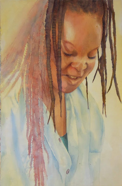
The under painting for the woman.  At home before class I wet the paper and dropped in orange and a cool yellow.  After that dried is when I should have transferred the drawing (I did it before and it was hard to see). I then used rubber cement to make texture in her hair and on her scalp.  I used a purple and blue to make the darks.  I dripped the hair strands.  Then I wet the paper around her head and added some color to the dark parts of her hair and added darks to her face as well (I used the purple and blue - the purple was quin. rose and ultramarine plus phthalo blue.  The blue was phthalo blue plus ultramarine mixed together).  I have more hair to add and a little more dark.  I will post again when I have it done.  For the shirt area I added a green (phthalo blue and warm yellow) and put plastic wrap to make the texture.

This is the same woman in process as a watercolor painting.  I mentioned it and a few of you wanted to see it.  I started it last fall and it's been sitting there until I can get back to it.  I have a bit more to do.

1/24/19

A&A W J&F, 2019

I mixed a dark neutral (3 primaries).  i took a bit of the neutral and added a lot of water to make it lighter. I wet the cow around the spots and dropped in the neutral color and guided it around.  While it was still wet I dropped in some red as well.  I wet and dropped in the light color for the small cow in the back. 

I worked on the wing.  I wet the area and added the neutral in lines in the direction of the feathers.  I added some red as well.  It still needs more darks.  I wet the posts at the bottom and added many colors in a vertical pattern.  I did not mix them with the brush, I dropped them while holding the paper upright so they would run.  I wet the beak and added the neutral color and red.  Later I came back and added white gouache.  I added yellow to the head.  Later I came and shaded it with white gouache.

DAC MM J&F, 2019

On the head an flipper I used white, terra cotta (burnt sienna will also work), black cherry (black grape or indigo will also work).  On the shell I used the colors mentioned and also added a little grass green and pomegranate.  I added some peacock blue to darken the water around around the head.  Make sure when you do this that the color graduates outward, don't make an outline or halo.  Focus on the values, the lights, mediums and darks, make sure your turtles, especially the heads and front flippers, "pop".  I will demo more on the turtles next class especially for those who missed class. 

On the green pepper I used white, grass green, dark green, peacock blue, indigo, yellow chartreuse and a little scarlet lake in the dark area.  I layered these according to the value I needed.  I usually put down darks in the shadows, layer a lighter color over the top and then do the darks again.  In the light areas I lightly layer a color, then do white, then the color again.  In a white highlight areas I layer the white and press hard at the end.  Layering combines the colors and adds richer color.   On the yellow pepper I started with canary yellow and did a light shading over the entire pepper.  On the left side shadows I layered scarlet lake, canary yellow, white, purple, white, canary yellow.  On the right I started with cadmium orange and have not layered color yet.  I started working on the top but have a bit more to do value wise.  For the red pepper I worked on the top left only.  I used crimson red and indigo and a little white.  I barely started layering and will do more next class.  I plan to use crimson red, pomegranate and scarlet lake as well as white, indigo and possible canary yellow.   I will demo more on the peppers next class especially for those who missed class.

1/17/19

Art & Ale Watercolor and White Gouache Jan & Feb 2019

I transferred the drawing first.  Next I wet the paper and added green and yellow in the grass areas and blue at the top (you can use whatever colors you wish).  I then splattered some of the green and yellow (splatter the colors you decide to use).  When the paper was shiny but not puddles I added table salt towards the top and larger salt towards the bottom.  I let it dry.  We will start painting the cows next class.

We started with a blank white piece of paper.  We wet the paper and added blue (add any color you want to add).  I made it look like a sky.  After that dried I transferred the pelican.  I mixed a dark (I used the 3 primaries included the darkest blue I had).  I leaned it towards purple.  I started on the head and wet an area.  I dropped in the dark.  I dropped in red on the top of his head and the dark below it and let them merge. I worked down into the feather area and added the paint in lines to make a feather like texture, especially on the edges.  When I wanted lighter areas I used a little more water in the paint (that way the white of the paper showing through makes the light areas).  Since we are using gouache we can also make lighter areas with the gouache, I will show you that later).

DAC MM Jan. & Feb. 2019


This is the texture I made for a background in class. I wet the paper, added a blue-green color and added large salt and table salt when the paper was still shiny/wet but not puddles.  I allowed the paper to dry and then removed the salt.  The next step is to transfer the turtles.

This is a background I had ready with the turtles transferred.  I then painted watercolor onto the turtles.


I added a tiny area of colored pencil using mostly white, a little orange and some blue in the background on the right side fin and neck of the top turtle.  I will demo much more colored pencil during the next class.

I painted each pepper separately.  The yellow pepper was first.  I wet the pepper and stem, dropped in warm and cool yellow and a tiny bit of warm red on the left side.  I added green and some warm red to the stem.   I used watercolor pencil and a piece of sand paper to add the dots of green (it's a texture process called sanding).  I then painted the red pepper with watercolor pencil.  I wet the pepper, used sanding to add the color and then spread it with a brush.  On the stem I shaded the watercolor pencil on dry paper and spread it with a brush.   There are several other techniques to add watercolor pencil (I will go over them again in one of the classes).  I painted the green pepper by wetting the pepper and using a cool and a warm green.


I added the background.  I mixed a gray.  Gray is made by mixing the 3 primaries and leaning it toward the blue.  Brown is made by mixing the 3 primaries and leaning it toward red and yellow.  I wet the paper and dropped in the gray moving it around the paper.  I then dropped in some of the yellow, red and green used in the peppers.  I added a bit more gray on the bottom and added the color of the pepper in its cast shadow.  The shadows faded a bit more than I wanted so I may redo them with watercolor before staring on the colored pencil.

11/16/18

Art & Ale Acrylic and Colored Pencil Nov. 2018

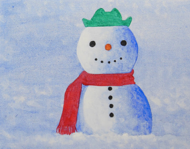
Acrylic on canvas.  I added the white highlights on the scarf, hat, nose and buttons.  I also added more white to the snowman and the snow. I added shadows to the hat, scarf, snowman and the snow.

I worked on the leaves.  I started with a light layer of grass green working around the veins and highlights.  I then added a medium dark with dark green.  I used black to add the darkest darks.  I used chartreuse on the veins and the lighter green areas.  In the highlights I used white. 

I kept working using the same colors. I added some canary yellow to the veins in some areas. I have some finish work to do but am getting close. 

NCBG IEW Oct. and Nov. 2018

I added a few more darks in the finished areas and worked on a few of the red seeds.  I added the red part below the more finished area by wetting the area, adding red, adding a mixed dark, lifting a highlight on the left side and then adding salt.  I will continue with the colors I have used already to finish this piece.

the poured piece with 2/3 masking removed.

The piece after several hours of time at home adding mostly values (lights scrubbed and darks painted) and a little color.

This is how it looked after class with the rest of the masking removed and more scrubbing and more painting of darks.  I have a bit more to do such as adding the darks in the gills and more darks elsewhere that are missing or not dark enough or that need a glaze of color.  After I add those I will set this painting up to look at over a week or two so I can find anything that I missed or that I need to adjust.

After transferring the drawing I wet the background, branches and leaves (everything except the flower).  I held the painting slightly upright and dropped in color and let it run.  I used gray green and yellow and then added and splattered some warm red as well as spots of water.  Then I laid it flat and added salt (when the paper was still shiny but not puddled).  After it was dry I removed the salt and ran water and a soft brush over the edge of the flower to soften the darker color that collected around some of the edges.  Later, after that was dry, I glazed the background with rich green gold (Daniel Smith).  I glazed it to tone down the texture.  I still wanted to see the texture, but needed it to be less busy.  Sometimes, for very busy backgrounds, I must gaze more than once.  After everything was dry I worked on the leaf next.  I did it in 2 sections.  For the top part I dampened the leaf (dampening is a little less water which comes with a little more control) and added green (mixed from warm yellow and blue that leans towards green).  While still damp I added a little dark in the dark areas, some red in the middle and some yellow near the edge.  On the bottom section of the leaf I dampened and added a blue green towards the tip and a regular green near the stem and yellow on the edge.  I left a space for the middle vein.  After the leaf was dry I lifted some veins with a soft brush, water and a paper towel on the leaf (may do more).  On the bottom leaf I added thin shadows under the veins and a thin shadow on the other side of the middle vein as well. I ran yellow down the middle vein and dropped little dots of green and red.  For the branch I mixed a brown leaning towards gray.  I dampened it and put the paint in on the dark side.  Later, after it was dry, I added more shadow and some texture. On the flower I mixed quin. rose with a little ultramarine blue.  I dampened the petal I chose to start and added the paint to the dark area letting it or helping it move outward.  I moved petal by petal moving around so petals could dry before working next to them (if that makes sense).  I then did a second pass on the dark petals in the middle.  I used a darker red made by adding a little green to the quin rose and ultramarine mixture.  Remember, Normally I would finish all the petals before a second pass and all the leaves, etc. before moving on and finishing them.  But for demonstration purposes moving on in a small area is necessary.  You can also work in a smaller area for learning purposes as well.

11/13/18

NCBG IEW Oct. & Nov. 2018

The masking has been removed on the top 2/3 of the painting.  I started shaping the mushrooms and background by adding shadows and scrubbing some highlights as well as adding some details and glazing some color.  I will remove the masking and demonstrate what I have done in class tomorrow.

11/8/18

Art & Ale Acrylic and Colored Pencil

Acrylic on canvas.  I started by wetting the canvas and adding watered down ultramarine blue.  I used a damp brush to lift some of the paint making texture (larger texture on the bottom getting smaller as I moved up).  After drying I transferred the snowman. Then I used white and painted it on the left side watering it down/lightening it as I moved right.  Then I used ultramarine painting it on the right side watering it down/lightening it as I moved left.  I added a shadow under the scarf.  I then painted the scarf red, the hat green, the buttons black and the carrot orange. We will shade and add highlights to all of those next class.  We will add a shadows in the sow as well.

We started on the berries.  I put white on the white spots.  I then went over the berries with a reddish orange - pale vermilion, permanent red or poppy red (poppy red is not light fast) will work.  I then used scarlet lake, a wam red, to darken the berries (crimson red will work).  I worked around the white spots.  I used a colorless blender to smooth this out (a stump will work as well).  I then added more white in the white spots, indigo for the dark spots on the berries and then more white to shape the berries.  next we put chartreuse on the veins.  We will work on the leaves next class.

NCBG IEW Oct. & Nov. 2018

I worked a little on the bottom stem and bud and leaves.  I worked on the top as well getting the first pass of watercolor and adding some darks.

Added more shadows and details to the bottom section.

Before class I decided to make a second loose pass of color.

I started adding darks and color to some of the seeds and to a section in the bottom.  I also did a little white gouache work as well as negative painting work to show you 2 ways to get the fuzzy look.  I also demonstrated adding a slightly darker color to the bottom right background. 

This is before class and after the light blue pouring.

I added more masking and poured a third round going back to the warm yellow and red colors.  If this was not a class piece and I might have decided to pour a few more times.  But stopping here for time sake.

This is after taking off the top half of the masking.  I have a nice under painting on which to start direct painting.

Textures - blowing with a straw (2 colors), rubber cement on the left (only one light pass of purple so far, would do several more before removing the masking), sanding with watercolor pencils on a wet area top right, and the purple square is from another day where I splattered making with a tooth brush and then added the purple and removed the masking.

Salt, 2 sizes, and sanding into the color n the right side.

plastic wrap top left, larger bubble wrap top right, small bubble wrap bottom left, Wax paper (not a good one) bottom right.

See the Texture handout for a description the how to do these.

11/6/18

BAL MM Oct. & Nov. 2018

I worked more on the body and face as well as the branches.  

Before class.

I worked on the petals, part of the background (adding blue and touches of dark) and started working on the middle parts as well.

Before Class.

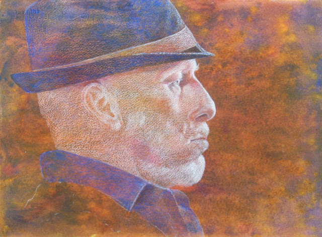
I started some pen & ink on his hat and clothes and a little on his face.  I added a few more layers to his face.  I have more detail and value work to do, more layers.

11/5/18

NCBG IEW Oct. & Nov. 2018

First round of masking and pouring.

I added some more masking and then a layer of light blue (pthalo, VERY light pthalo).  With the masking I made some small textures, did more of the gills, covered a few larger areas as well as entire mushroom caps - the light ones.  Most of these light caps have shading that will need to be done later, but I wanted to protect them from the next pass of color.  2 caps were partially covered, 4 were fully covered and 3 were not covered at all.  I plan to do a little more masking and the last round(s) of pouring in class before removing the masking.

11/4/18

BAL MM O&N 2018

I finished the white on his face and head and started adding Copenhagen Blue and black to his hat and clothes.   I will continue demonstrating next class. 

11/2/18

NCBG IEW Oct. & Nov. 2018

Wet on wet (working wet to dry).  I finished adding a cool red glaze to the artichoke.

I softened the bottom stalk with water, a brush and a paper towel.  I added some more petals.  I dampened each petal before adding the color.  Dampening is wetting, but not as wet as when we did the first and second passes (a little less wet allows for more control).  Then I used the various mixed greens and some yellow and a little red to start lightly shading the petals.  I added a little blue green to the stalk and leaf. Then after all was dry, I started adding darks and gradations to the petals on the bottom right.  I worked mostly wet on dry, although some areas I will used wet on damp as well.

Wet on dry upright.  I worked on this upright working from the top down.  I used very thin color.  I used 2 browns, yellow and red.  I allowed the color to drip and run together.  I worked on the subject and background.  This pass is very light.

I used more pigmented color, but still on the lighter medium side of value.  I used a red (mixture of warm and cool red), green, purple and brown.  I started adding some of the darks and the seeds.  This will help me see the structure more, it's like making a road map.

Pouring.  I transferred the drawing and went over it with a number 2 pencil in some areas (so I would not lose the drawing).  I wet the paper with a spray bottle and poured using yellow and red.  I moved the paper around so the color would move and mix.  Test the paint in the bottle for how dark it is before using.  It should be on the lighter side.  

11/1/18

BAL Mixed Media Oct. & Nov. 2018

I worked on the face a little lightening the light areas more.  I added some green to darken behind the sloth's face, will most likely darken this even more to create contrast.  I worked on the fur using cream, white, dark brown terra cotta, spanish orange, crimson red.  I worked in the direction of the fur using a stroke that created a line while still paying attention to the over values.  I started working on the branches adding some darks and lights.  I used white, dark brown, terra cotta, chartreuse, and for the dark I think I used indigo with dark brown...  I worked on a leaf using white, yellow chartreuse, grass green, and a dark for the veins (cannot remember what I used there, maybe dark brown).

I started working on him like I do all other pieces on a medium dark to dark background - I used white to shade the values (did not finish that part yet).  Then I added peach and then light peach and terra cotta and dark brown and indigo and a little scarlet lake so far.  I did some indigo and dark brown on his hat so far. as well as a little white for the highlight.  He has many more layers yet, I will demo in the next class.

An example but much further along with more layers and many more darks and lights.  Need to work on the ear and face surrounding the ear, the hat and the shirt and a little more elsewhere.  But it's far along in the process.