9/30/13

Colored Pencil (September/October 2013)

Colored pencil on white.  Started as a value study.  This is the chicken after quite a few layers.  I used the small pencil topper eraser and the battery operated eraser to add more texture.  

This is the otmatoe on the textured surface after melting the pencil and spreading it around on the background.  It needs more work, but is improved.

This is the very beginning of the tomato with a blue value study under drawing.  I used true blue (Prismacolor).

This is the tomato after the first layer of red.

Colored pencil on a medium colored surface.  I transferred the drawing and then used white and black to create a 'road map' of the tiger.  I shaded the white and black areas lightly.  This will make it easier to know where I am on the drawing as I move forward with color and value.  


9/26/13

Continuing Watercolor (Sept./Oct. 2013)

I added some details and shadows to the petals and middle.  I scrubbed out some lights in the middle and on the petals.  I straightened the oddly shaped middle.  It needs a litle more work, but is getting close to copmplete.

I added more dark to shape his face.  I added dark and scrubbed out some light on his hat..  I used masking fluid to put some thin lines for the plaid.  I dampened the shirt and dropped in color (I used yellow and red).

9/25/13

Aqueous Acrylic & Gouache (Sept./Oct. 2013)

Acrylic.  I added a color wash on the background, mostly a cool red.  I started adding the dark and white areas as well as the color on the top of the head and ears.

Gouache.  I carefully added a wash of color, mostly red and a little yellow to the background. I started adding the dark and white areas as well as the color on the top of the head and ears.   

Acrylic.  I transferred the drawing onto a textured acrylic background.  I have done a value study with white.

Gouache texture.  Wet the paper, drop in yellow and red, leave spaces and add the blue.  Make sure the paper is very wet so the color will move.  Don't mess too much with your paint brush.

Gouache (watercolor textured background).  I transferred the drawing onto a textured background.  I have done a value study with white.

9/24/13

Colored Pencil (September/October 2013)

CP on dark.  This is the value study in white and the beginning of color over the white.  Sorry for the quality, it was taken with my phone.

This is after color has been added.  It needs more color work, value work, and some detail.

CP on white.  This is after the value study in dark brown and the beginning of color.  Sorry for the quality, it was taken with my phone.

This is after more color has been added.  There is more color work, value work, and details needed.

This is the beginning of the tomato.  It started as a value study in true blue.  The texture needs to be removed as it is distracting.

9/20/13

Continuing Watercolor (S/O 2013)

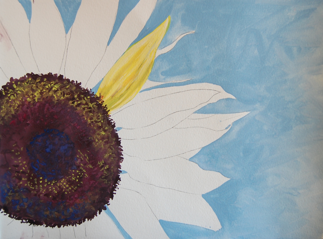
Transfer the drawing, wet the middle section and drop in vibrant color.  I used quin. rose, perm alizarin, and new gamboge.  Then I mixed a dark brown (indigo and burnt sienna).  I added the dark brown on top paying attention to the values (I dotted in in).  Then, I added salt (regular and sea salt) when the paper was shiny\, not puddles..  Then I wet the background and added blue (cobalt).  When the paper was in the 'danger zone (almost dry and will create blossoms when you go back in with a wet brush), I went in with a wet brush to make blossoms in order to add texture.  After the paper was dry I worked on a petal.  I slightly dampened the petal, added new gamboge.  While still wet I added the red-brown mix from the center to make the stripes.  I also used a dried brush to life some light areas.

Reference photo

First wet the paper, then I added blue and yellow (cobalt and aureolin).  I splattered some as well.  After this was dry, I transferred the drawing.  I dampened the face area and painted in the values of his skin with sienna brown and a little of the dark brown (sienna and indigo).  After that dried I dampened the hat and painted in the values of the hat.  I used a mixture of cobalt and quin. rose. 

Reference photo

Aqueous Acrylic and Gouache (SO 2013)

Gouache.  After transferring the drawing, wet the background area and drop in color.  A little salt was added as well (add salt when it's shiny, not puddles).  After that is dry carefully dampen the tiger (so you don't lose the drawing) and drop in color paying attention to the values.

Reference photo

Acrylic.  After transferring the drawing, wet the background area and drop in color.  After that is dry carefully dampen the tiger (so you don't lose the drawing) and drop in color paying attention to the values.

Reference photo

Acrylic plastic wrap texture.  Wet surface, drop in color, put plastic wrap on top, allow to dry.

Acrylic Salt texture.  Wet the surface, drop in color, add salt when the surface is still shiny, but not puddles.

Gouache plastic wrap texture.  Wet surface, drop in color, put plastic wrap on top, allow to dry.

Gouache texture.  Wet the surface, drop in color.  For this one I used the 3 primaries.  I added the first two (red and blue) and saved spaced for the yellow.  I dropped in the yellow and did not push it around with the brush so as not to mix the colors all together (if I mixed them I would have a paper that is all brown).  I then lifted and slanted the paper allowing the colors to run together a little.  Then I laid it down and added a little salt when the surface was still shiny, but not puddles.

9/17/13

Tuesday Class

Scratch Board and acrylic.  This is the hen I am doing and used as an example today in class.

Scratch board and acrylic.  First scratch out the light areas paying attention to the values.  Finish the value study before adding color.  Then, add acrylic to tint the tiger.  Then, after the paint is dry, scratch out more highlights or texture as needed.

Colored Pencil (Sept./Oct. 2013)

Colored pencil on a dark surface.  Start with a white pencil and do a 'value study' shading in the light areas.  Then start layering color.  On the comb I added canary yellow and then pomegranate as well as a tiny bit of  indigo.  I then used scarlet lake and then white again.  This is at the very beginning.  Finish the value study part before adding color.

Colored pencil on white.  Start with dark brown (or some dark color) and do a 'value study' shading the dark areas.  Then start layering color.  I used scarlet lake and black as well as white.  This is at the beginning.  Finish the value study part before adding color.

9/16/13

Photo for class

9/5/13

Exploring Gouache (August 2013)

Local Color Gouache.  On this one I showed how to use white over a dark area to change it.  I then added the red color over the entire area.  It now needs yellow/orange and some refining.

Value Study Gouache.  I added the yellow over this.  It will need more red and the highlights strengthened and then some refining.

Gouache over a dark texture background.  I worked on the body with white getting the first layer on.  I will add a few details to 'imply' feathers.   A little more yellow might be nice in a few areas.  The entire piece needs a few more details and adjustments, but it is close to complete.

Gouache on white paper.  I started by wetting the background and adding the blue (it was indigo and white).  I allowed it to dry.  I added yellow to the petal.  After it was dry I added darks to the petal (I only did one petal because it's a demo). The darks were a red and a purple color.  I added a dark purple to the middle (would do this after finishing the petals if this was not a demo).  I then added yellow to the petal over the darks as well as some white in the light areas.  I added yellow as a highlight in the middle.  I also added red and blue.  I then added some of the dark purple back in.  I added these colors as 'squiggles' to imply the texture of the middle.

White gouache over a dark background I have started adding white, paying attention to the values, over the textured watercolor background.  I can leave it as white or add color over it later - my choice.

Myrtle Beach Mixed Media Workshop (July 2013)

Colored pencil over acrylic (textured with plastic wrap) prepped with Acrylic Ground for Pastel on mixed media paper.  I added a few more layers of colored pencil and have a few more to go.

Exploring Colored Pencil (August 2013)

Colored pencil on a dark background.  I added more white and showed 2 ways on adding a shadow - either dark in the shadow or if on black paper some light around the shadow.

Colored pencil on a light background. I started to add darks with dark brown.  I also added some color.  This will take quite a few layers.  In the shadows have values go from dark to light and pay attention to the subtle shades in the shadow.

Colored pencil on watercolor paper with a under drawing that is melted colored pencil (I used goo gone).  There are two ways I melted on here - 1. in a lid I scribble colored pencil, melted it, and painted and splattered it on the paper, 2. I shaded a few layers on the paper and then melted it.

This I showed in class - it is an acrylic textured painting (a plastic wrap texture) with Acrylic Ground for Pastel on top (Golden Acrylic Product), and colored pencil on top of that.  I have a few more layers of cp until it's done.

9/3/13

Tuesday Class

Scratch Board.  This is of course the start.  Transfer the drawing and then scrape out the lights paying attention to values.