 |
| I worked on the flower petals adding an orange color to warm it up and shade the petals. I added highlights to the finches feet. |
 |
| I added lights and darks all over. I added bubbles. It still needs more bubbles but it's getting close to done. |
|
| I worked on the flower petals adding an orange color to warm it up and shade the petals. I added highlights to the finches feet. |
|
| I added lights and darks all over. I added bubbles. It still needs more bubbles but it's getting close to done. |
 |
| I worked more on the trunk and ears and a little on the face. It still needs more darks and lights. |
 |
| I worked on the hat and the face and the neck and shirt and hair. This has a ways to go. The eyes, nose and mouth are not done as is a lot of the rest actually.. The hat texture on the top is incorrect darn it, will need to redo the angle... |
 |
| I worked on the left side of the face (her right, our left...). I used a little more white before starting. Then I covered the area lightly with peach. I added terra cotta in the darker areas. I used light peach and peach to blend. I did light layers of these colors to blend and shade the face. I added dark brown into the mix for the darker areas. The next step in that area is to re establish the lights with white and light peach. Keep in mind that I typically would work on the entire piece building it up as a unit, but due to time constraints with demonstrating I did a small section. |
 |
| I worked on the side windows of the main car focusing on values mostly with black and white (and a little blue as well). |
 |
| I worked on the feather pattern on the bottom neck section. I used white and black. |
 |
| I worked on each area adding lights and darks and details. Still needs a little more work, especially on the petals, but it's close. |
 |
| I worked on the eye area, a little on the ear and mouth. This needs a little more value and detail work. Just remember, the values, the lights and darks, are important! Values, values, values! |
 |
| I started this piece with cream and white paying attention to the values. I then used a little indigo in the darkest areas (be careful with the indigo, another dark such as black grape is easier). I usually do several layers of white and build them up. Then I added peach using the side of the pencil. I added it lightly at this point over the white. Then I used terra cotta (colors like burnt ochre or sienna work as well) and started adding some darker areas. I added dark brown to make some areas darker and indigo in the darkest areas I add the dark colors in layers and often used peach or something lighter over the darks in the middle layers (this helps blend and unify the colors). So I often go back and forth light to dark to light to dark again in some areas. For the light areas I used cream, white, peach and light peach adding these in layers. White will be added at the end in the very lightest areas. The nose needs some help as I lost one of the nostrils, ooppss. It needs some reshaping as well. This whole is at the beginning and needs a lot more value and detail work. |
 |
| I added a stem. I used white, yellow chartreuse, grass green, crimson red and white. |
 |
| I added the main shadows and worked on the parts of the head. Still more to do, but it's getting there. |
 |
| This is the first part - adding white to a dark background. I add it using the side of the pencil and not a lot of pressure. I then layer the white and work on getting gradations. The eyes on this are off and need correcting. |
 |
| I used tracing paper and traced the drawing and placed it over the eyes and transferred again which allowed me to see what was needed. I put the nose in to be able to get the proper placement. This is something i do every so often when I realize I have not followed the drawing well while shading. |
 |
| This is where I am after correcting the eyes and shading a bit more. Remember - this is all about the lights and darks - the values (values, values, values). Work hard on the values as this will really help you. |
 |
| I painted dark green and indigo over a painting I had started awhile ago and have no desire to work on anymore. I splattered a reddish brown into the wet paint. To make this background I wet the paper first and then painted and splattered the color. |
 |
| I transferred the drawing with white transfer paper. |
 |
| Finally worked on this and finished it. |
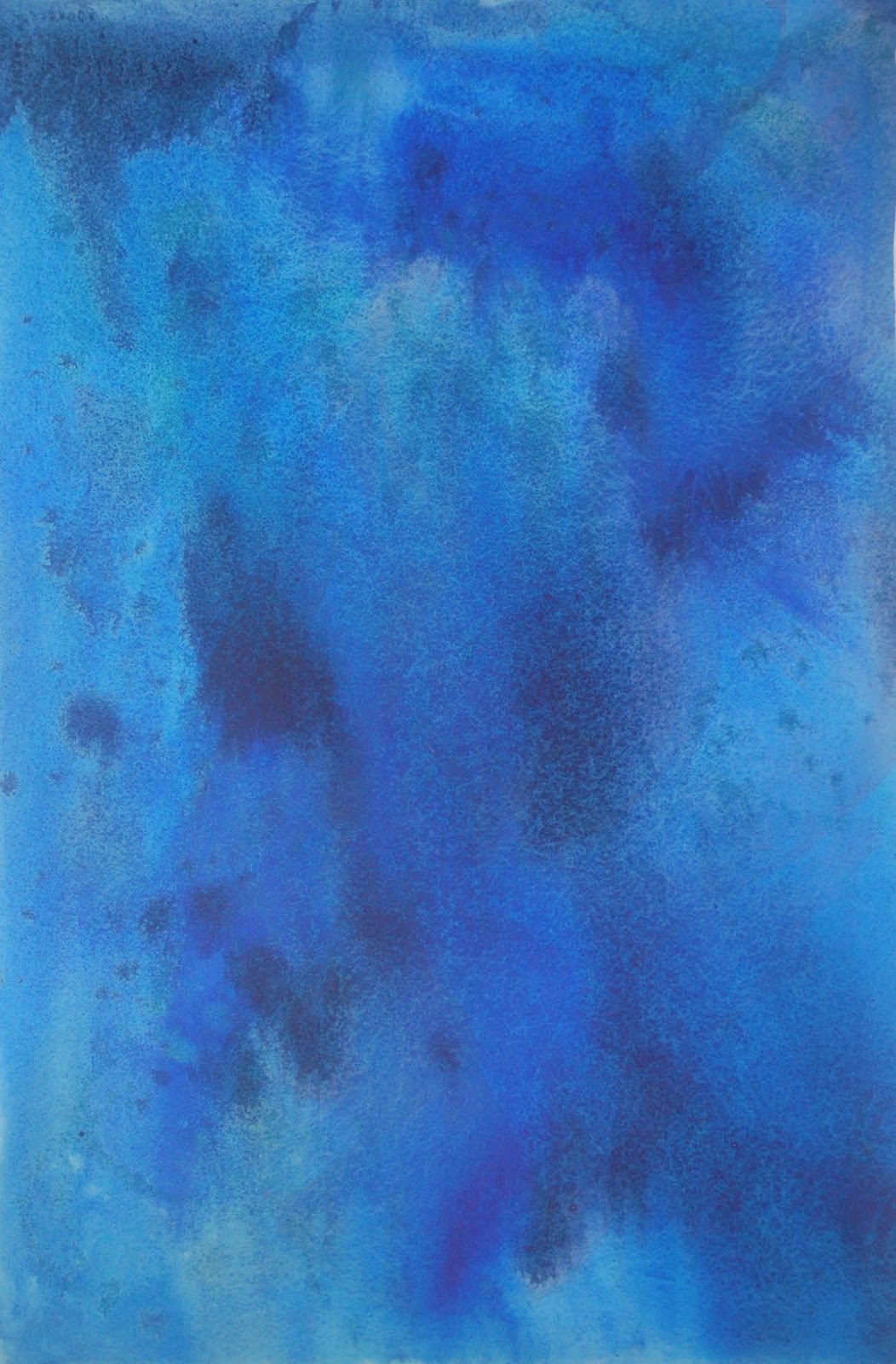 |
| I painted dark blue over a painting I had started awhile ago and have no desire to work on anymore. I used phthalo blue and indigo blue and a little bit of warm red mixed with the phthalo. I wet the paper first and then painted and splattered the color on and them lifted the paper to move the paint around. |
 |
| I transferred the drawing with white transfer paper. |
 |
| I added yellow to the white petals and some darker green to the leaves and an orange grown to the middle of the flower. I added some dark to the hummingbird and then some green. I added black to the yellow bird and then yellow. I added orange to the beak and highlights on the beak, around the eye and on the eye. I shaded the petals a little with the orange brown. There is quite a lot of value work and some detail work still to be done, but the foundation is there. |
 |
| I fixed some of the areas that would not take paint last week. I meant to mix a grey blue and a grey but made a brownish color instead (oopss). I plan to add yellow so we'll see if that will do enough to unify. I have a little more lights and darks to add. To make water and glass (and metal too) - it's all about the light and dark patterns and a combination of soft and hard edges. Study the values in the photos and try to copy as that will hopefully help you understand. |
 |
| Had worked on this with colored pencil and then decided that the background was too busy (it was pointed out that it looked like blood splattered which it did...). So, I painted it with yellow, mostly warm yellow and a little cool yellow. This pushed the texture back. Remember each of these pieces is unique so your piece most likely will not need more painting to calm the texture. I then used white and cream colored pencil to start adding the lights. I will need to work on the values and details in the next class. |
 |
| I worked on the leaves using white, canary yellow, Spanish orange, grass green, dark green and true blue, indigo. True blue was put over the brownish background color at the top. To unify and balance I started adding the true blue elsewhere. I shaped the leaves with the white, greens and yellows. Follow the values to get the leaves to curl as they do. I started working on the background leaves as well. The dark leaves in the background add contrast and pop the front leaves forward visually. I used white, cream, pomegranate and Copenhagen blue on the flowers so far (Copenhagen is a new purple-blue I have been enjoying. Indigo or black grape will work in it's place). I added some white on the front open flower and worked on the bud on the back right. I also used cream on the white parts of the flower. |
 |
| I worked on a few more petals and the background. Still have some untouched petals to do. |
 |
| Worked on the front of the car, the two back cars, the windshield and inside the car. Still have more to refine and detail. Working mostly on the values. |
 |
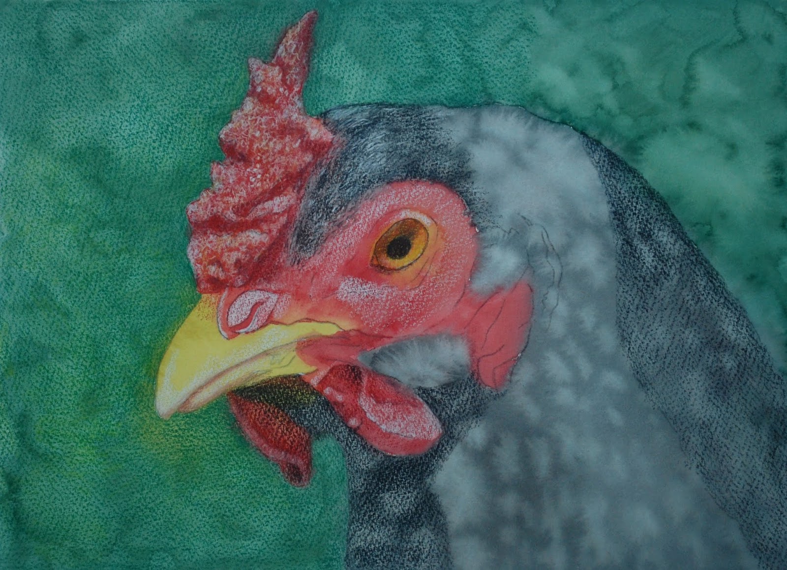
| Started this with local color watercolor. Each area was colored with watercolor/watercolor pencil the color that it is with no attention paid to values. I started working with the colored pencil, but just in the comb and head and it's just started. May lift some off the comb area as I did a bit too much... |
 |
| First we made a background. I wet the canvas panel, added color, and used a sponge to make texture. After that was dry I added some thinned yellow. After it was dry I added thinned white and used a sponge to make texture. I then transferred the drawing and started adding dark in the shadows (lightly) and white in the yellow areas. I will complete this and add color next class. |
 |
| After my initial issue with the canvas panel beading up, I added a layer of Liquitex Clear Gesso to take care of the issue. I then started painting with a warm dark and a blueish gray. I have barely started. I will glaze color after the details are added. Step one is to get the values on. |
 |
| Colored pencil over a watercolor and/or watercolor pencil colored and textured background. First I wet the paper and dropped in color, splattered color, drew with watercolor pencils and then painted with water, sanded, etc. (Sanding is grating watercolor pencil over wet paper). After it was dry I transferred the drawing and started with white and crimson red colored pencil. I then added black grape for a dark. This is the very beginning of the process. |
 |
| I transferred the drawing and then used watercolor and watercolor pencil. I have done about 4 layers of color allowing it to dry in between layers. The first layer was purple and pink all over the paper and especially on the flowers. the second layer was the background behind the flowers and leaves with a dark green. The third was the entire area around the flowers with green and warm yellow and with some splattered red. the fourth was a dark behind the flowers with watercolor pencil. It is now ready (or very close to ready) for colored pencil. I might add a few darks in the leaf areas with watercolor pencil. |
 |
| I worked on the middle and the bottom petals. In the middle I scribbled with colors such as terra cotta, dark brown, scarlet lake, indigo, spanish orange, yellow chartreuse and white. I made sure it looked textured using scribbling/scumbling to imply the actual texture of the object. I then worked on the petals. I used white to shape and lighten and correct and soften. I used canary yellow and spanish orange for the color. I used scarlet lake and cadmiun orange plus indigo for the shadows (along with the yellows and white). The petals need a little more work, but they are well on the way. The niddle part is very close. I will make adjustments to the center as needed after I work on the flower and background more. |
 |
| I worked on the windows and started on the grill and headlights at home. I will work on this in class for those who need to see it. let me know. |