1/30/18

DAC CP Jan & Feb. 2018

I added more color to the skin around the eye, worked on warming some of the shadow areas (I used white and then scarlet lake and terra cotta to do this).  I continued to refine and add darks and lights.

I worked mostly on the shadows under the grapes.  I went over them with white and then a very light version of pomegranate and a little black grape in some darker areas.  Still have 3 unfinished grapes and an unfinished branch...

I used white on the head areas and added highlights and then went over the area with scarlet lake to warm it and later added a little spanish orange to the front to add warmth and a glow.  On the feathers I added more white and a little more color and then used black to add shadows.  He is close to complete, but needs a little more refining and detailing.

I shaded this with white first.  I applied the white carefully on the front (as this is the area that will be the center of interest). I applied the white less carefully on the back side - I completely covered the area and erased darks and used white to add lighter areas.  The hair is made of scribbles. 

I covered the entire head scarf with true blue as well as her hair (front and back).  Choose any color you wish for this part as the color of the scarf does not need to be blue.  I then shaded the face with terra cotta first.  hen I used black grape on some of the darkest areas.  I used scarlet lake to add some warm medium and dark areas and spanish orange to add warm to some light areas.  This is now the under drawing that we will work on.

1/29/18

Sertoma CW Jan. & Feb. 2018

I added the rest of the blue for the mountains.  I worked most on the bottom half of the painting.  I started dividing the grass areas and added dark to the bottom glass and the path/road. There is a lot more work to do, but this is a good base.

This is a monochromatic painting or a value painting.  We will use one color and it's values to make a painting.  I started by dampening the face, dropping color into the dark areas and then I guided it around into the lighter areas.  I used Indanthrone Blue.  Any dark color will work.

I finished more petals and demonstrated adding the darks/shadows.  I talked about values today - the lights and darks and how important they are.  I also demonstrated adding darks around the subject to pop it forward.  I need to add color and value to unfinished areas and then refine and detail. 


1/25/18

BAL Watercolor Jan. 2018

I removed the masking.  I added yellow to the bottom leaf section.  I wet and softened some of the color on the flower part with water and a soft brush.  I then worked on the middle brown stem part of the painting. I then moved to the top, wet around the flower, and dropped in 2 greens and some red.  I moved around and down behind the leaves.  Then I let everything dry.  Next I used a scrubber brush to straighten up the edges of the flower and to lift highlights from the brown stem part. When the flower was dry I used a mixed purple to shade the flower petals (need to shade a few areas more).  I added some green darks on the leaves and scrubbed out some highlights.  I have more of this to do to "bend" the leaves.  I also added some brown to some of the leaves. 

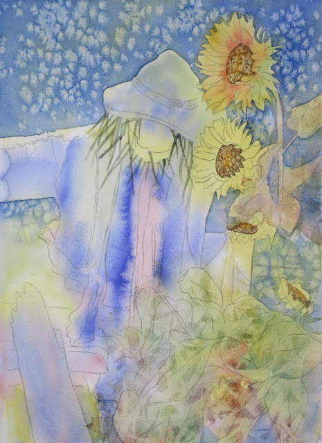
I worked more on the background with blue and salt.  I used masking to make hay pieces under the hat and around the head of the scarecrow.  I dampened (less wet then when I wet the surface) a sunflower and added orange and a warm yellow as well as green on the backside.  After things dried I wet the leaf areas, dropped in color (orange, green, purple, yellow) and put plastic wrap over it and scrunched the plastic wrap.  This makes a leaf like texture.

1/24/18

DAC CP Jan. and Feb. 2018

I started refining and adding details, color and value on the eyeball (still need to work on the surrounding skin).  I added some eyelashes with both white and black and dark brown/black grape.  I still needs a little more work and refining.

I demonstrated using a stiff brush to bend the colors on the sanded pastel paper.  I added more darks and highlights and worked on the stem and shadows.  Everything still needs work.  

I worked on the back paper with a white pencil laying in the light values (opposite of what we usually do in drawing....).  This is important to do on black in order to get bright color.

I started adding the color.  I used scarlet lake and pomegranate on the head, and blues, greens, and warm yellow on the feathers and yellow and orange on the beak.  This is what i consider the under drawing.  Everything must be refined and detailed as well as the values being enhanced.

1/22/18

Sertoma Continuing Watercolor Jan. & Feb. 2018

I worked a little more on the mountains.  I wet the grass area, dropped in color (greens and browns), and laid saran wrap on top to make texture.  After that was dry I mixed a dark (phthalo blue and pyrrol scarlet), wet the tree area, and put the color in from the bottom up letting the trees become fuzzy at the top since  these are the background trees.  I also dropped in some orange while they were wet. We will add more trees that will become more hard edged and detailed as they come towards us.  The grass area needs layers of color and especially value which we will do next class.

I worked on more of the petals making a few more passes as I added shadows and scrubbed highlights.  The shadows and values are necessary to give the petals form, to make them appear 3D and rounded.  I glazed the background with yellow and a little more red. I them discussed how the background could get darker or lighter depending on what the piece needs for contrast and for the artichoke to "pop".  I showed the white gouache at the top as one way to lighten.  You can also scrub with a magic eraser or lift with a brush and scrubbie.  I worked on the first pass on the stem as well.  It needs more shadows and texture still.

1/17/18

DAC CP Jan. and Feb. 2018

I started with peach and covered all but the eyeball with peach.  I then added terra cotta in the shadows.  I did more white in the light areas.  I added true blue, canary yellow and spanish orange in the iris,  I used orange and scarlet lake to warm up and add glow to a few areas.  I used indigo in the dark blue areas on the eye.  I have the foundation down now and will show how to refine areas next week in class.

I finished all but one grape with the pomegranate.  This is how it looked before class.

I worked on one grape for demonstration purposes.  Normally I work on the entire piece and build it all up together.  I used pomegranate, scarlet lake, cadmium orange, black grape, white.  First I laid down some more color with scarlet lake and some orange and black grape and then went over the entire grape with white (this smooths and blends).  I then layered more color as needed over the entire grape.   The next step will be to refine and adjust it (will show in class). I also need to add more color to the shadow (but it has been blended/burnished with white).

1/12/18

BAL Watercolor JF 2018

Pouring.  We started with pouring as the under painting. I transferred the drawing and masked small sections of white on the flower for the first round.  I poured with green, yellow and a little orange.  After this dried I masked a few more areas on the flower petals and the veins on the leaves.  I poured again with the same colors.  I used a paper towel to lift from the leaf highlights (press the paper towel onto the leaves where the highlights are).


I wet the paper and dropped in color.  I lifted with a dried brush on the edge of the hat to make a highlight.
 This is a photo taken with my phone in class - the lighting and color are off.

After the first pass was dry, I then painted orange, brown and yellow in the centers of the sunflowers and added salt.  I mixed the orange (warm red and warm yellow) and the brown (either 3 primaries that lean toward red and yellow OR orange with a little blue).  I then painted a darker blue in the background and added salt. Add salt when the paper is wet and shiny but not a puddle.

DAC Colored Pencil January and February 2018

Colored Pencil on Strathmore Toned gray paper.  I started with white focusing on the highlights.  I then worked with black lightly applying the darks.  Do not add too much black in areas that will have color over the top.  This project focus is values.  We start with an under drawing of the values and add color on top.

Colored Pencil on UART sanded pastel paper. I started with Canary yellow and shaded it over the entire subject and shadows.  Then I used Pomegranate (or Crimson Lake) to shade the grapes.  Pay attention to the values and highlights.  I then lifted the highlights and put white into the areas.  I also put a little pomegranate on the stem shadow side and a light layer of pomegranate in the shadow area.  This project focuses on a start with color and we will build the values as well.

1/8/18

Continuing Watercolor January and February 2018

We started this by wetting the background (making it really wet so the paint will move), dropping in some greens and yellow, and then adding salt when the paper wetness was best. The best time to add salt is when the paper is still wet and shiny but not puddled.  After it dried I demonstrated how to soften edges with water, a brush and a paper towel (to remove the excess water).  I demonstrated painting a petal (this is the first pass).  I dampened the petal (damp, not wet), and then start painting and shaping the petal.  I used a yellow green and a blue green both mixed with different ratios of warm yellow (mine is quin. gold) and purple blue (mine is ultramarine).  After that was dry I did 4 areas of glazing - red, blue, yellow and rich green gold.  I will eventually glaze the entire background to soften the texture as it is too busy. 

I started this by wetting the paper and adding Ultramarine blue and shaping it to make sky, mountains, and textures.  this is my under painting.  After that was dry I started painting the mountains.  I dampened the area first and then added blue and shaped the values.  I used a paper towel a little to add texture.  I need to finish the mountains on the upper left and a small piece on the right.

Continuing Watercolor March and April 2017

This is the photo I took after class ended.

This is how it looks now.  I am still working on it as you can tell by the many unfinished areas.