12/14/20

NCBG IEW Nov. & Dec. 2020


At home I finished adding the masking to the mushroom tops.  I added dots and whole areas of masking that I gently rubbed after the masking was dry.  These two masking techniques can be used to create texture and they help soften the side that needs to be softer.  

I started adding light washes of color to the mushrooms.  I started with warm yellow (Spanish orange) and warm red (pyrrole scarlet) plus purple blue (ultramarine). I added a second pass of washes on the middle mushroom.  I did this before class for drying purposes and to speed the process for the demonstrations. 


I used water and a brush to go over the entire background to subdue the texture.  Often the textures created are too distracting and using  water and a brush or some glazing is needed to push them back. 

I mixed a dark (the 3 primaries) and wet an area and added a shadow.  I used the dark to also attach the base of the stems to the ground. I made marks and added some brown to the bottom of the mushroom stems to ground them.  I will add a few darker darks at the bases of the mushrooms in the shadow areas at some point.  

I demonstrated the light washes of color (warm yellow, purple blue, warm red) to the mushroom and the stems (orange, warm yellow, and red).  I used a dark brown ( the primaries leaned towards red and yellow) to start adding some details and shadows to the mushrooms.  I used the dark from the shadow to add shadows and details as well.  More refining still needs to happen.  

I removed the masking.  I used a brush and water and a paper towel to soften any unwanted hard lines made by the masking. 


12/3/20

NCBG IEW Nov. & Dec. 2020


Texture made with wax paper.  I wet the watercolor paper, dropped in color, crumpled the wax paper, placed it over the wet paint, and placed something to hold it down until it was dry.


Texture made with plastic wrap.  Wet the paper, drop in color, place the plastic wrap on the wet paint, and scrunch and/or twist until you make interesting shapes.


Sanding texture made with watercolor pencils and a strainer.  Wet the paper and drop in some color if you wish (i added some yellow). While this is wet, color watercolor pencils on a strainer over the paper so the tiny pieces fall and make a spotted texture.  The yellow wash area and to the left of it is a place where I sprayed water to show what too much water can look like. The right side and along the top is the way it can look.


This is the start of the mushrooms using salt as the texture.  I wet around the mushrooms and dropped in dark color (you decide on the color and how dark).  I used both table salt and larger sea salt.  You can see the differences in size.  Add the salt when the paper is shiny, but not puddled..  I will most likely be adding more color and glazing this as it will be too distracting as is.  I also started adding masking fluid on the mushrooms (the gray stuff on there).  I will finish adding it before class.  


Before class I did a small part of the branch with a mixed dark gray color (the 3 primaries leaned toward blue).   I also started adding a light blue, like a glaze (ultramarine) to the petals.


I worked on more of the branch with the mixed gray (warm and cool red since plus warm yellow plus green blue), I glazed parts of it with blue and yellow.  I still need to adjust the values on the branch a little.  I added more ultramarine blue to the petals as well as some of the gray from the branch (but lighter).


Colored pencil (work in progress) over a dark watercolor background (that was another painting covered in dark color)

White gouache (work in progress) over a darkened watercolor painting of the artichoke.


The artichoke before I added a red glaze

The artichoke after a red glaze was applied to the background and the start of some edges being cleaned up.

11/30/20

NCBG IEW Nov. & Dec. 2020

I finished adding the background.  I may do some glazes over it at some point.

I worked on this with the Quin Rose only.  I did not finish the 3 small connection points yet, there are more values in those areas.  We will work on glazing and adding color in the next class.  But doing a monochromatic piece is always good practice when learning a new medium.  I still do them often. 


11/26/20

NCBG MM Oct. & Nov. 2020


This is still in process. 

Using the same colors as before, I worked on more layers, refining the values, adding details as well as adding more color.  I used a lot of white. I have some refining to do on the onion, but it is getting close to complete.

I have darkened the background following the pattern of the watercolor plastic wrap texture.  There is colored pencil over the entire background (which is typical for my pieces).  I used the two cool grays, 50% and 90% to do this.  I made it darker to add contrast and pop the onion forward.  I am considering adding color to the background, trying to decide on the color...

I am also working on the board it is sitting on, I started adding color.  I am also still refining the values.  I am using colors from the onion on the board as well as the two grays from the background.

Below are photos of the start so you can see the difference more layers makes.

The initial colored pencil layers.

The start, a value study with watercolor


Using the same colors from before, I worked on the unfinished leaves, refined the leaves I had finished before, worked on the unfinished petals, and refined the petals I had worked on before.  I used cream over the entire background to soften it and push it back.  I added a little grass green, pomegranate, and Spanish orange, lightly, in some areas.  I am still working on the background, picking at it here and there until I am happy with it overall.  I will also continue looking at the leaves and petals and refining and enhancing the values as needed.


11/21/20

NCBG MM )ct. & Nov. 2020


Using White and Yellow Chartreuse/Chartreuse (you could use canary yellow as well), I started shaping the sprouts. I then used grass green and green to add the darks and a little red to neutralize the green in a few areas.  I used Cream, White, Burnt Ochre, and a little Grass or Dark Green to shade the base of the sprouts (in pace of Burnt Ochre you could use Sienna Brown, or a mixed brown with warm red+warm yellow+a little green blue).  I will continue with these colors to finish the sprouts.  Pay attention to the shadows  and the subtle gradations in the shadows in the reference photo.

I worked on the onion using Burnt Ochre, Pale Vermillion/Cad. Orange, Scarlet Lake, Spanish Orange, Indigo Blue (or another dark such as Black Grape or Dark Brown or Dark green), White, and cool gray 50% in some of the subtle shadows.  The first step was to shade the bulk of the onion with Burnt Ochre.  Pay attention to the subtle values as you work. I then added orange, yellow, and red at various times while working.  I used the dark, in my case Indigo Blue, to add the dark areas and shadows. I used the white to correct areas such as overpainted areas, add highlights that were missed, and to add lighter areas. 

On the wood base the onion is sitting upon, I worked on the right side and on the cast shadow.  I used cool gray 50%, cool gray 90%, and white. Choose colors, a dark, medium, and light or just a dark and light, that work with the color palette in your piece.  I worked on the upper right edge of the wood adding darks and lights in a textured way to start shaping the wood base.  I will do the same on the left side.  I used white to lighten the edge of the cast shadow and to bring light into the sides of the shadow (study the shadow in the photo).  I also added a few dark lines of the wood into the shadow.  I started to add some color from the onion into the cast shadow as well.  On the bottom of the wood I added lights and darks and made the bottom overall lighter than in the photo.  The reason is that I did not want a large all dark shape at the bottom of my piece.  It will be dark, just not black.

I am using cool gray 50% and cool gray 90% to add medium and dark values to the background in areas that I need to shape and add contrast to make them pop  I could also use white or 10% or 20% cool gray if i need light areas.  I will continue to ass these colors all over the background.  I may decide later to add color, possibly in a light glaze of colored pencil, not sure yet.  But I wanted you to know that is an option.  


I worked on a few petals and the top 4 leaves this morning.  I did the top 4 leaves because several of you were having issues with those leaves.  Study the highlights and shadows on those leaves for guidance.  Three leaves on this only have the underpainting of watercolor, I need to work on those and the rest of the petals.  My background also needs some work, a few areas need to be subdued.  I could do this with more watercolor on the background or with colored pencil.  I will most likely do it with colored pencil.  

I wanted to note something about the placement of the flower - I made sure that the top leaf went off the page.  The reason for this is to keep it from floating which the leaf going off the page does, barely.  I could also crop more and have one or more of the leaves go off the page.  I did not want to add a stem, I like it without the stem.  But I could have added one to keep it from floating.  Or, I could let it float a little...


11/19/20

NCBG IEW Nov. & Dec., 2020

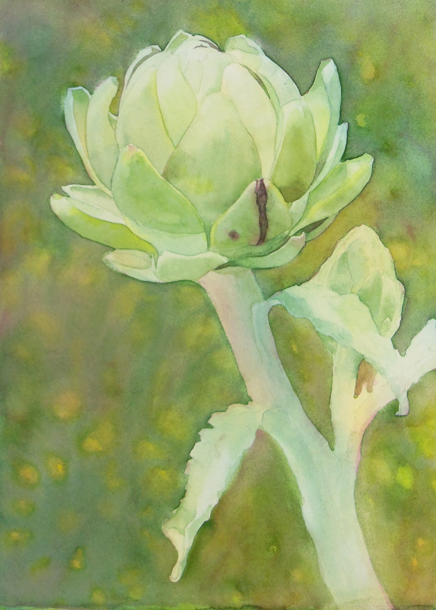
I demonstrated using less water for more control to add some darks and details to the head of the artichoke.  I generally work light to dark, wet to dry.  The first passes tend to be wet-in-wet, getting more dry and working in smaller areas with each pass.  I added some darks and some of the lined textures as well as red for the damaged spots.  

I did about 3 layers/passes in the red (cool red with a little green).  The first pass was a medium light red over the entire area.  The next pass was slightly darker red and I worked in less of the area, just the shadows.  The third pass was darker and an even smaller area putting dark red into the darkest areas of the shadows. If necessary I could lift out more highlights at some point in the red area.

The leaf that I started in class, I demonstrated the first pass.  I wet the areas where I wanted the color to flow. I added a little more color in the darker areas and a little less in the lighter areas.  The next pass will be to add the next darkest layer of shadow.  I will work towards the darkest shadows getting darker and more dry as I go.

I demonstrated lifting with a soft brush and then the Eradicator Brush (which is new to me and worked really well).  I demonstrated and talked about scrubbing which I usually only do at the end of a painting to correct areas.  I do it at the end since it changes the surface of the paper which makes it difficult to continue painting in that area.  I forgot to mention that I sometimes use scrubbing at the end not to fix issues, but to add texture in some paintings.

I demonstrated glazes.  Glazes are light mixtures of color used to change the temperature of an area or to slightly alter the color of an area. I demonstrated some red, yellow and blue glazes on some of the bracts.

I demonstrated adding color to the background.  I did this in a small area for demonstration purposes.  I wet the background area, making it very wet so the paint will move, and dropped in color (the color choice is yours if you decide to add a background).  I dropped in red (mixed from both my warm and cool reds) and then a green (mixed with my green blue and my warm yellow).  I did not mess with the color much, otherwise it would mix and make brown.  I will most likely do a glaze or two over this background once I finish the background.

I demonstrated dampening the stem in a few areas as well as a few bracts/petals, while the background was still wet, allowing background color to move into those areas.  This "attaches" the subject to the background and makes areas of soft edges.  I can also make soft edges by running a damp brush over an edge. 

Be patient with yourselves, remember you can't do everything at once.  Work general to specific, light to dark, wet to dry. Save your whites and if you lose some lift them back out.


For this one start with your cool red only.  Use it and the amounts of water to pigment to do a value study on the entire piece.  This will help you get a better grasp on water amounts.  This is key, understanding what the watercolor does with the varying amount of water on the paper, in your brush, and in the pigment.  Have a towel or cloth to help you monitor the amount of water on your brush.

And practice, practice, practice!!!


11/17/20

NCBG MM Oct. & Nov., 2020

Colored pencil and pen & ink over watercolor.  This started out as predominantly white and black ink over a watercolor background that I planned to just tint with colored pencil.  However, the colored pencil has ended up being predominate.  I am mostly finished, still working on shaping the background with colored pencil.
 

11/15/20

NCBG MM Oct. & Nov. 2020


For this value underpainting I mixed a gray blue color using 3 primaries with a little extra blue (I used pyrrole scarlet, indanthrone blue, and permanent yellow deep).  

I first painted the dark shadow on the bottom.  I wet the shadow area only and dropped in the dark pigment.  

Next I wet the the background on the top portion, dropped in a slightly lighter version of the color (added a little more water to lighten the color).  I then placed plastic wrap on the wet paint and scrunched it creating shapes.  I left it on until it dried. 

The plastic wrap allowed paint to wander into areas on the onion and stems.  I used a scrubby brush to remove these.  I left the paint that went under the plastic wrap on the stem areas.  

After that dried I wet the shadows on the onion and added a light version of the color.  I dropped some darker color at the bottom and let it spread a little.

Using white, scarlet lake, pomegranate/crimson lake, indigo, black grape, spanish orange  I started working on the petals - adding value and detail as well as reshaping and refining.  I worked on the middle area and a few petals out from there.

Using white, grass green, dark green, indigo, canary yellow, yellow chartreuse, and spanish orange I started working on the leaves.  I working on the bottom left leaf.

I worked on more of the scales with colored pencil.

I worked on this a little more.

**These photos were taken with my good camera in good lighting.  I was unable to use my good camera in this class until today (it was out of commission for the past few months).  So these are the most correct photos as far as color and value.

L & T Class


This is the piece in good lighting after the first few layers.  The previous layers are shown in the photos below.  So far we have used Cream, White, Sienna Brown (or Terra Cotta) and Dark Brown (or Dark Umber). I used a stump after the layers to help blend and smooth the colored pencil.  This needs more layers, more darks, and refinement which we will do the next time we meet. 

Be aware that the colors and values are incorrect due to the lighting in which the photo was taken.  This is in the middle of the layers after we started adding color with the Sienna brown.

Be aware that the colors and values are incorrect due to the lighting in which the photo was taken.  This is the beginning of the process with the Cream and white.  We added the light values first.

11/7/20

NCBG MM Oct. & Nov., 2020


I added the background to the under painting.  I wet the paper around the flower, dropped in color.  When it was still wet, but not puddles, I added the salt.  I used course sea salt, but you can use table salt, etc.  After it was dry, I glazed the background with yellow to tone the texture down a little.  In the next class we will add colored pencil on top. As I get further along I will evaluate the background and decide it it needs to be adjusted.


I started the ink portion of the process.  I used a black ink pen to organize the darks, to add texture, and make some areas darker.  I used the white pen to add white to the light areas.  I also started adding texture to the branch.  I most often use a very scribbly ink stroke.  With time you will figure out what works for you as far as ink strokes.

On the bottom pine cone, I added colored pencil to the scale.  I used white, olive green, dark brown and indigo.  You can use these colors or choose colors that work for your piece.

On the top right pine cone, I started adding colored pencil in several places. There is one scale that has purple, this has the most colored pencil.

Remember I used white and then added color to fix a background  area I had accidently made dark.  White is a useful pencil to have for fixing things.  Also remember I added a small amount of colored pencil in a similar pattern as the watercolor to pop a few areas.  I will do this all the way through while working on this piece.    

A close up photo.

A close up photo.


In this piece I am focusing on using watercolor for the background and ink for the details.  I am tinting it with colored pencil.  I demonstrated the branch texture, which is organized scribbles.

11/6/20

NCBG IEW Nov. & Dec., 2020

I worked on this at home a little more.  I did not do anything to the stem so I took a close up of the artichoke head.  I'm working on adding shadows. Remember, it's not complete in any area quite yet.


11/5/20

NCBG IEW Nov. & Dec., 2020


This is a photo of the artichoke demo.  First I wet the entire paper, I made the paper saturated with water.  I then dropped in warm and cool yellow and splattered it and moved the color around (mine is very light, needed a bit more pigment in my mixture).  

After that dried, i made the first pass on the artichoke.  I mixed a green (warm and cool yellow and green blue) and demonstrated painting individual bracts (I often refer to them as petals, it's easier for me for some reason).   I wet the petal, dropped in the color in the darkest area and guide the color.  To gradate and lighten, I clean the brush in water, dry the brush on the towel and move the paint into the lighter areas on the petal.  Sometimes I don't clean the brush, I just wipe the paint onto the towel and then move the color on the petal.  

In some areas I added yellow or yellow green while painting.  Later I will demonstrate glazes to add blues, yellows, and reds.  I use glazes to change the temperature, color, or to add atmosphere or a glow.  

For the reddish damaged part of the petal, I mixed cool red plus a little green blue.  For darker green I make the green lean more blue and/or I add some red to the green.  Both work.  Sometimes for a dark area I mix a black color composed of the colors I have used in the painting (to keep it cohesive).

 I started the second pass, which is adding the shadows and the start of the darks.  I also dampened the stem with a little more water than the petals, but less water than the background.  I dropped in a green blue and some yellow green and some red (I made some of the red I mixed earlier lighter with water).