8/30/19

NCBG ICP August, 2019

I worked a bit more on the leaves and branch and a few areas of the pear.

8/29/19

NCBG ICP August 2019

Used the same colors with the addition of black for the background and a little black added to the dark areas.  I worked on details and values and color.  So at this point I would spend the next few weeks looking at it and making adjustments.  But, alas, it's going into a show so I will do the adjustments over the next 4-5 days and then put it in a frame for the show. 

NCBG ICP August, 2019

This is how it looked at the beginning of class.

I demonstrated how to make changes to the background.  I used an eraser to erase color from the areas of the background I want to change (this removes the color, except for the stain of color, and allows for more pencil to be added).  I then add white over the erased area and after that I add the color I wish the area to be over the white.  I blend with a stump or my finger.  To get the softer edges - I overlap the colors and often use white or a lighter color over that and then often another layer of color with overlap and then I blend with a stump.  Try all the blending and layering to get some practice and to come up with methods that work for you.

This is how it looked at the beginning of class.

First I added canary yellow into some of the more yellow areas of the pear.  Then I used yellow chartreuse, grass green, dark green, scarlet lake to start layering the color over the white, do this lightly.  I shaded scarlet lake on the branches and canary yellow and scarlet lake on the big leaf and scarlet lake, grass green and yellow chartreuse on the small piece of leaf.

I used yellow chartreuse, grass green, dark green, scarlet lake, spanish orange, black grape, indigo, and white.  I started working on adding the various textures, adjusting the values as I work.  On the branch I started shading it using black grape, indigo, white and scarlet lake.  May add other colors as I go.

Using the same colors as above, I continued work on the textures and details.  I started adding the brown spots and imperfections and the dots that pears have.  I added a little color, very lightly, to the white highlights and worked on making the transitions smooth.  I worked on the big leaf using black grape, white and indigo to shape it and then dark brown lightly on top.  On the green part I used dark green, yellow chartreuse, indigo and white to shape it.  Still more of the same to do all over the pear.

When I am done I believe I will keep the background black.  As usual, I have smudges and scratches on the surface.  I plan to shade with black over the entire background surface.  This will clean it up, make it uniform, and I can clean up edges.  I could choose to shade with a dark color instead of black or I could use a variety of colors and make a background. 


8/27/19

NCBG ICP August, 2019


I shaded orange and then melted it and then melted the shavings in the lid and painted it onto the background.  I used orange as I thought it would make a nice warm background.  Warm yellow would have been nice as well. This photo was taken in poor light with my phone so it's washed out (had no other option).

Using white and other colors such as yellow chartreuse, canary yellow, dark green, black grape, scarlet lake I started shaping the background.  I also worked on the green grapes.  I added melted green to the back grape and added dark green, yellow chartreuse and indigo to the front green grape.  This photo was taken in poor light with my phone so it's washed out (had no other option).

Still working on the background using the same colors listed above with the addition of indigo.

Worked on the little piece of stem below (using the same colors).  Still shaping the background.  The colored pencil is getting thick and more like paint in a way. Using the stump and my fingers to blend as well as lighter pencils. 

I am specifically not working on the top background so I can do it in class.  Also leaving a grape or two and some of the stem unfinished for a demo.

Smudged the background a bit more and added some dark green and indigo as well as yellow chartreuse and canary yellow to the green grapes.

8/26/19

Sertoma CW March and April, 2019

Added some more shadows and little details.  She just might be done!

8/24/19

NCBG ICP August, 2019

I worked on it more with the white colored pencil. We will add color and detail in the next class.

8/22/19

NCBG ICP August, 2019

I worked with colored pencil, no melting anymore, on the the red grapes on the top right side.  I used scarlet lake, crimson lake (pomegranate will work as well), black grape , and white.  I shaded the values on the grapes.  Next I shaved indigo into a lid and melted it and started painting it on the background.  I also showed painting on the other colors.  On the bottom right I shaded the indigo on the paper and then melted it.  Either way works.  I need to finish the indigo on the background and then start adding the colored pencil colors in the background over the indigo.  The indigo is an under painting/drawing to get a dark down first to make the subsequent colored pencil go quicker.

This is colored pencil on Art Spectrum Colourfix sanded pastel paper, black.  I transferred the drawing with white transfer paper and then used a white pencil to start laying in the values.  I used a stiff brush to blend the pencil and then used the white pencil to lightly fill in any spaces and the stik tak/poster putty to lift as needed.  I go over the areas i want smooth lightly filling and lifting to make it smooth.  We will add color over the values next class.

8/21/19

Sertoma CW March and April, 2019

I have worked on this quite a bit since class.  I am still adjusting values and temperatures a little and adding details here and there.  But it's close to complete.

8/20/19

Sertoma CW August and September 2019

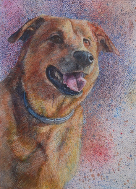
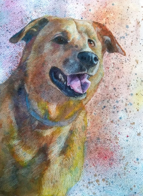
I added a glaze to the ear to warm it up.  I mixed a very thinned orange brown color and painted it on the dry ear.  I started adding shadows with a mixed gray.  The gray was made from the same colors as the brown, I just leaned it toward blue.  I used warm red, warm yellow and green blue (for me that's Daniel Smith pyrrol scarlet, permanent yellow deep and phthao blue green shade).  I also added shadows to shape the nose and started working on the eye and collar.  I am working in layers from light to dark.
I started adding shadows to the branch to give it form.  I also demonstrated adding some darker areas to the background so highlights and a leaf show up (negative painting).  Remember  - wet the paper far beyond the areas where you will be adding any color to avoid hard lines on the edges.  I dampened the pears and added a light wash of green/  After that was dry I dampened the pear and added some red.  I added green and brown to the small leaf area working wet on dry and using a mostly dry brush to move the color.


8/15/19

NCBG ICP August 2019

Black and White side view with white paper behind it.  I have started adding color on the color side.  I will be making adjustments to this as needed while I work on the color side.  I will be lifting/erasing to lighten and using my dark color to darken.

Color side with white paper behind it.  On the flower petals I have used pale vermilion, canary yellow, yellow chartreuse, scarlet lake to shade the petals.  On the leaves I have used grass green, yellow chartreuse, scarlet lake.  I have lightly shaded scarlet lake and Spanish orange on the middle seed section and some indigo to darken it near the petals.  On the bird I have used grass green, dark brown, terra cotta, and indigo.

This is colored pencil and solvents on hot press watercolor paper.  There are two methods used here.  I shaded the color onto the grape and then use a brush and rubbing alcohol to melt the wax and blend the color. On the other method I shaved the pencil into a container (I use metal jar lids), add rubbing alcohol, and mix it into a puddle of color.  I then paint it onto the grape.  To lighten the color add more rubbing alcohol.

For the red grapes I used a combination of crimson red, scarlet lake, and pomegranate. In the shadows I added black grape.  For the purple grape I used the same 4 colors but added much more black grape to the mix.  For the green grape and stem I used grass green, dark green, yellow chartreuse and spanish orange.  I added little spots of scarlet lake into the stem and melted it.  I need to add a blush of red into the green grape still.  and I need to do the other green grape.

8/14/19

DAC CP & MM July and August, 2019

So this is very close to complete.  At the end of a piece I spend weeks looking at it and making any necessary changes.  I encourage you doing this with your own work.  Stepping back and taking a look during the process and especially at the end is very helpful.  Sometimes i put it away for awhile and get it back out for a new look.

I started layering the color over the white on her skin.  I used scarlet lake to warm it up since mine is very blue/green.  I used terra cotta as well and then peach to blend it.  I layered the colors fairly lightly.  I layered these colors all over her skin and into her head.  I used dark brown and indigo blue as well as terra cotta and scarlet lake in the shadow areas.  I used white and light peach to re lighten the lightest areas.  I will continue using the same colors in layers to get the skin where I want it to be.  Your piece has different colors so some of you will need to add slightly different ratios of the colors than I used or you may need to add a little blue or green to yours is some areas.

For the braids I used scarlet lake and terra cotaa and layered the colors on the strand of braid.  Then I took white and made alternating light spots down the braid.  I used indigo in between these dots to make the crease in the middle of the braid and partially around the white spots.  The I layered some spanish orange and red over the white spots to give it some color.

Each of you will have a different look to your piece.  You can decide what to do or leave out as you work.  Some of you have lovely pieces that do not need to be finished with "skin" colors.

8/13/19

Sertoma CW August and September, 2019

I transferred the drawing first.  Make sure your transfer will not erase with water.  Do this by running water over a small section to see if it stays.  If it does not stay use a pencil to solidify your lines (not too dark).  I wet the background and branches and leaves around the pears.  I made it pretty wet.  I dropped in a mixed green around the pears and flicked in some yellows and water to make texture.  You can use whatever colors you wish for the background.

After the painting was dry,  I demonstrated using a damp brush and a paper towel to clean up some of the edges on the pears..  Then I mixed two browns using 3 primaries and leaning them toward yellow and red.  For a warm brown I used warm red, warm yellow, and green blue.  For a cooler, darker brown I used cool red, warm and cool yellow, and green blue.  I wet the branches and painted  a section of the branch warm brown.  I dropped the cool dark brown into the dark areas.  I also dropped in the reds, yellows, and blue.  I did this in sections on the branch while it was still wet.  When it was still wet and shiny, but not puddled, I added salt.  I used a larger crystal sea salt.

The first two photos of the pears were taken with my phone in the classroom.  I did color some color correction on the computer.  

Photo taken at home in better lighting.

I transferred the drawing first.  Make sure your transfer will not erase with water.  Do this by running water over a small section to see if it stays.  If it does not stay use a pencil to solidify your lines (not too dark).  I wet the background, I made it very wet.  I dropped in a warm yellow.  I added salt when it was wet and shiny but not puddled.  The salt did not work on this one for whatever reason (but it did work for all of you...). 

I mixed a warm brown (warm red, plus warm yellow, and a little green blue).  I dampened the ear and dropped in the color adding a little extra in the darker areas (dampened, not as wet as when we did the background).  I am not trying to finish the ear, just get the base color and a little value down.  I started working on the shadow areas dampening them and adding the warm brown and loosely following the value pattern. I added a little more red to the warm brown for the nose area.   

Using the cool, darker brown mixed for the branch on the pears, I started working on some of the darker areas of the dog.  Again, not finishing, just getting the dark started.

The first three photos of the dog were taken with my phone in the classroom.  I did color some color correction on the computer.  

Photo taken at home in better lighting.

8/9/19

DAC CP & MM July and August, 2019

I worked on the body fur a bit more.  Need to do the collar next class so you can see it done.

DAC CP & MM July and August, 2019Usinf

Using my light and dark colored pencil, Indigo Blue and White, I worked on the values adding light and dark.  I did enough to make the image start to show up.  I will demonstrate adding the skin color and working on the hair and clothes in the next class.

8/8/19

NCBG ICP August 2019

Dura-Lar Matte, black and white/value side, black paper underneath.  I used indigo blue and dark brown mixed together to create the dark color and I used white.  You can use whatever dark color you wish. I concentrated on the values, the darks, mediums and lights.  This is still in process.

Dura-Lar Matte, black and white/value side, white paper underneath.  Remember to use your eraser and stik tak/poster putty to create lines and shapes lift and to lighten and smooth as needed.  Also remember that this paper does not take lots of layers and that we will work on both sides.

View from the color side, black paper underneath.

View from the color side, white paper underneath.

NCBG ICP August, 2019


The black and white side, the side we will start working on first.

The black and white side with colored paper behind it (so the white shows up).

View from the color side.

View from the color side with colored paper behind it (so the white shows up).
This post shows the beginning process when working on the Dura-Lar Matte surface.

8/7/19

DAC CP & MMI am continuing July and August, 2019

I am continuing to add colored pencil paying most attention to the values - the lights, mediums and darks.  I am secondarily considering the color.  You must have value in order to have form.  The highlights and shadows are critical. 

Watercolor texture, plastic wrap

Watercolor texture, plastic wrap
Watercolor texture, wax paper

Watercolor texture, salt (2 sizes of salt)

I made the background for this piece by wetting the paper, dropping in phthalo blue and aureolin yellow, and then adding salt when the paper was still wet but not puddled.  After it was dry I transferred the drawing with white transfer paper.  Then I started with a white pencil for my light color (you can also use light colors such as cream, light peach, or 10% gray).  I also started adding the darks with a dark pencil, indigo blue (you could also dark colors such black, black grape, 90% gray, dark brown). The light and dark color you use is determined by you and the color you used to make your background.  With the dark and light pencil start working on your values.  Do this fairly lightly so that other color can go over the top.