 |
| I added white to the back of the frog and worked on his back legs and feet. Am close to complete. It needs a few more details and shadows. |
12/8/16
Wakefield Vets Class
12/1/16
Wakefield Vet Class
 |
| I started working on the head and then down on the bottom of the body and the front feet as well as the shadow. I used dark green, black (around the eye only), scarlet lake, white (to lighten areas for additional yellow especially), black grape, grass green, canary yellow, and indigo. I muted the bright red under the body with a little green and muted some green areas with a little red. On the top of the head and the back of the frog I shaded in grass green and dark green and melted it. I will add the white highlight shapes next class. I have not done anything to the hind leg. |
C & C Class
 |
| This is the view from the black and white sie after color has been added on the color side. |
 |
| This is the view from the color side after adding some color. |
11/30/16
C & C Class
 |
| Colored pencil on Dura-Lar Matte. This is the black and white side. I have done a value study with a black pencil as well as a little white in the highlight areas. |
 |
| This is a view from the color side. |
11/17/16
NCBG ICP November 2016
 |
| I worked on some leaves and on the background a bit. needs more work of course. |
 |
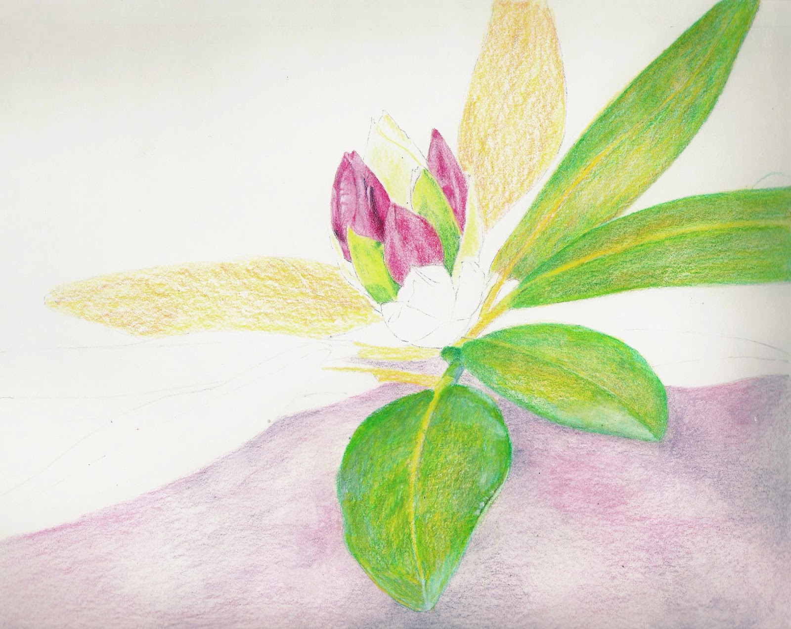
| Colored pencil on a sanded surface. For the pear - I started with spanish orange and yellow chartreuse (you can see the beginning colors on the pear on the right). I added grass green around the edges, blending it into the other colors, making it gradate. I used dark green for some shadow and then cream over the entire pear to blend the colors. The I used the more of the same greens and yellow as needed and added true blue and black grape for the shadow. I pt some white in the highlight. I used scarlet lake and spanish orange for the bottom red area. |
Wakefield Vet Class
 |
| I used Canary yellow, true blue, white, and scarlet lake on the frog. The I used Goo Gone Gel to melt/blend the colored pencil. I used true blue, black grape and scarlet lake for the shadow and then Goo Gone Gel to melt/blend the pencil. I consider this the under drawing. |
Sertoma CW October & November 2016
 |
| I mixed a dark and painted the body of the cow making sure to pay attention to the form. I took off the masking and softened the spots and added some color to them. I need to warm up the dark on the head as well as add more shadows and details. |
 |
| I worked on the clothing a little adding some shadows. It needs a bit more work. I added yellow to the top to balance the yellow on the clothing. I worked on the face adding shadows and details. Again, more work is needed. The right eye needs some adjustment and shadow. |
C & C
 |
| Acrylic. I added more red to the radish, some shadows and highlights to the leaves, a bit more dark to the shadow. |
 |
| Acrylic. I worked on the dark more adding shadows and details. I also added more orange and blue to the emu's head. |
11/11/16
NCBG ICP November 2016
 |
| I worked more on the middle adding shadow, highlight, and texture. I worked on the middle petal. |
 |
| I added a dark background and melted it. After melting I started working on top refining it with light and dark areas. I worked on a few leaves as well as the center. A reminder that it looks disjointed for demonstration/educational purposes so I can show you things in smaller areas. |
 |
| This is the black grape (or whatever dolor you used) value study side. |
 |
| This is the Black Grape/Value Study study side after some color has been applied to the other side. |
 |
| This is the color side after some Black grape has been added to the other side. |
 |
| This is the color side. Typically I would finish the value study side before adding color (except for some color tests as needed). But for demonstration/educational purposes I did not. On the leaves I used yellow chartreuse first with true blue over the top. I made 4 very light passes of these colors. For the petals I first put down a light layer of cadmium orange hue and then a light layer of crimson red. I then used Black grape on the darkest parts. On the middle I put a light layer of true blue and added some of the other colors, lightly, around the outside of the middle (crimson and cad orange). Then I used indigo and dark brown to make a dark, you can see it at the top right edge of the middle section. Remember that this surface takes less layers than many other surfaces. |
Sertoma CW October and November 2016
 |
| I worked on the face a bit more adding some shadows, adding the other eye. Still need more shadows on the face. Added a dark (mixed) to the hair. Started with a light version and will darken areas as I go. |
 |
| Wax paper texture. I wet the surface, dropped in color, and laid the crumpled wax paper on the surface and put a book on top leaving it there until it dries. |
 |
| Salt texture. I wet the surface, dropped in color and added salt, both fine table salt and larger sea salt. I applied the salt when the surface was shiny, but not puddles. I knocked the salt off after it was dry. |
 |
| Plastic wrap texture. I wet the surface, dropped in color, and laid the plastic wrap on the surface. you can move the plastic around until you get a design pattern you like. Leave it until it's dry. |
 |
| Transferred the drawing making sure it was a little dark and would be seen after the texture was applied. Put masking fluid on the cow's white spots (both cows). After dry, I wet the grass area, dropped in color, and applied salt (fine table salt and larger sea salt). I applied the salt when the surface was shiny but not puddles. After that was dry I knocked off the salt and painted the back cow with a mixed dark and the front cow head. You can make dark with things like indigo and a dark brown or alizarin and pthalo green or by mixing the 3 primaries (how dark it is depends on how dark the colors used are and what color the dark is depends on proportions of the colors used to make it). I did not paint the cow's body so I could make grass textures with masking into the cow body while it's the same color as the grass. |
11/10/16
Wakefield Vet Class
 |
| Colored pencil on UART sanded pastel paper. I have finished the first layer of pattern of the wing. Now I need to refine and add darks, lights, and details as needed. |
C & C
 |
| Acrylic on paper. I painted the eye orange (mixture) and a little yellow. After the eye was dry, I wet the paper, dropped in orange (light and wet). The background colors are actually more intense than shown here, poor photo. |
 |
| I made a thin blue mixture (i neutralized the blue a little by adding a tiny bit of orange) and painted in some blue. |
 |
| I mixed a warm dark and started painting the dark areas. I't at the beginning. |
11/8/16
NCBG ICP November 2016
 |
| I melted all the areas and have a completed under drawing. The next part is to work on top of the under drawing. |
11/7/16
BAL, Mixed Media, September 2016
 |
| Worked more on the flower finishing the petals, adding highlights and shadows, adding details, and refining. It is close to complete. Not sure if I will add a stem. The colors of this photo are off a bit from the original. |
NCBG ICP November 2016
 |
| Colored pencil on Dura-Lar matte. Black grape value study side. This was before class, getting ready for class demonstrations. |
 |
| This was a scan taken from the color side. This is the side with the pencil tracing on it. The black grape is on the back. |
11/6/16
NCBG ICP November 2016
 |
| I worked on the flower finishing the white value study. This photo was taken in poor lighting and with a poor camera (my only choice as I was not home) |
 |
| I added canary yellow over the white value study. |
 |
| The example from the other class. Close to complete, have some refining to do. |
11/4/16
NCBG ICP November 2014
 |
| Colored pencil on Stonehenge Paper using a solvent and colored pencils to make an under drawing. This demo photo was taken prior to class. I left sections in various stages for class/educational/Demonstration purposes. When working on my own art I typically work the entire piece. |
 |
| This was taken after class, after the demonstrations. Areas are still at various levels. Colors used so far on the leaves - canary yellow, spanish orange, grass green (I put the grass green on paying attention to the values). Then I melted the pencil. Colors used so far on the red petals - grayed lavender, pomegranate (I put the pomegranate on paying attention to values). Then I melted the pencil. Colors used so far on the green petals - yellow chartreuse and grass green in the shadows. Then I melted the petals. Colors used so far on the background - grayed lavender over the whole thing, pomegranate and black grape in organic shapes. Then I melted the pencil. After melting on the leaves I used black grape for some areas on the green to tone it down. I used the grass green and yellow chartreuse and canary yellow as well. I used white and cream for light areas. On the petals after melting I used black grape and pomegranate as well as grayed lavender and white. |
 |
| This was taken after I did some work to get it ready for the next class demonstrations. I need to use solvent and finish the background. If I do more I will post again and let you know. |
11/3/16
Sertoma Continuing Watercolor, October & November 2016
 |
| Added a yellow glaze to the background. Worked on the leaves adding darks and scrubbing highlights, and adding some details. Still have more to do. I worked on the floer adding shadows and details. |
 |
| Worked on straightening the edges of the ornaments. I scrubbed in some areas, used dark in other areas either on the ornaments or in the background pulling the edged out into organic shapes. I added the ornament tops and hanging wires. I added some darks to the ornament reflections. I made the red areas brighter. |
 |
| I made another pass adding more shadows as well as some details on the face. I painted some light green in the hair and background. I painted a yellow wash on the clothing. I will demonstrate the second eye next class and continue adding shadows and working on her hair. |
C & C
 |
| Acrylic. Worked on the leaves and the shadow. I mixed a slightly neutralized green to paint the leaves. I painted the dark areas and pulled the paint into the light areas. I mixed a gray and painted the shadow. This needs more values and some details. |
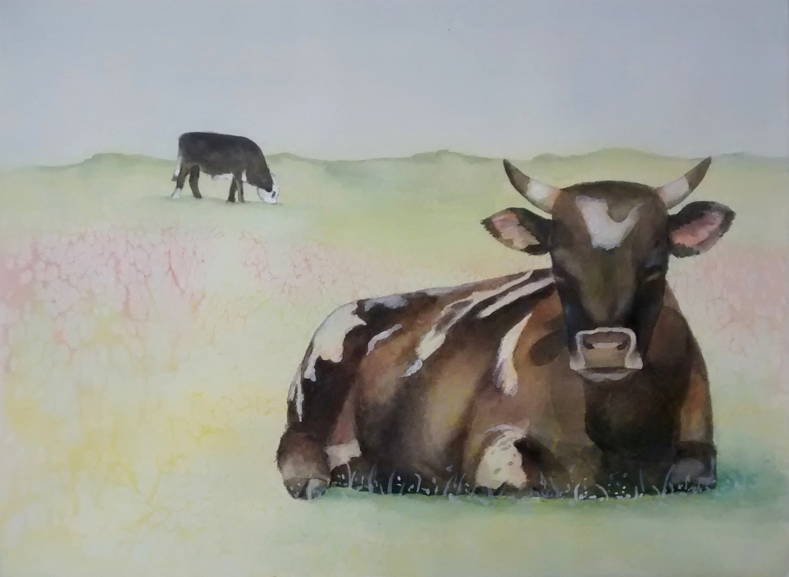 |
| I worked on the head and some shadows on the body. I added a neutralized green to the horizon, to the hills there. I added shadows under each cow. Using white I added some grass over the bottom of the cow. it needs to be painted with green and yellow and little grass added around it as well. |
10/27/16
NCBG ICP November 2016
 |
| Colored pencil on dark. I start with white and do a value study. |
 |
| I then cover all the white in canary yellow. I left things unfinished for demonstration purposes. |
 |
| I started working on the petals using spanish orange to warm it up along with scarlet lake and cad orange for shadow areas, and white and cream to blend and lighten as needed. I added true blue to grey the orange in some shadow areas. I used indigo with scarlet lake on top for the dark areas. I used all the colors layered and textured for the center of the flower. I used white to add texture. On the stem I used indigo to mix with the yellow and make green. I added red to the green as well and used white on the highlighted side and to make the hairs. |
Wakefield Vet Class
 |
| Continued refining the owls head (still more to do) and started working on his body. I used spanish orange and cream as the main color. I used dark brown, sienna brown, and black on the spots. I used whit and cream for highlights and use some cad orange in spots as well. |
Sertoma CW October & November 2016
 |
| I worked a little more on the petals and the shadows on the leaves. |
 |
| I darkened the background (so now need to fix the edges of the ornaments), added more pine needles, and shaded the snow a bit more. |
 |
| I started with a very light rose, ultramarine blue, and aureolin yellow. I worked upright and painted the colors from top to bottom concentrating on the skin and pulling colors out into the painting. I let that dry. I mixed a skin color (rose plus aureolin yellow) and started painting the shadows. I let drips and splatters happen and added more as desired. |
Subscribe to:
Posts (Atom)