9/29/16

CW Sertoma, August, September, October 2016

This photo was taken with my phone, so it is not great.  This is after working a bit more on the face,

I worked more on the face as well as the veil. I added a few shadows to the face, worked on the eye and a few details.  Still needs more darks and need to work more on the clothing

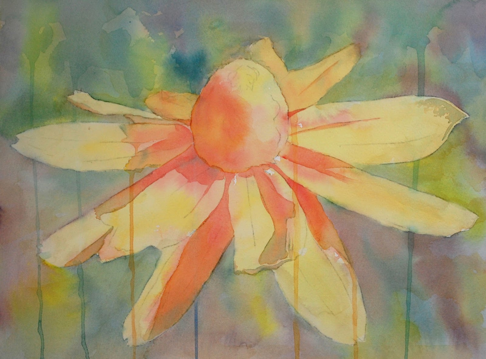
This photo was taken with my phone, so it is not great.  This was wet-on-dry upright.  I used a warm and cool yellow.  I made sure the flower was covered and left some white areas in the background.

I used a blue tinted a little towards green on the background.  I went around the petals.  This paper seems to be missing the sizing so it will be interesting...

This photo was taken with my phone, so it is not great.  I used very light and wet color (a blue-green, reddish purple, and yellow).  I painted the color all over, it is a little brighter than in this photo.

Sprinkled a tiny bit of Brusho on the painting and sprayed it with water.  You can also try sanding and spritz it with water (sand paper and watercolor pencils).  After that dried I painted the cow with a light wash of the blue-green reddish-purple, and yellow.  These steps are all the under painting.  Have fun with this one.

C & C Class

Acrylic.  Most of the work in class was on the head, adding shadows and details as well as on the piling.  I have a few more things to do, but it's close  The red and blue drips are still to bright, need to break those up. May do a little on the background, especially in front of his head.   

BAL Mixed media September, 2016

At home I put Yellow Canary over the white on the unfinished petals.  Remember, I typically would work all over the entire piece rather than the center and a few petals.  That is done for class and time constraints.

I have used white on one of the petals to add more highlights.

I have started to add the darks.  Need to work on this quite a bit next class.

At home I added some yellow to her shirt and red to the scarf.

I worked mostly on the face with scarlet lake, canary yellow, indigo, true blue, and white.  I added a bit more dark in the background, especially in front of her face.  It has more work overall that is needed of course

At home I used pomegranate to define the flower (it was hard to see). 

I used pomegranate, white, and indigo to start the shadows and highlights on the flower.

I used indigo, canary yellow, true blue, red (can't remember which one), and white to work on the one leaf.

I worked on this a tiny bit, upright, wet-on-dry. I added some darks

I demonstrated the first pass on an upright, wet-on-dry, painting.  I used light and very wet color allowing it to drip.  I focused on the skin and pulled the paint into the background and onto the clothing.  I mostly put yellows on the light areas, blues in the shadows, and reds on the mediums.  This is not required, but seems to be what I do in general.

9/24/16

C & C Class

Acrylic under painting, Acrylic Ground for Pastel, colored pencil on top.  This needs a bit more work. The colors and values are off as it was taken indoors with a phone camera.

Acrylic painted upright. The colors and values are off as it was taken indoors with a phone camera.  The under painting was yellow painted very loosely.

9/22/16

CW Sertoma August/September/October 2016

I worked more on the petals, added dark to the center, and glazed blue over most of the background to create more contrast.  Needs a little more work, but getting close. 

Darkened the stomach area and worked on the piling.  It needs some feather texture and a few darks on the piling.

This is the second pass (taken inside with my phone so not a great shot as far as color and value).  I worked on the face adding more color and some value.

This is after the next 2 passes.  First I started adding some darks and details to the face.  Then I started working on the head scarf (M mixed a blue that leans towards green).  I added a bit of rose as well.  I splattered some with the blue color I mixed.  I gently lifted any that landed on the face with a damp, clean brush and a paper towel.

BAL Mixed Media September 2016

I worked on a few more petals using canary yellow, scarlet lake, and more white over the original white.  I also have added indigo to the cent and the deep shadows on the petals.  I used true blue, canary yellow, white, and indigo on the center green part.

Textured Watercolor background (could also use thinned acrylic).  Wet the paper (very wet), drop in color, allow it to move.

Textured Watercolor background (could also use thinned acrylic).  On the left is bubble wrap and on the right is wax paper, slightly crumpled.  Wet the paper (very wet), drop in color, place the bubble wrap/wax paper on the wet paint. Place something fairly heavy on top.  Allow to dry.  Where the plastic bubble wrap/wax paper hits the paper will be dark, where there is air will be light. 

Textured Watercolor background (could also use thinned acrylic).  Wet the paper (very wet), drop in color, place plastic wrap on the paper, scrunch it to create shapes.  Where the plastic wrap hits the paper will be dark, where the wrap has air will be light.

Textured Watercolor background (could also use thinned acrylic).  Wet the paper with some color, when it is still shiny, but there is not any puddles, sprinkle with salt.  This paper makes very light salt texture.

Using a thoroughly dry background, transfer the drawing and start adding white pencil to the highlights and light areas doing a value study in white.  I also added some purple and orange pencil to slightly darken parts of the background especially in front of the face. This is at the very beginning.

Painted this flower upright on Stonehenge paper.  Painted the background allowing it to drip and run using purple and yellow and water (avoided the flower).  While it was still wet I painted the flower rose.  I laid it down a bit (still tilted) and put some salt on.  After it was dry I painted the green on the leaves.

This was done in another demo.  This was painted flat.  I wet the background, dropped in color, and added drops of water and salt.  After dry I painted the flower rose.  After that dried I painted the leaves green and the stem brown.

This was done the same as the one above and in another demo.  It has the start of colored pencil on the petals and lots of colored pencil on the leaves and stem.


9/20/16

BAL Colored Pencil and Mixed media, September 2016

I worked on the rest of the petals with the white.

9/15/16

Wakefield Vet Class

Step one - white value study

Canary yellow

Start adding red (scarlet lake) and blend it in the shadows with canary yellow and white.  The middle of the flower I've added red (either pomegranate or scarlet lake or both) plus some indigo for some dark accents as well as white for highlights.  I used indigo as well as canary yellow and white on the stem.  This still needs all the petals finished and some refining and detail work.

Be aware that the two photos directly above are not the greatest as they were taken indoors with my phone.

This is a different example for your use.

Continuing Watercolor August/September/October 2016

Worked on the head area.  Added darks, shadows, and some details.

This is the upright painting on the easel.  I started with the skin using a blue, yellow, and 2 reds (warm and cool).  These colors are VERY light and form an under painting.  I put the yellow in the white areas and the blue in the shadow areas.  I pulled the color out into the background.  I allowed drips but they are optional.

I added a warm yellow over the petals.  I then painted the middle part with a dark.  I worked on darkening a few shadows as needed.

C & C Class

Acrylic.  This the second part of the under painting. I like to get color underneath some of the dark areas as it will show through and be more interesting.  I painted all the areas with various colors on the pelican as well as gray on the body and the piling.  I painted some white on the front of his head and beak (To correct the shapes).

I used a mixed gray and painted a medium light value from the red on the back of  the head down to the tail except for the wing.

I painted more yellow on the head and chest area.  I painted a light very blue for the eye. I mixed a medium dark and painted the back of the head (the red area) leaving a little red at the top and blending it.  I painted down the neck and body to the tail.  I fixed the shape of the yellow spot on his chest and made it look like feathers.  I painted around the second leg (negative painting) so it would show up.  I left the part of the body by the wing light and painted a shadow under the wing.  I did a little light painting on the wing as well.  I painted green and brown, lightly, on the piling. I painted white on the red drip behind his head.  The drip on his body will go the more I paint the body.


9/13/16

BAL Colored pencil and Mixed Media, September 2016

Colored pencil on dark.  This will help when you use colored pencil over a medium to dark watercolor or acrylic background when we do the mixed media.  I transferred the drawings and then started with white. I did a value study of the flower in white (as you can see by the 2 outside petals I started).  I also did the middle of the flower in white, paying attention to the lights and darks, the values.  Next I used canary yellow over the all of the white. I reapplied the white to the lightest areas.  I then used scarlet lake on the shadows paying attention to the values and color. Next I used a warm yellow (could also use an orange or a light layer of scarlet lake and canary yellow) over the petals and middle.   

I used indigo blue and pomegranate as well as a little true blue so far.  I am doing a light  layer first, laying in the values as a road map of sorts.  I will do the body similarly to the head.  I also put canary yellow on the eye. 

9/8/16

Wakefield Vet Class

I have been adding the shadows on the head and neck and started adding the whiskers.  The whiskers on the face in the white areas need a fine dark line underneath the white line (use very sharp pencils).  The whiskers in the background need a fine white line (sharp pencil press pretty hard).  Neither of these photos are fantastic.  Taken with my phone and not in the correct light.  I corrected them some, but they are just OK.

Added more whiskers and a bit more shadow.  This is getting close, but needs a bit more refining.

Re-posted this since you are working on it currently.

CW Class August, September, October 2016


Started adding shadows and some warm yellow on the back petals.  Allowed some drips (optional).  The first 2 photos were taken in class with my phone in poor lighting conditions.  I did some editing to correct the color and value, but they are still not great.

Added more shadows.

Added some more drips, this time for the background.  Made the drips with non staining color (such as cobalt) and then gently and carefully lifted them from the petals while still damp.  Started adding the grey shadows using orange to shape the shadow and then dropped in green.
 
Started adding the body using lots of color and changing the color as it moves down the page.  Also added color and value to the beak.  This first photo was taken in class with my phone in poor lighting conditions.  I did some editing to correct the color and value, but it's still not great.

Did a little more work adding color and value to the head and beak.  Started adding the darks to the tail feathers and legs. Added some more color to the background to accentuate the head and beak area (first yellow in front of the head and beak as well as a little behind the head as well and then reddish purple dropped into the wet paint).  Encouraged some of this to create drips (optional).