10/31/20

NCBG ICP October & November 2020

This is step one with a white value study.  I saved some areas for future demonstrations in case they were needed.

The photos taken of these projects were taken in various lighting situations with different cameras, so there will be differences in color and value.

I shaded Canary Yellow over the yellow green and red areas on the pears.  I used the side of the pencil and added it lightly.  I finished a little more of the branch and leaves with white.


I added Grass Green, Dark Green shading some of the green areas.  I have not added any red yet, the black showing through looks reddish in the middle of the front pear.


Blurry photo and it's a little light as well, but it shows the addition of the red to both pears.  I added Carmine Red and the darker spot is Scarlet Lake.  In the past I have used just Scarlet Lake, but Carmine Red is a good color for this pear if you have it.

I added Scarlet Lake to the back of the leaf and the branch (after finishing the white values on the branch).  I added the Grass Green, Dark Green, white, and some Yellow Chartreuse to the leaves and Yellow Chartreuse to the Pear in some areas.


I started adding Black Grape and Indigo Blue, and a small amount of Dark Brown to the branches to add darks and some White to lighten some areas.  I did the same to the back of the top leaf.  

I used Dark Green and Indigo to darken areas on the green parts of the leaves and Yellow Chartreuse and White to lighten areas.

On the pear I used Scarlet Lake to add the texture in the red areas.  I used White, Carmine, and Scarlet Lake to texture the edge on the front pear where it turns from light to dark.  I used Indigo to start adding the dark squiggly texture at the bottom of the pear.  I used Indigo and Black to start adding the dark spots on the pear (Black grape can be used as well and White to lighten).

From here forward I will use all the colors we have been using to refine the pears and branches.  I will add details, adjust values, adjust color, add texture, smooth where needed, and manage my edges.  I will use Black on the outside to help with edges if they will not be lifted (fading it out from the edge so it looks natural if needed).  

This end process is spent usually over weeks (or a month or more for larger pieces) mostly looking, evaluating, and then small periods of time correcting things.
 

10/29/20

NCBG MM October & November 2020


I added a few more layers of paint adding shadows.  I used very simple colors and they do not all match which is OK for an underpainting.  Next class we will work on the background.  You do not need the painting part to be completed, you will have time in class and the following week (I needed to have it completed so I could add the background in a demo).  We will do most of the colored pencil part in the Nov. 6 class.  We will possibly get a start on the colored pencil this Friday if time permits and it things dry in time.

I added more watercolor shadows.  I will also be adding black ink to the shadows in a demo. The watercolor helps me get the shapes organized and to use less ink. If/when you do a shadow in a light area do not be concerned, I do it regularly.  It is workable/fixable.

I have used mostly the white and black pen on the pinecone and branch.  The background is watercolor.  I have added a tiny bit of colored pencil into the pinecone to tint areas after I finished with the pen & ink.  I will demo on this a little for you tomorrow during class.

10/26/20

NCBG MM Oct & Nov 2020


Pinecone example 1. Colored pencil and ink superimposed over a watercolor background.  

This is an example of painting a background with watercolor, or in this particular case taking a painting that barely got started and transforming it into a background with more watercolor and some watercolor splattering/flicking.  After it was dry, I transferred the pinecone drawing onto the background.  

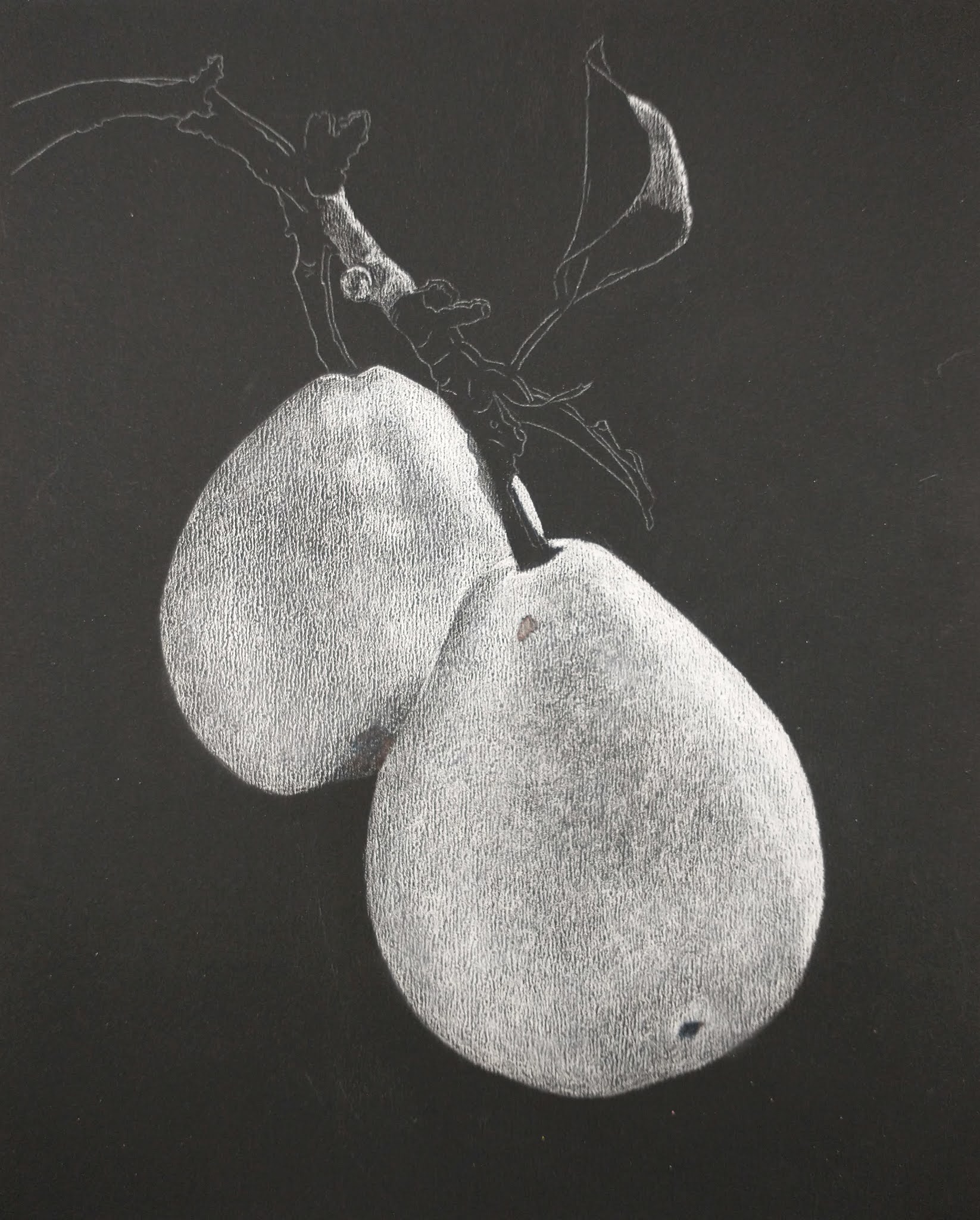
This also shows the darker graphite paper and the lighter graphite paper (the right side of one pinecone and the branch are the lighter graphite).  The white transfer paper I used in a small area that barely showed up on this background, so i went over it with graphite since I could not see it.  I often need to try different graphite on the colorful textured backgrounds to find what shows up best.


Pinecone example 2. Colored pencil and ink over a watercolor background and loosely painted subject.  

This is the start with watercolor and watercolor pencil on hot press paper (watercolor pencil is optional, just wanted to show you a few techniques with it).  

I transferred the drawing first because it's easier when teaching.  Oftentimes I transfer after making the first pass on the background.  I used dark graphite transfer paper for mixed media so my drawing lines are visible (I would not use this transfer paper for a 100% watercolor painting).  Test your graphite transfer paper for darkness and erasability and how it holds up to water being added.  Some graphite is too light to see after we make all the textures and some is made to disappear during the painting process (at times not ideal for mixed media pieces).  Dark watercolor backgrounds need white transfer.

The colors you choose for your background are completely up to you.  Choose colors you are drawn to for the background.  I wet the entire paper and dropped in warm yellow (the paper was very wet).  I added the yellow all over the entire 

paper ignoring the drawing.  If there is enough water, the paint should move with no brushwork lines visible.  

I splattered/flicked other colors onto the background while it was wet, again all over ignoring the drawing still. I then did a process called sanding with watercolor pencils.  Holding a small strainer over the painting I scrapped the watercolor pencils on the mesh of the strainer to make fine particles go onto the wet paint all over, still ignoring the drawing.  I used a variety of watercolor pencil colors.

You can make as many passes as you wish with the watercolor.  I usually do at least two passes, oftentimes 4 or 5, sometimes more.  You can also do the sanding more than once as well.  Just remember that the sanding will disperse if rewet (which can be a lovely effect). Play around with all of this. 

After my paper was dry, which took awhile, I wet the branch and painted it using a mixed brown, a tube brown is completely fine to use (mixed brown = warm yellow + warm red + cool green, more of the red and yellow to make brown, more blue in the mixture makes  gray).  Some of the watercolor speckles mixed in as I was wetting and painting which looks nice.

I mixed a light green (light means more water and less pigment).  I added the green to areas of the pinecone, I did not wet the paper first.  I mixed a dark brown and started putting in the shadows on the pinecone, I did not wet the paper first.    

Highlights and shadows can be added and/or enhanced with the ink and colored pencil.  Any mistakes can be fixed with colored pencil and the subject matter will be enhanced using the colored pencil and ink. 
 

Camellia.  Colored pencil over a watercolor underpainting of a more carefully painted subject or a subject painted with local color.  

If you are decent with watercolor or wish to practice your watercolor, you can paint the subject as carefully and detailed as you wish.  If you are not a watercolor painter you can paint local color on the subject.  

The top part of the flower and the top left leaf are painted with local color.  I wet the area and dropped in the color.  I added a second layer of the same color in some of the shadow areas.  I still need to add the shadow areas on the leaf.  I will post again after working on these more.

The other leaves and the lower petals have been painted a little more carefully paying attention to the values and dropping in varied color.  I need to work more on these.  I will post again after working on them more.

We will work on the next phase with colored pencil in the next classes.

For my mixed media pieces my watercolor underpainting is sometimes local color, sometimes a very detailed painting, and sometimes a more loose watercolor painting.  Often I start a watercolor painting and decide to switch to colored pencil and/or pen & ink to finish it.  Sometimes I start a watercolor painting, ruin it in some way, and make an amazing mixed media piece with it (so don't discard watercolor paintings gone bad...).  

10/24/20

ICP October, 2020


Using a white pencil I did a value study.  I used black to add some details.  I used a scrubber to smooth the pencil and stik tak to lift.  We will add further details and be able to adjust values more as we add color to this.

Using the same colors that we used for melting with the addition of black (or gray) and white and dark brown (you can use indigo, black, or black grape instead of dark brown).  I added shadow and highlight to the stem, shadow and highlights to the mushroom and the white spots.  White is a very useful color for of course adding highlights, lightening areas, changing colors in an area, adding texture, and fixing things.

10/20/20

NCBG ICP October, 2020


The process in pictured on dark sanded pastel paper.  This is UART Dark 800 grit paper.


10/15/20

NCBG ICP October, 2020


I demonstrated two methods for working with dissolved colored pencil.  We are working on hot press watercolor paper.  Other papers will work, but this is my favorite.  It can be a mid grade or student grade paper.  1. Shade several layers of colored pencil and then use rubbing alcohol and either a paintbrush (or a Qtip) to paint on the rubbing alcohol to dissolve and blend the colored pencil. This is shown on the right side of the mushroom.  2. Sand or grate fine particles of colored pencil into a container (I use jar lids) and add rubbing alcohol to dissolve the colored pencil.  Paint on the colored pencil and splatter it if you so choose.  This is shown on the left side and the stem and the splatters on the background.


I shaded another layer of colored pencil and then used the rubbing alcohol and a lovely pointed Qtip to blend it (called precision tip Qtips). 


Value side.  I worked on this between classes.  I added a little white and dark texture on the bend part of the stem and the top colored leaf edge to show adding texture.

Color side.  I demonstrated adding color on the bird 9it's not quite complete yet).  I used grass green, canary yellow, dark brown, burnt ochre, and indigo blue.  I also demonstrated adding texture to the top bed in the stem and the top colored leaf edge.  I used white on this side on the leaf edges and added yellow to make them more prominent.  I also added some white to some seeds to pop them forward and to add texture.

10/13/20


10/10/20

NCBG ICP October, 2020


I worked more with the black grape to work in the values.  I used the black grape and both erasers to adjust things as I worked.  I will keep refining and adjusting the values on this side as well as managing the edges.  

This is the view from the color side.  I have erased the original graphite lines on this side.


10/9/20

NCBG ICP Dura-Lar Student Examples


NCBG Intermediate Colored Pencil October, 2020


Value Side of Grafix Dura-Lar Matte paper.  I started this with black grape doing a value study.  You can use whatever color appeals to you for the dark - colors such as black, sepia, indigo, dark brown, etc.  I will add white in a few areas after the black grape value part is complete.  I work on top of a piece of white paper for adding the black grape and color and on top of black or colored paper for adding white. Remember this erases easily and the eraser or stik tak can be used to lift.  I used the Tombow Mono Zero eraser to remove the seeds in the middle part, you can also work around them the seeds if you so choose.  The bulk of the work on this piece will be done on the value side.

Color side of Grafix Dura-Lar Matte paper.  Using pale vermillion, spanish orange, and canary yellow I started adding color to the petals.  I used grass green and canary yellow to add green to the leaf parts. I used pale vermillion, spanish orange, and dark brown on the middle seed part.  I will demonstrate more color work in the next class.

10/2/20

NCBG BCP September, 2020


I demonstrated the background, adding more color.  So far I have added Copenhagen blue, Spanish orange, and red to parts of the background (I cannot remember which red I used, either scarlet lake or pomegranate).  I added some scarlet lake and spanish orange to the blueberries and the branch as well as more copenhagen to some areas.  Remember to use the eraser, the stik tak, and the stump as needed.  keep your edges neat and use a light touch.  Layer, layer, layer, lightly.  

Look at the pears on my art blog by clicking the link on this page at the top left, Kate's Art, to look at the background of the pears.  This piece was done with 6 colors, I used all 6 in various proportions over the background.  I did many light layers.  I used the eraser, stik tak, and stump all over this piece.  Many layers were built to the darks.


I worked more on the branches and the top leaf bud.