6/27/17

BAL CP Animals June 2017

Colored pencil on dark mat board.  I worked on the eye on the right side.  I need to finish the ears and lighten the entire thing and add shadows as needed.  Then I need to add cream to warm the white.

Colored pencil on colourfix sanded pastel paper.  I worked on the fur on the head and the long fur on the body.  When I do fur I make my strokes in the direction of the fur.  The pencil strokes vary depending on the length of the fur.  I go back and forth between dark and light as I layer.  I used Dark brown, cream, white, terra cotta/sienna brown, black.  I worked on the ear as well using white, true blue, pomegranate, terra cotta, dark brown, and scarlet lake.

Colored pencil on Borden & Riley Denril Vellum paper (or you can use Dura-Lar matte paper).  I did the majority of the work on the black and white side.  I need to add some white in areas but have not yet.

This is a photo of the black and white side after I applied color on the color side.


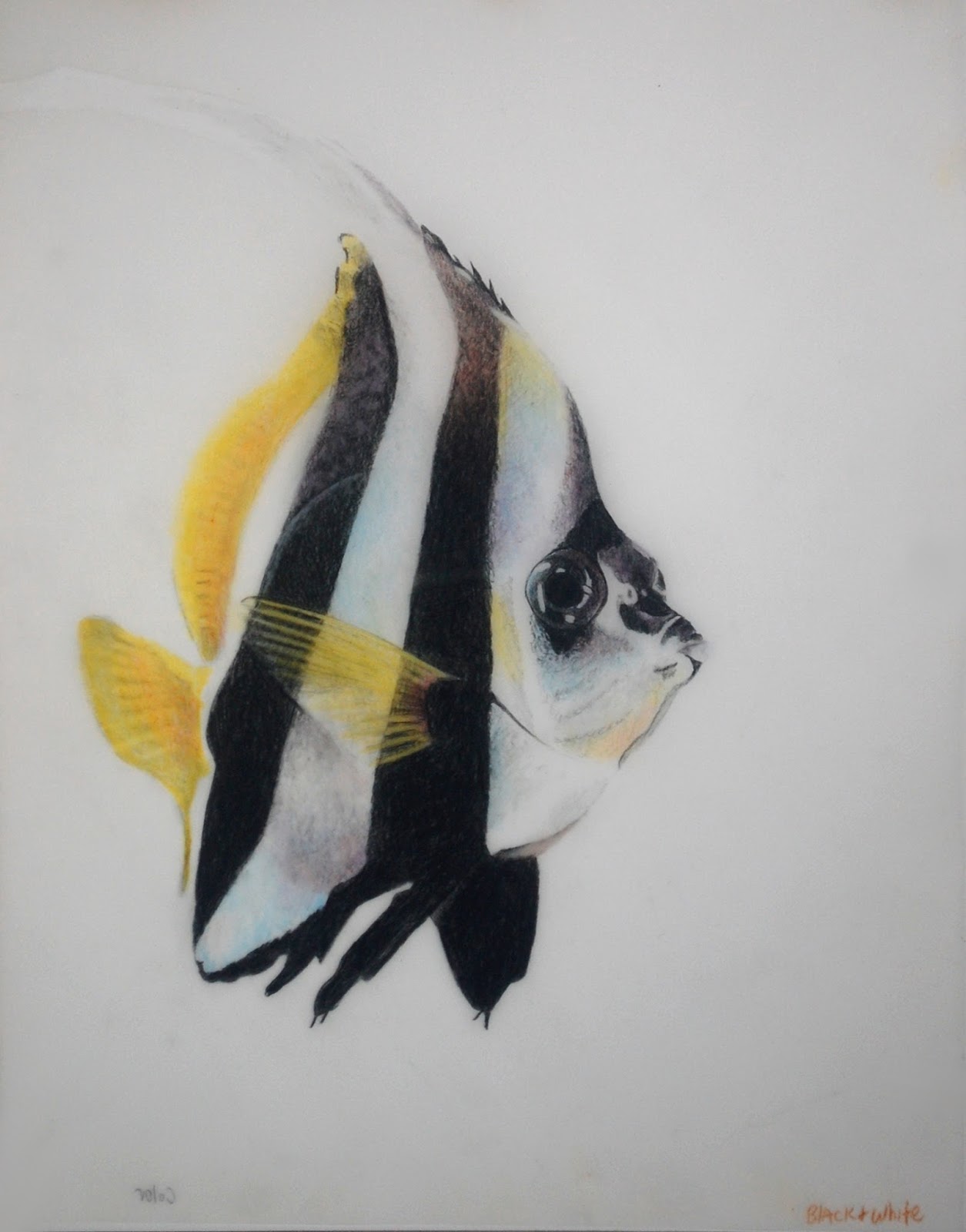
This is the color side.  I started work on this side by erasing the original traced pencil lines first.  Then I started shading color.  I used cadmium orange hue and Spanish orange for the fins.  I used true blue, canary yellow,  spanish orange, black grape on the white parts of the fish.  I used scarlet lake, black grape and true blue on the black parts.  You can use any colors you wish really. 

This is a photo from the color side after I placed a background behind the fish.  There are still some areas of the fish that are not completed yet, but this gives you the idea on how to finish.


Watercolor on Stonehenge paper.  This is the background I created for the fish with Pthalo blue.  I traced the fish, wet the paper outside the traces fish, dropped in color and guided it around, and then flicked water and blue paint.  In addition to watercolor backgrounds, I also make backgrounds with melted colored pencil and alcohol ink on yupo.

6/20/17

BAL CP Animals


Colored pencil on colourfix sanded pastel paper.  Started with white and cream which is usually what I do when working on a medium to dark surface.  Then I used terra cotta (sienna brown would work as well), dark brown, black (in the middle of and around the eye), yellow chartreuse (eye), peacock blue (eye - true blue would work as well).  I need to finish the white and cream (Outside of a demonstration I would normally do this before adding fur colors and color on the eye) 

Colored pencil on Borden & Riley Denril Vellum paper (or you can use Dura-Lar matte paper).  Black on the black and white side.  Shade with black and add white as needed to this side.  I finish shading this side before flipping it over, erasing the pencil lines and adding color to the color side (which I will do next week).

Colored pencil on sanded and colourfix pastel paper.  I started with cream and white.  I typically use white or cream or some other light color first when working on a medium to dark colored surface.  I then used terra cotta, sienna brown, dark brown, true blue, black, spanish orange (on the eye after white was put down first).

Colored pencil on colourfix sanded surface.  Used the same list of colors and worked more on adding form, value, and fur texture (terra cotta, dark brown, white, cream, canary yellow, spanish orange, black, true blue).  The front part is close or finished.  Behind his ears was just started and needs work.

Colored pencil on Colourfix Sanded pastel paper.  Sticking with the same palette we've been using I worked mostly on the left side of the drawing, behind the ears.  I did a little to the front of the wolf adding color, fur texture, and values as needed, refining it more.  On the left side there is a line that is too straight that needs correcting (upper/middle left side).  It's not dark which is good, but it's too straight.  I added indigo to the background to make it a little darker and to cover some stray pencil marks that would not come off.

6/15/17

NCBG AEW June 2017

Watercolor on Yupo.  I lifted a bit more on the dogwood as well as shaped and refined the top petal I had lifted during last weeks class.

Watercolor on Daniel Smith Watercolor Ground.  I painted another leaf.

I added a bit more white gouache, glazed some of the white gouache, and glazed the background with  rose and rich green gold (yellow would work as well).  I had also demonstrated adding dark and lifted some out after the demo.

Pouring.  I removed the masking fluid on the top of the pine cone and softened it with water and a brush.  I also painted some areas to incorporate the masking marks.

Wet on dry upright painting.  This was started with a light background, several colors, painted upright.  After it was dry I started painting the pears, branch, and leaf, upright and wet on dry.

6/13/17

BAL CP Animals

After the white colored pencil value study was done I used terra cotta and peach plus white, light peach, dark brown, and black.  I used a little cream, true blue, and scarlet lake as well so far..

I used black, true blue, cadmium orange hue, white, canary yellow, scarlet lake so far working over the melted under drawing. 

I added more of the Inktense watercolor pencil before adding more colored pencil on top.  I wanted darker and more intense color as it saves time later.  I then used black, white, pomegranate, cadmium orange, scarlet lake so far.

Progression
An Art Exhibit by Kate Lagaly

At the Kirby Gallery
213 N Main St, Roxboro, NC 27573

Reception: June 16, 2017 6pm-8pm

Gallery Hours: Tuesday-Friday 1:00-5:00 pm and Saturday 10:00 am -4:00 pm

6/9/17

NCBG AEW June 2017

Watercolor on Yupo.  First I covered the Yupo with medium dark paint, let it dry, then transferred the drawing with yellow transfer paper (white transfer paper would work as well).  Watercolor on Yupo takes awhile to dry and it moves and changes as it dries.  Next I used water, a paint brush, and a paper towel to start lifting out my drawing.  This takes a little practice.  You can lift a little or use the paper towel and lift it all.  Later, after it dries again, you can add color back into some or all of the lifted places.

Watercolor on Daniel Smith White Watercolor Ground.  I did this on foam core which does not require any primer before applying the ground.  However, I prefer to work on very stiff surfaces such as masonite. On masonite I prime first with Kilz II primer and apply the ground after it's dry.  I typically do 1-2 coats of the ground.  I allow it to dry 24 or more hours before using.  Then I paint as usual wet on wet, wet on dry, etc.  Like all new surfaces it has it's idiosyncrasies to adjust to.

Watercolor on watercolor paper.  This paper is 300 lb and "stretched" using rolled tape on the back (shown in class).  I also showed stretching 140 lb paper  - Wet  both sides of the paper, place it on your board, staple all around the edges, allow the paper to dry. You can tape on the edges around the paper to hold the staples in.  This painting was used for various demonstrations.  I used it to show rolled tape stretching, shading white, using white gouache, and how to soften edges and make changes  

Watercolor on watercolor paper.  This started with pouring, then masking, then a second pour, and now direct painting.  I worked more on the pine cone adding dark and medium values.

Watercolor on Golden Acrylic Absorbent Ground.  I did this on foam core which does not require any primer before applying the ground.  When transferring a drawing onto the ground, do not press hard with the pencil as it picks up the graphite very well.

Watercolor on Yupo.  I put a dark blue all over the paper and splattered other colors. 

6/6/17

Sertoma Colored Pencil Exploration May and June 2017

Colored pencil on Strathmore toned grey drawing paper.  I used white, true blue, black grape, spanish orange, scarlet lake,, grass green, olive green, yellow chartreuse, and indigo, plus black in the background. 

BAL Colored Pencil Animals June 2017

White Prismacolor colored pencil on dark brown mat board.  I have worked more on the values shading and lifting as needed. I wanted to stress something that I failed to stress in class - make your pencil strokes in the direction of the hair on the dog, especially as you near the end of shading.  Pay attention the the values.  Think of the eraser and poster putty as drawing tools.  I used them a lot in this process.

6/5/17

BAL Colored Pencil Animals June 2017

White pencil on a dark brown mat board.  I transferred the drawing with white transfer paper.  I used a white prismacolor pencil shading in the values (lights, mediums and darks).  I will finish the white value study before I add color.

Prismacolor Colored pencils melted with a solvent on Stonehenge paper.  This is an under drawing.  I melted the pencil 2 ways.  One - I made shavings of the pencil with a small strainer into a jar lid and added the Goo Gone Gel, stirred and then painted it on the paper.  Two - I colored an area with a pencil and melted it with a brush dipped in Goo Gone Gel.  I also splattered the pencil colors

Watercolor pencils on watercolor paper for an under drawing.  I used Derwent Inktense watercolor pencils and Cotman 140 lb. watercolor paper.  I put the watercolor pencil on in three ways.  One - I colored and area on dry paper and then used a brush and water to wet it and to spread it around.  Two -  I wet an area, colored it and used a brush to spread it around. Three - I wet a brush, rubbed it on the pencil tip to pick up color, and painted the color on the paper.  After the under painting was done and dry I started working with Prismacolor colored pencils in the area below the eye.  

6/2/17

NCBG Advanced Expressive Watercolor June 2017

Wet on wet.  I transferred the drawing.  For the first pass of watercolor I wet the paper, dropped in color and tilted the paper upright to let the color flow. I let this dry.  Then I did little wet on wet sections in the painting.  I wet the smaller shapes and dropped in the color allowing it to mingle. The colors I have used are a mixed bright green (prussian, aureolin, rich green gold) and a mixed reddish purple (quin rose, ultramarine blue, a touch of green) and rich green gold.

Pouring.  I attached my paper to a stiff surface with rolled tape on the back of the paper.  I used jars of color thinned with water - yellow, a mixed reddish purple and a mixed orange.  For the first pass I sprayed the paper, poured the purple and yellow moving the paper around so the color could flow.   I continued to spray as needed to move the color.   If your piece has some whites, save those with masking before you pour.  After this was dry I used masking to save some of the light color from the original pour.  Then I poured again using the purple, yellow and orange in the same manner as the first pour.  After that was dry I used a mixed dark brown and a mixed tan color to start the pine cone painting.  I left the masking until after this round of painting.  I will remove it after this round is complete and dry.

Vet Class

Original drawing using a viewfinder and grid.  Pencil on tracing paper.

Colored pencil on UART sanded pastel paper.  Started laying in the color.  First did a light layer of canary yellow (as seen on the grapes on the left). Then used pomegranate and black grape shading the values on the grapes and shadows.  Next I used white to blend (as seen in the top right grape).  Did some more shading with pomegranate and black grape over the blended colors (as seen on the two dark grapes).  Added wrinkles near the stem using white and yellow chartreuse and pomegranate (as seen on the top grape).  Added a shadow on the grape on the right by adding true blue and black grape, and some white over the colors that were there already.  Added a little scarlet lake to the two darker grapes.  Used a bunch of the colors in the stem and yellow chartreuse last.  This of course needs more work and refining.  But it's a good start.

6/1/17

Sertoma CPE May and June 2017

Colored pencil on UART sanded pastel paper.  I worked on the back and right side grape, shadows and stem.

Colored pencil on Dura-Lar Matte.  This is the black and white side.  I did a value study using a black colored pencil, an eraser to make lines and poster putty to lift as needed.  This surface does not take a lot of layers, but can be worked on both sides which is nice.

This is the black and white side after color has been added on the color side.

I started adding color on the color side.  I used grass green, yellow chartreuse, pomegranate, and crimson red so far.

I worked a little more on the elephant and the water coming from his mouth.