9/26/20

NCBG BCP September 2020

I started adding color to the dogwood.  I add the color lightly in layers.  I used yellow chartreuse, scarlet lake, spanish orange, and indigo as well as white to blend the color and also to lighten areas as needed.


I added copenhagen blue to the areas with local colors of blue, purple, brown, and black.  I added the layers very lightly using the stik tak and erasers to lighten and the stump to blend.  With this method I use erasers heavily to keep areas light and for cleaning edges and recapturing highlights (I use the pencil top erasers to lighten and the Tombow to clean edges and add highlights).  I paid attention to color and value, darkening areas with an additional layer or two at this point.  

I started adding pomegranate/crimson lake to the areas with the local colors of red/pink, orange, brown, and black.  I again used the erasers and stik tak to lighten and clean edges, etc.

I also added some more background with the blue (have the option to add other colors to get the grayish brown in the background if I choose).


I did more work with the pomegranate/crimson lake and copenhagen blue adding some details and adjusting color and value.  I have a few more areas to get to with the pomegranate/crimson lake.  I also need to add some warm red (scarlet lake/crimson).


9/22/20

NCBG BCP September 2020


This is the first step when working on a dark colored background.  Start with white, make a value study of the subject.  I will add color in the next class.  I did add some yellow chartreuse to some of the middle buds so that I could finish the white on a few bracts/petals.

9/20/20

GNSI-C Sunday, September 20


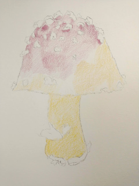
This is one of two ways I start these pieces when using a solvent as the under drawing.  For this process I apply the pencil lightly in layers and then dissolve and blend it and then finish with the colored pencil in layers.  

Step one, lightly shade the colored pencil layers.  This layer has a cool red (pomegranate) and a warm yellow (spanish orange).

A reminder that these are photos taken at different times of day, so the color and value are not 100% correct.


Step 2 add more layers, I added a warm red (scarlet lake) and more of the warm yellow and cool red.


I used the Rubbing Alcohol on half so that you can see what that looks like.


I finished with the Rubbing Alcohol.


Using the same colors I added more layers and used the Rubbing Alcohol a second time.


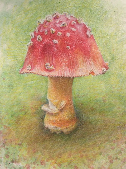
I started on the layers after the solvent adding color, value, and detail.


I started adding a background by adding layers and by painting on and splattering dissolved colored pencil.


This is still a work in process.  It will be completed after more color, value, detail, and refining on the mushroom and in the background.


This is one of two ways I start these pieces when using a solvent as the under drawing.  For this process I apply dissolved colored  pencil in layers and then finish with the colored pencil (non dissolved) in layers.

Step one, paint with dissolved colored pencil.  I dissolve the colored pencil in a small container (I use jar lids) with the solvent and tiny grated/sanded colored pencil pieces.  It looks like paint. This layer has a dissolved cool red (pomegranate) and a dissolved warm yellow (spanish orange).

A reminder that these are photos taken at different times of day, so the color and value are not 100% correct.


I added a dissolved warm red (scarlet lake).  This needs a layer or two more and then the process would continue with layers of undissolved colored pencil. And at some point I would add a background.


9/10/20

NCBG Beginning Colored Pencil September, 2020


The paper is Strathmore Toned Gray paper.  For the first I used white and true blue.  The white is for the light values and the true blue is for the dark values.  This is the first of several layers, so no need to get this dark and saturated.  I used the drawing stump to blend the pencil.  I used the stik tak to lighten areas that were too dark.


For the next pass we used Crimson Red, Indigo Blue, Canary Yellow, and Grass green.  I used the Canary Yellow and did a light layer over all of the blue areas and partly into the red areas. I then used Crimson Red and did a layer on the triangular shapes.  I added some Grass Green to the stalk and up into the head of the asparagus. I used indigo to start adding some darks.  I used the drawing stump to blend the layers. This is mostly at the beginning stage. In a few areas its starting to have more layers.