8/28/21

NCBG ACP August, 2021


I added lights and darks and the color.  I used crimson red, indigo blue, white, grass green, dark green, yellow chartreuse, pale vermillion.  I used a little scarlet lake in the warm red areas.  I used white to smooth some areas and then re-added color.  I paid close attention to the values. 

I demonstrated adding light and dark to the background. I used white (could have used cream) as well as light and dark umber.  I used the dark and light to make some things pop forward using contrast and some to recede by diminishing the contrast. It's still a work in progress.  I added some yellow as well, may add more.


NCBG ACP August, 2021


This is how the piece looked before class.

I worked on the background and on the bottom right leaf in class.  I added darks and lights to make leaves and apples pop forward or to move them back into space.  I worked on the upper left corner erasing some of the color and I added dark to the upper right corner.  

I added some leaves and branches after class. I kept the amount of leaves and branches simple for class so that you would not be overwhelmed with so many leaves and branches.  Not sure if I will add more, might add some on the right side and upper left.

I added some yellow and red lightly to the background.  I added more white to the highlights.  I lifted some darks that were too strong. 

I lowered the contrast of the branches and leaves as they went off the page.  This helps stop these shapes from being roadways out of the artwork. 

I worked on some edges and added more color to some of the dark areas.

I re-add white to the highlights throughout the process and then again at the end before I spray workable fixative and frame the piece.


8/21/21

Zoom Mixed Media August, 2021


This is the piece after the Zoom class ended.  I had worked on this before class on the left side, the smaller mushrooms and a little of the background.  During class i worked on the middle top two mushrooms and the middle bottom on the stems and adding in the shadow as well as the right side background.

At this point in the process, when the wet mediums are completed, I start working dry with the colored pencils.  I focus on the values, the highlights usually first and the darks usually second with the medium values mixed in as needed.  I establish the values and after that start adding details.  I also consider color with the values, but it is less important than the values.  The values are the structure.

For demonstrations in classes, I work in small areas.  But my typical way to work is all over the piece bringing it up to completed as a unit.

The main colors I used were white and cream as well as indigo blue and dark umber, so 2 light colors and 2 dark colors.  I also added some colors for color such as burnt ochre, canary yellow, Spanish orange, pale vermillion, true blue, 50% warm grey (not sure if i missed any...).  As I finish I will add colors if necessary, but these will be the main colors.  

I will use a drawing stump to blend and an eraser to remove areas or make textures.  I will also work on the edges and the background as I go.

8/19/21

NCBG ACP August, 2021


I worked on two petals before class.  I demonstrated a petal and the center part in class.  I used white, crimson red, crimson lake, yellow chartreuse, grass green, indigo, scarlet lake.  

I do these pieces in layers, the layers help with blending.  Lighter colors can be helpful for additional blending as well.  Sometimes I will add a light color like white, cream, or yellow over a dark or medium colored pencil area and the re-establish the local color and value on top.

You can used a stiff scrubby type brush to push the color into the textured surface for blending if you wish.  I usually use a scrubby brush on the first layer.  Clean the scrubby on a scrap piece of paper by rubbing it on the paper.  When I use a scrubby, I keep several scrubby brushes for various values of colors when working.

NCBG ACP August, 2021


Before class I worked on one apple, a leaf, and some branches with the colored pencil.  I went on to work on several more apples, branches, and the large leaf in class.  I did a little more work after class on the apples and big leaf.  I used white (Prismacolor white in general and for spots and Stabilo white for some spots) , carmine red, crimson red, yellow chartreuse, Spanish orange, grass green, dark green, indigo, pale vermillion, dark umber.

I focused on form, adding the subtle shadows and highlights. I also adjusted colors, added texture, added details, and worked on the edges.  I will continue doing these things with the colored pencil.  After I get closer to being finished I will study the background and decide what adjustments may be needed. 

Focus mostly on the subtle values in this piece.

8/17/21

NCBG ACP August, 2021


This is how it looked after class and after I re-established the drawing.

This is how it looked after the Zoom session today.  I Worked on another apple, demonstrated some branches, and worked on the leaf.  I used the same colors as I used in class om the apples and branches.

I shaded dark phthalo green onto the dark part of the leaf.  I added dark red in the darker parts. Then I wet the dark part of the leaf to dissolve the color.  I used white on the light parts of the leaf and wet that as well. 


I worked on the apple and the leaves and branches that were left using all of the same colors.  I wet them to dissolve the color.  I may do a few more things this evening or tomorrow morning before class so that I will no longer need to use water (unless necessary later on or some reason).

8/13/21

Zoom Mixed Media August, 2021


This is the one I demonstrated during class.  I wet the paper (it was very wet), dropped in warm and cool yellow, and then added salt while it was still wet and shiny, but not puddled.


This is an alternate option for mixed media.  I did this before class so it would be dry during class.  This could be called everything but the kitchen sink.  I wet the paper (very wet), dropped in color ( warm and cool yellow, warm and cool red, purple blue and green blue).  While it was still wet I used 'sanding' to add watercolor pencil texture.  Then, while it was still wet but not puddled, I added salt.  I set it aside to do its thing overnight.  The photo below shows how it looks after some work has been done.   

This is how this looked at the end of class.  I showed how to add light back into the piece - using as eraser, lifting the paint with a stiff flat brush (I used the small eradicator I ordered from Rosemary & Co., a British company), and using the white watercolor pencil from the Faber Castell Albrecht Durer set (by shading with the white and wetting it and also by using a wet brush to get the white from the tip of the pencil).  The process for this one is to re-establish the white/light, add darks, fix any issues, and then add details.


This is the one I did before class so that it would be dry for the next step.  I wet the paper (it was very wet), dropped in warm and cool yellow, and then added salt while it was still wet and shiny, but not puddled.  The green on the left is from me grabbing the paper with wet paint on my thumb, ooppss. The photo below shows how it looks after some work has been done.   

This is what this on looked like at the end of class.  This has had a layer on the bottom of color (reds) on dampened paper, sanding with watercolor pencil, and a little more salt.  

The top has had both blues (green and purple blue) on dampened paper and the edges were gently blended.  Later I added a warm red glaze to knock back the bright color.  I added some blue in background spaces between the mushrooms to connect the top and bottom.

I added layers of light color on the mushroom with both watercolor pencils and watercolor.  I also started adding some medium values and a few darks.  You can do this whole piece using watercolor only, watercolor pencils only, or a combination of both. 

We will do the finishing touches next week with colored pencils.

8/12/21

NCBG ACP August, 2021


This is step 1 of the underpainting.  In these layers I work on adding color and texture.  The layers are more loose than the final layers will be.  I consider values, lights and darks, but not overly so at this point.  I wet the paper (very wet) and used watercolor pencils and the small wire mesh strainer to do "sanding."   This adds texture to the background, apples, and leaves.  

This is not necessarily the way I want the background to look in the end, but I will leave it until later.  

For this layer I used the reds, yellows and greens - warm and cool yellow (light yellow glaze and cad yellow), a warm and cool red (dark red and pale geranium), and greens (light green and dark phthalo green).


I then shaded watercolor pencils onto the apples and stems.  This is after 2 layers.  For layer 1 on the apples, I used a warm and cool yellow (light yellow glaze and cad yellow), a warm and cool red (dark red and pale geranium), and greens (light green and dark phthalo green).  On the stem I did phthalo blue first and later a layer of dark red and then a layer of brown. I did a second layer on the apples to add more color.  I will demo a leaf for you now that I can see them on my painting.

This is after re-transferring parts of the drawing I lost.  See the process for re-transferring in a post below.


I transferred the drawing onto the prepared surface.

Be aware that all of the photos are not exactly as the pieces look in person both in color and values.

Transferring Drawings

Sometimes, during the process of making art, the transferred drawing can get lost. I have a few things I do to combat this or to fix any issues.

You can make marks on your paper to realign your drawing if things go awry and/or you can tape the paper to the side of the watercolor paper and leave it taped there until after you do the first few layers.


This is my transferred drawing, you can see on the right that the paper is still attached and can be folded behind the watercolor paper when I go to work.  You can also see the triangle marks on the left.  


I also have a way to re-transfer when my lines are hard to see in some areas.  In the case here I could no longer see the leaf on the left and a few other areas.

I cut out some of the background paper around some of the shapes in the drawing and re-taped and re-transferred.  It's not perfect, but it works well.  I need to do this at times on my pieces.


7/28/21

Zoom Colored Pencil Class June, 2021

I worked all over adding dark and light values, refining areas, cleaning up edges, finishing some unfinished areas, etc.  The one thing I did was remove the tiny bit of flower peaking out on the upper right.  I then used a grey pencil and a blending stump and stik-tak to help camouflage the stained imprint left after I erased the flower.  I may need to do a tiny bit more to hide it and to the background, but it's close.  I am mostly done, but will spend time looking at it overall and making tiny corrections if needed.

7/27/21

Zoom Colored Pencil Class July, 2021

I have continued to use the 6 colors (peacock blue, Copenhagen blue, yellow chartreuse, Spanish orange, Scarlet lake, pomegranate).  I am continuing to layer and blend (with the drawing stump).  Every so often I will use white and/or a colorless blender towards the end to further the blending and/or add some white (especially if my light areas are dirty or have too much color and won't erase).  I still have more layers and smoothing to do and some areas to detail, but it's mostly completed.


7/24/21 NCBG Beginning Colored Pencil May, 2021


I have worked more on the background and a little on the blueberries.  Now is the time where I will study this and make changes and additions to further refine.  I will spend most of the time looking at it.  I already know I am not satisfied with the stem.  I need to look there first.

Another thing I will consider during this time is where to crop this piece.  I do not plan to leave all of the empty space around it.

7/24/21

NCBG Beginning Colored Pencil May, 2021


I worked on the stem and parts of the blueberries that were incomplete or not started yet.  I also used Peacock blue with a little Copenhagen blue to start a background.  I added the background because I have several stains on the white paper.  I shade the peacock, blend with a drawing stump, erase for some light areas and add Copenhagen and more peacock for darker areas and use the blending stump again. 

I did the next step on the bottom part of the background compared to the photo above this one.   I blended, used the eraser to make light areas, added some Copenhagen to darken in some areas, and blended again.

I will finish the background.  After that I enter the final part of the process.  I set this up in a place that I can look at it to refine and make corrections.  This part of the process usually takes weeks but can take months (especially if the piece had some struggles). 

Notice the more layers of pencil and blending the smoother it gets.  


Zoom Colored Pencil Class July, 2021


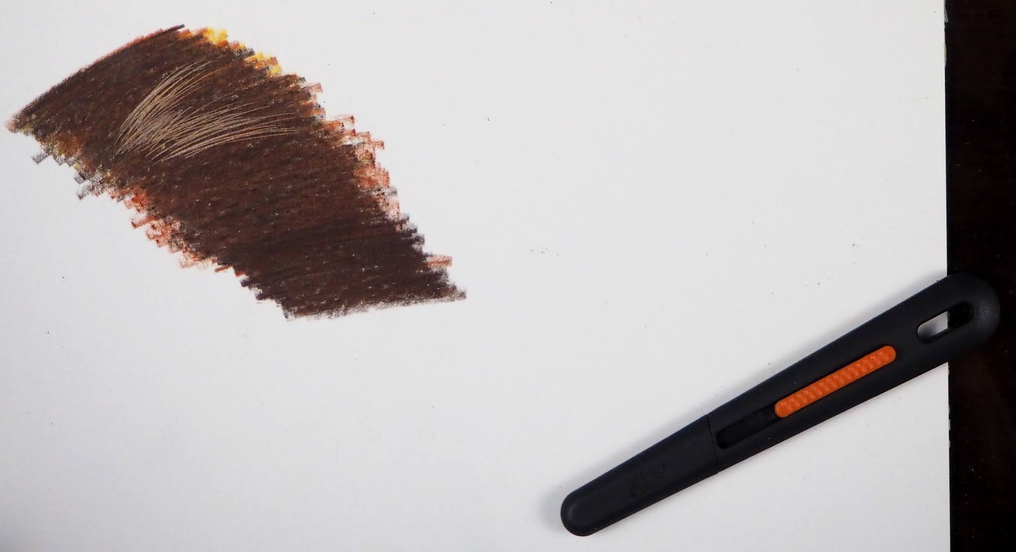
Texture on the black paper using the slice utility knife (a ceramic knife).  I have found that for this to show up and not damage the surface it needs to be coated with a good layer of colored pencil.

The slice utility knife (blade retracted) and the texture on white paper.

Texture on white paper.


Before class I added light layers of yellow chartreuse, Spanish orange and pomegranate (cool red).

This is how it looks after layers of the warm and cool yellows, warm and cool reds, purple blue and green blue.  I have shaded and blended the layers with a clean blending stump (clean it on sandpaper).  I have also used the side of a pencil top eraser to lighten areas.  The eraser is used like a drawing instrument to remove pencil from light to dark by varying the pressure as I erase.  I also use my Tombow Mono Zero erase for edges and small areas.  I used to use the edge of the pencil top to do this task before I had the Tombow.  This was a bit rushed since we were short on time, but I can smooth it out as i add subsequent layers.  This process is more delicate that the others I do and it's a great way to learn color mixing with colored pencils.  I will post more photos as I work on it. 

Zoom Colored Pencil Class July, 2021


This is the photo taken after class.  I worked mostly around the eye and beak adding values, color as needed, and details.  I used white, cream, black, and dark umber the most and also burnt ochre, sienna brown, Spanish orange, pale vermillion, and 50% gray.  I worked on the feather as well, organizing the shapes and values and adding texture as needed.  I used a sharp white and black pencil to start adding the fine feathers.  This is about 85% complete.  I need to finish some of the feather areas and then set it up to look at and make changes or additions as needed.  As I told you this end process can take weeks or months, but it's mostly looking and correcting or enhancing.  Most often it's to do with values, the lights and darks.  

This is how it looked right before class.  I had started working on the left  and left bottom and middle to right bottom feathers adding and organizing values and more color as well as adding and organizing the texture.

This is what it looked like after last week's class.

This is of course the first layer, the light value layer that I do on all dark and medium dark colored surfaces.  I usually use white and/or sometimes cream or a color such as light peach.  For this I used white and cream.

7/16/21

Zoom Colored Pencil Class July, 2021

This is the one I worked on during class with the white and the cream.

This is the one I worked on before class with the white and the cream.  This is the under-drawing.  There are a few areas that will need to be changed which is usual at this point.


This is the one I did before class with color shaded over the white and cream.  I used Copenhagen blue, terra cotta, burnt ochre, Spanish orange, and dark umber plus a little black near the eye.  You can see in the pupil that the black pencil spot is darker than my paper.

This is the mixing, blending, lifting, and erasing I did before we started the hawk.  The places where the texture does not come through were from the colorless blender (which I would not use until the end or close to the end of a piece).


6/18/21

Zoom Colored Pencil Class June, 2021


This is how it looked at the end of the last class.

Before the second class I worked some on the left side and top of the stem.  I used all of the same colors - white, black grape, cream, 50% warm gray, scarlet lake (warm red), Crimson lake, pomegranate, Spanish orange (warm yellow) lemon yellow (cool yellow), grass green.  I added canary yellow and yellow chartreuse.

I layered the darks and started working on some details.  It's mostly about the values, the lights and darks.  Values create the form, they are part of the structure.  Color is about beauty and expression.

Using the same list of colors with the addition of black to deepen the dark on the right petal and canary yellow to add into the yellow fringe, I worked on the right petal in class showing the layers of color and the addition of details. 

Using the same colors, with the addition of yellow chartreuse, I worked on the stem. 

I also worked on the top light petals starting the folds and the wrinkles.  I used the same colors as last class, with the addition of canary yellow and light umber (easier than mixing the brown).  And I still need to work on the concave square medium dark area I talked about in class.  I will work around it first and then study it to see what, if anything, it still needs in order to be pushed back.  Sometimes the problem area becomes solved when you put in the items around it (and sometimes not...).

This process is a matter of gently layering the colors to build the values, darks and the lights, adding color to express your beautiful self.