6/18/21

Zoom Colored Pencil Class June, 2021


This is how it looked at the end of the last class.

Before the second class I worked some on the left side and top of the stem.  I used all of the same colors - white, black grape, cream, 50% warm gray, scarlet lake (warm red), Crimson lake, pomegranate, Spanish orange (warm yellow) lemon yellow (cool yellow), grass green.  I added canary yellow and yellow chartreuse.

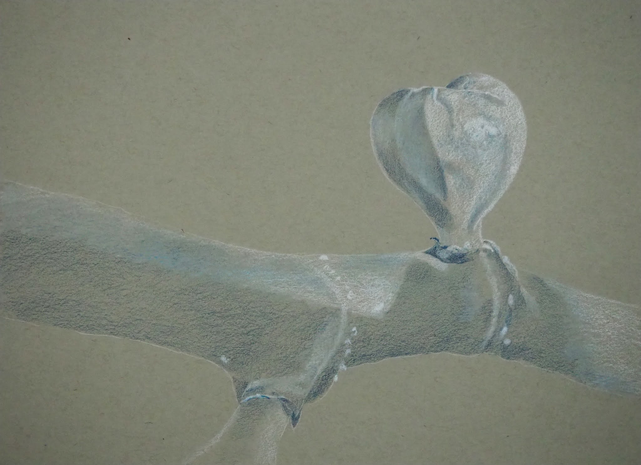
I layered the darks and started working on some details.  It's mostly about the values, the lights and darks.  Values create the form, they are part of the structure.  Color is about beauty and expression.


Using the same list of colors with the addition of black to deepen the dark on the right petal and canary yellow to add into the yellow fringe, I worked on the right petal in class showing the layers of color and the addition of details. 

Using the same colors, with the addition of yellow chartreuse, I worked on the stem. 

I also worked on the top light petals starting the folds and the wrinkles.  I used the same colors as last class, with the addition of canary yellow and light umber (easier than mixing the brown).  And I still need to work on the concave square medium dark area I talked about in class.  I will work around it first and then study it to see what, if anything, it still needs in order to be pushed back.  Sometimes the problem area becomes solved when you put in the items around it (and sometimes not...).

This process is a matter of gently layering the colors to build the values, darks and the lights, adding color to express your beautiful self.

NCBG Beginning Colored Pencil May, 2021


This is how it looked after the last post.

Using the same limited 6 color mixing palette, I continued to add darks to the shadow areas.  I added more dark to the upper left blueberry and to the left pink and green blueberry.

Remember that Peacock Blue and Scarlet Lake make a good dark (and you can add Copenhagen Blue or other colors as needed) .  Vary the ratios to vary the color - if you need it to be a dark blue lean it toward blue. If you need it to be a dark red lean it toward the red.


I added more Copenhagen blue and peacock blue to the upper left blueberry.  I used an eraser to gently lift some of the color in the light area.  I also started adding the middle detail using both blues.  I am still working on the center. 

On the bottom left blueberry I started adding the center part using both blues and both reds.  I am still working on the center.  I also deepened the color on the blueberry and darkened the darks using both blues and both reds.  I lifted as needed using an eraser, gently, like shading a light area with a pencil.

I used peacock clue and yellow chartreuse to make green on the stem.  I used both reds on the red part and overlapped the reds and green a little.  I mixed the red and green to make the darks as well.  I used an eraser to lift a little light.


6/11/21

Zoom Colored Pencil Class June, 2021


This is how it looked at the start of class.  I had done a little of the cream and white.

Close-up.

This is after the White and Cream for the light areas and the Black Grape and 50% Warm Gray for the dark areas. I could have used other colors in place of these.  I was mostly thinking dark and light.  

Sometimes I enjoy these so much that I finish them with the value colors and not the rest of the color I had planned.

 I am shading all of this lightly except for the white strip parts and the white edges. 

I added Spanish Orange (warm yellow) to the filaments.

I shaded Lemon Yellow on the petals that are yellow or have some yellow and on the stem.  I added some in with the Spanish Orange on the filaments as well. 

I shaded Scarlet Lake to areas that are red or had reddish tints.


I added Grass Green to the stem, shading it lightly over the entire stem. 

I shaded all of these colors lightly.  Additional finishing layers come after this part of the process is finished.  I work to quickly and lightly get the structure and form going before finishing.  This is my roadmap.

The differences in color are due to the lighting.  I took a few photos during the video process and one before and one after in a different location so the lighting varies a little.  I did do some some editing to bring them closer together.

NCBG Beginning Colored Pencil May, 2021

This is how it looked at the end of class.

I have worked on this since class adding color and more lights and darks to the bracts and the stem mostly.  I'm using the same colors we have already used plus I added indigo blue to the colors being used to get some more dark values.


6/1/21

NCBG Beginning Colored Pencil May, 2021


This was what this looked like before class.


This is what it looked like after class.  

In class I demonstrated the next layers on the bracts. I added more white for light areas and more of the yellow chartreuse as needed.  I added the crimson lake for the tips and darkened the tips (grass green and red make a nice dark as does red and indigo blue).  I also added a warm yellow to some areas of the bracts.  I overlapped the green and red where they meet on the bracts.

I added grass green to the flowers in the center and also used white, and yellow chartreuse.  I added crimson lake to make the darks (indigo blue would work as well) and to add some red on the flower buds in the center. This area still needs more darks and refining and detail.

I also demonstrated on the stem using Crimson Lake, Yellow Chartreuse, and Grass Green (and white if needed).  You can also use Indigo Blue to add darks.

NCBG Beginning Colored Pencil May, 2021


This is what it looked like before class.

Using the same 6 colors, I started adding the shadows to add the form.  The 6 colors:
Scarlet Lake (warm red) 
Crimson Lake (cool red) (note - I often use Pomegranate as my cool red)
Spanish orange (warm yellow)
Yellow Chartreuse (cool yellow)
Peacock Blue (green blue)
Copenhagen Blue (purple blue) (note - I sometimes use Denim Blue or Indanthrone Blue as substitutes).

Note - a  3 color palette I use sometimes is Crimson Red, Canary Yellow, and True Blue. 

I continued using the stump to blend the layers (clean between uses) 

I use my stik tak and erasers to lift the light areas.  

Remember that Peacock Blue and Scarlet Lake make a good dark (and you can add Copenhagen Blue or other colors as needed) .  Vary the ratios to vary the color - if you need it to be a dark blue lean it toward blue. If you need it to be a dark red lean it toward the red.

Zoom Watercolor & White gouache Class May, 2021


This is the dog at the end of class

This is the dog after some white gouache work adding details all over (mostly lots of hairs).   I added some of the dark here and there as needed. 

I added a yellow glaze on the left side of the background.  Then, after that dried, I added a thin layer of white gouache to the entire background.  I meant to do that for you in class.  The process is the same as glazing.  I mixed up a puddle of white gouache and painted it wet on dry.  The white gouache 'glaze' mutes the color, mutes the detail, it pushes the background back as it should be. 

5/26/21

NCBG Beginning Colored Pencil May, 2021

This is how the piece looked after class

I finished the unfinished areas with the first few passes.

I started adding more layers and darkening some areas on the left side flower.  This will be covered more in the demo today and I will post more here after class as well.  

I used grass green, scarlet lake, crimson lake, yellow chartreuse, and white in the middle flower section and the top bract areas to start adding some darks, more color, some lights, and the start of detail.


5/21/21

Zoom Watercolor & White gouache Class May, 2021

This is what it looked like after last class and before this class.

This is after the glazing and layers of dark plus white gouache.  I need to finish the white gouache and work on the background (since I showed you different looks on each side of the background and am in the process on fixing the red on the left).


NCBG Beginning Colored Pencil May, 2021

This is step 1 for the blueberries.  I added light layers of Crimson Lake, Yellow Chartreuse, and Copenhagen Blue.  The paper texture will show which is OK.  These are the beginning steps, the under drawing.

I used my stik tak/poster putty, adhesive putty to lift the pencil in the light areas (it leaves a light stain of the color).  

I added Copenhagen Blue, lightly, over the Crimson Lake.  I added Peacock Blue lightly over the Copenhagen Blue.

I used the stik tak/poster putty, adhesive putty to lift the pencil in the light areas.

I used a Drawing Stump to blend all of these layers


5/16/21

Zoom Watercolor & White gouache Class May, 2021


I transferred the drawing darker than usual since the dog is black and since we added color as the first layer.

I wet the paper, dropped in ultramarine blue on the back side of the dog and all over the background.  I added spanish orange to the front of the dog as well as pyrrole scarlet to add warmth.  The red faded quite a lot on the front of the dog as it dried, I can add glazes of it later if I feel that it needs the color.  I also added red to the collar.  

Color choices can be different, choose colors that you prefer. 

I also flicked some color into the wet paint. 

I added red on the front of the dog, I felt it was needed.

I started adding the mixed dark (I mixed ultramarine blue, pyrrole scarlet, a little spanish orange, and a little phthalo blue to make the black).  I dampened the medium to large areas so that I had more time to work.  I worked wet on dry on the smaller areas.  I added the dark from the darkest areas to the lightest areas.  This is the first pass with the dark and will not have all of the details or values quite yet.

Do some negative painting into the white fur parts of the dog's fur.

I added some spanish orange into the eyes.

I worked on the face, lightly.  I will add another layer here in the next class.  I also worked on the body with more negative painting for the fur texture into the white fur.

I added the values into the nose, lightly for this first pass.

I used the mixed gray to add shadows to the collar.  I also added some more red to some areas.

I added the values into the eyes and then the color after that was dry.

I added white gouache into the collar.  I will also demonstrate white gouache on the dog after we get more darks and some texture and detail first.

I also added some red near the eye.  I am studying the background as I go to decide what it needs. It may need more red and/or to subdue some areas of the red. The yellow near the bottom needs to be either balanced or eliminated. Glazes into the background might be needed.  Still looking and waiting for more to be done on the dog. 


5/14/21

NCBG Beginning Colored Pencil May, 2021

The first step is to use white and shade the highlights in layers.

The second step is to shade parts of the white with yellow chartreuse (or chartreuse) leaving the highlights white.  

I did the left flower before class.  


These 2 photos are of the same stage of the drawing taken with different cameras under different lighting.

I demonstrated the first 2 steps using white and then yellow chartreuse on 2 petals on the right side flower

I left 2 petals blank in order to demonstrate this process later for a student who have missed class.

I then demonstrated adding the red using crimson lake.  I added some spanish orange on the edges of some of the red as well as in some green areas where warmth was needed.  We will continue this project in the next class.


NCBG Beginning Colored Pencil May, 2021

This is the additional piece I worked on.  This is the photo from last week.


These photos are at the same place.  They look different due to lighting and the camera used to take them.  I wanted you to see the variation.  And this is after I used editing to try and bring them closer together.


I demonstrated this part of the process again for a student who missed the first class.  

For the fig - I added Canary Yellow over the entire fig (except on the one highlight) and on the partial fig at the bottom.

For the branch - This has several light layers.  I often add color on the bottom layers to add warmth, richness, and to make it more interesting and varied.
1. for this one I used yellow chartreuse and added some of that lightly to areas that looked yellow in the photo.  
2. I used warm red (Scarlet lake) and added some lightly to areas that had a reddish tint in the photo. 
3. I used a warm brown (Burnt Ochre) and did a light to medium layer over the entire branch.
4. I used a dark brown (Dark Umber) to add dark values.
5. I used White to re-establish the highlights and light areas as needed.


NCBG Beginning Colored Pencil May, 2021

This is the photo from last week.


These photos are at the same place.  They look different due to lighting and the camera used to take them.  I wanted you to see the variation.  And this is after I used editing to try and bring them closer together.

During class I worked on the fig in layers.  I added grass green, lightly, to shift the fig towards green.  I then used grass green, indigo blue, white, spanish orange and yellow chartreuse plus burnt ochre to work on the values, the color, and the details.  I studied the photo and added darks, lights, texture, little details, and concentrated on warm and cool areas.

Next I focused on the branch, especially the lights and darks.  I used burnt ochre, dark brown, indigo blue, and white.  I also added color using spanish orange, scarlet, lake or yellow chartreuse.  I started to add texture and details.  I will continue the branch next week. 


5/7/21

NCBG Beginning Colored Pencil May, 2021


Step 1 - Using White I added in the light value areas, with a light touch, in layers building up to the lightest area.  I used the side of a sharpened pencil to keep my touch light.

Remember this is an under drawing or the first pass, we will be adding more white throughout the process as we adjust values.


Step 2 - Using Indigo Blue I added in the dark values with a light touch in layers building up to the darkest value (but not quite as dark as shown in the photo).  I used the side of a sharpened pencil to keep my touch light.

Remember this is an under drawing or the second pass, we will be adding more dark values throughout the process as we adjust values.

I demonstrated using the stump to blend the layers as well as cleaning the stump between uses with sandpaper or a sanding block.


The next step is adding color.  

For the fig - I added Canary Yellow over the entire fig (except on the one highlight) and on the partial fig at the bottom.

For the branch - This has several light layers.  I often add colors on the bottom layers to add warmth, richness, and to make it more interesting and varied.
1. I used warm yellow (Spanish Orange) and added some of that lightly to areas that looked yellow in the photo.  
2. I used warm red (Scarlet lake) and added some lightly to areas that had a reddish tint in the photo. 
3. I used a warm brown (Burnt Ochre) and did a light to medium layer over the entire branch.
4. I used a dark brown (Dark Umber) to add dark values.
5. I used White to re-establish the highlights and light areas as needed.

These are the beginning layers of color.  There will be more to come in the next class.  


This is the demonstration piece from class.  

I added the color to the piece I started before class.  I can demonstrate adding the color again on this as needed.