


 |
| I started adding color with spanish orange. I put a light coat over all areas that are orange on the half I am demonstrating and in the eye, lightly. I then used pale vermilion over the top of that and on the edge of the eye. Next I used sienna brown to add shadows and to darken some of the orange in areas as needed. I added dark brown for deeper shadows and darker areas as well. I added a little chartreuse to the eye. I then added a shadow with sienna brown under the lid, on the top part of the eye. I darkened the top of that shadow with dark brown. I added more black to the areas around the eye. I then used white to make the highlighted areas, to give that some form. I used sienna, pale vermilion and white to work on the white area below the eye. I gave it a fur texture too, basically "messing up" the edges. I'm working on all transitions from the white to the orange. I'm studying them and using white, pale vermilion and sometimes sienna brown to make the transitions. For the black spots I am giving it a fur texture, "messing up" the edges with white and black and brown and orange as needed. For the nose I added peach over the whole thing and then pale vermilion and then peach again. Later I added more pale vermilion in the darker areas and some white for the highlight to give it some form. I added some black texture around the nose area as needed. |
 |
| Steadman's very first colored pencil. Nice work. |
 |
| Steadman's second colored pencil. Really nice work here! |
 |
| We added color in the background using spanish orange and peacock blue and a stump. Now this bird needs some detailing, refining, and adjusting. I spend weeks looking at it and making small adjustments. |
 |
| I started with white and black on Strathmore Toned Blue mixed media paper. I am working on shading the values. |
 |
| This is how it looked at the end of the last post. |
 |
| I worked on the wing. I started on the right side towards the middle. I used black, white, and aquamarine plus some canary yellow at the end. I layered the colors paying attention to the values. I added more white to the light parts as needed. I had to reshape areas and change some shapes which is usual in something like this. After getting the layering far along I used a stump to blend and soften and hard edges, sometimes I used white to lighten, soften, or blend. I worked across to the left and down on the feathers. I added sand, light umber, sienna brown, and indigo blue to the white, black, canary yellow and aquamarine. I worked on each feather shape layering the color and paying attention to the value. If the original road map was too dark I lightened it with white and added the color. Then I softened and blended with the stump (remember to clean it). After I was done with that section I moved up on the feathers. I am still working on the wing feathers. |
 |
| This is the parakeet from the last blog post |
 |
| I used aquamarine, light aqua, white, and sienna brown plus a little black/indigo blue on the chest area of the bird. I covered the entire area with light aqua. I then started shaping the feathers and areas. I worked in the direction of the feathers using white to lighten and aquamarine to add medium values and black or indigo with aquamarine on top for the darker values. I used the sienna brown, lightly, with light aqua over the top to make the gray brown area in the feathers. I used white to blend, texture, and lighten areas as needed. I moved down the front of the body shading with light aqua over the entire area. Then I added white in a textured pattern going in the direction of the feathers to the front and bottom. I used aquamarine and a little indigo blue to the shadow under the wing. Next I worked on the head adding light aqua and a little Copenhagen blue to the left side of the cheek. I used white to lighten and blend the light aqua into the cheek area. make strokes in the direction of the feathers. Then I worked on the stripes on the head around the eye. I added feathery texture with white going in the direction of the feathers over the black and white stripes. Using white and black I made and undulating pattern of light and dark on the stripe area under the eye. I lightened the white and dark in one horizontal stripe and then darkened the next stripe, and so on. This is a subtle pattern so as not to make any hard horizontal lines. Above the eye on the head I lightened and darkened areas according to the values in the photo. |
 |
| This is how it looked in the last post. |
 |
| I started adding the wings with black and white doing what I call making a "road map" in a confusing area. After that I worked on the head. I added yellow ocher to the eye and the beak. I lightly added yellow ocher on the white are from below the eye to the beak and up around the beak and down the right side of the beak. I also added sienna brown to the beak and on the head in the areas I put yellow ocher (do this lightly). I then added canary yellow lightly from the yellow ocher up onto the head. I added peach lightly as well. I also added some of these colors to the cheek. I used dark brown to make the shadow around the beak between the beak and the fluffy white. I added shadows and highlights to the eye. and the yellow around the eye using white, dark brown and sienna brown plus a little black. I worked on the beak adding highlights and shadows as well as color. I used white to add more white to the head working it into the areas shaded with color and making parts lighter that need to be. Next class we will work on the back part of the head and into the wings and chest areas. |
 |
| This is how it looked for the last post. |
 |
| I worked on more petals and on the background adding more color and using the stump and/or white to blend. I need to finish the rest of the unfinished petals and then adjust the values and add needed details. |
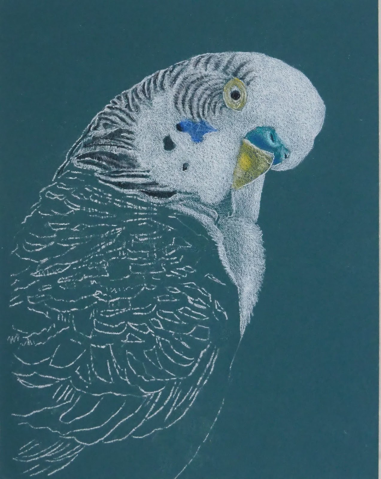 |
| This is the parakeet on a blue green mat board. The first step was to work in white adding the light values. Then I used black to add the stripes, pupil, nostril, and black markings. I added some copenhagen blue on the cheek and yellow ochre to the beak and around the eye. I also added a spot of spanish orange to the beak. I used aquamarine and copenhagen blue on the beak. |
 |
| This was posted in the last post. |
 |
| I worked mostly on the leaves, refining them and adding details and values. I worked on the two biggest leaves on the left side. I used the same color - dark green, indigo, canary yellow, and white. I added true blue to the mix. I used the stump the most for blending. I used white to make corrections and adjust values. Then I started adding a background. I used indigo blue first to shape the value pattern of the background. Then I used dark green over the top following the value pattern. Then I used canary yellow evenly over the entire area. Next I used the stump to blend it all together. I plan to make adjustments to the background if needed after the flower and leaves are further along. This was done during our class time. |
 |
| I continued working outside of class. I worked on some leaves and petals using the same colors and process as before. In the background you can see the layers and stages of the process. There is indigo only on the bottom left side, then indigo with dark green on the bottom middle and bottom right side, and then a section with the yellow on top above that, and then the blended colors on the top half of the background. |
