8/28/14

Scratchboard and Pen & Ink (August 2014)I


I did a bit more work on the neck before class

I did a bit more removal on the neck.  I then mixed some color (scratchboard ink magenta and yellow and water).  I added color to the neck ans beak.  It needs more highlights scratched out.  The color is uneven from head to neck due to a glare while taking the photo.

Pen and ink bee - I did a bit more ink before class.

I did a bit of work before class and during class on the flower areas especially.  LOTS more to do.

I did this before class.  Scratched out a petal, a highlight on the branch, and used the steel wool to add texture to the background.  I then colored the background with the ink (blue, green, yellow).  There is a glare upper right.

I demonstrated the background during class.  I scratched the background with steel wool and then colored it with ink (green blue, yellow).  There is a glare bottom left.

I did an ink wash and then some pointillism.  I wet and washed ink on the background.  After it was dry I added ink to the shadows on the flower and stem. I then used a micron pen to start adding details with pointillism. 

8/27/14

Mixed Media Sertoma (August 2014)

This is the dogwood that started out very chaotic and purple and yellow (rubber cement watercolor).  It has only a bit of the underlying design and color left and lots of pencil layers on top.  There is a little work left to do.  I did more work on this at home before class.

This has a watercolor background (painted after I transferred the dogwood) and white gouache on the petals.  I used pen & ink for the shading.  There is a little colored pencil on the background.  This was how it looked before class.

I added a bit more ink, some colored pencil (and melted small areas).  I needs more work.

I worked some on the pattern in the shirt with pen & ink and colored pencil before class.  I toned some areas of the background down with colored pencil.

I finished the pattern on the shirt and then added the highlights and shadows with white and black.  I worked a little on the hat (highlights) and worked on the face with white, light peach, peach, dark brown, and sienna.  I have started to put in the wrinkles and the mouth and the ear.  Need to do the hair with white and black colored pencil.  Have already added some pen & ink.  Overall it needs more work.

I did this at home so it could dry.  I started with masonite, primed with Kilz 2 primer.  I wet it and added acrylic splattering until it looked interesting.  I let it dry.  Then I transferred the drawing and used white to paint the highlights.  I let it dry.  Then I sprayed the surface lightly with water, added the Acrylic Ground for Pastel, and painted it around with a wet flat brush.  I then lightly sprayed again (to smooth it a bit) and let it dry.

I have now started with the colored pencil working especially on the head behind the eye.  I have used pomegranate, canary yellow, and white mostly.  I did a little on the beak with white and black and pomegranate and some on the background with dark green and indigo.  It all needs more work and refining.

8/25/14

Scratchboard and Pen & Ink Sertoma (August 2014)

Pen & Ink.  I added washes of the scratchboard ink (first magenta and then yellow) to the pen & ink piece.  Later I added more of the pen & ink.  I could have used watercolor in place of the inks.

Scratchboard.  I scratched a bit more and then used the Ampersand Scratchboard Ink to add color and then scratched a bit more to re-establish highlights.  There are other options for coloring including Inktense pencils, Faber Castell Pitt Brush Pens (as we learned today), and acrylic.  I'm sure there are other methods as well... 

Pen & Ink.  I added more ink.

Scratchboard - all I can say is that I have a LONG way to go...

Mixed Media Sertoma (August 2014)

Colored pencil over watercolor.  On this I showed how to apply and then 'melt' the colored pencil.  I used Goo Gone, but rubbing alcohol, Turpenoid, Gamsol, Bestine, and several others things will work on Prismacolor colored pencils to melt the wax.  I did this as the background was entirely too distracting.  I am still working on the background some.  I worked on the stem, the petals, and the middle of the flower adding detail and value.

Watercolor and gouache so far.  I added white gouache to the petal to lighten before adding other mediums.  I plan to use gouache on all the petals.

Colored pencil over watercolor.  This is an example from another class

Colored pencil and ink over watercolor.  I worked on the hat adding highlights, shadows, color, and details.  It needs a bit more work.

8/23/14

BAL Class (August 2014)

Acrylic on student grade watercolor paper (140 lb. cold press).  I used a reddish brown (mixed with the 3 primaries).  I transferred the drawing, wet the paper (damp, not real wet), and used thinned acrylic to paint in a value study of the man.  I will also do his clothes in the brown as well.

Colored pencil on light gray paper.  I used sienna brown to shade in the values.

Watercolor on 300 lb. cold press watercolor paper.  I transferred the drawing, wet the paper (damp, not real wet), and used burnt sienna to do a value study of the man.

BAL Class (August 2014)

Acrylic.  The eye, the one I messed in while it was wet, needs to be fixed, badly.  It is the wrong shape and the pupil is too low and disconnected.  I added details and values and toned down the background.  It has quite a bit of work left.

Colored pencil.  This is going well and just needs more work.  It is fairly far along.  I added values and details.  I have more work with the white (the white is not as garishly bright as the photo shows it to be).

watercolor.  I added details and values.  There are a few things that need correcting, but overall it is going well.  I added values and details and it still needs more values and details, but it is going well.

Acrylic.  I toned down the background a bit - darkening it in the front.  I added some details and values to the flower - it needs more of the same.  I also need to give it a stem and some leaves to anchor it.

Colored pencil.  I have darkened the background and added s nit more value and details to the flower.  it needs more detail and value on the flower and leaves. and of course the background needs to be completed.

Watercolor.  I removed the rubber cement and glazed with yellow over the background.  The flower need a lot more value and detail work and the background need to be organized. 

8/15/14

BAL Class (August 2014)

Acrylic.  I added more white paying attention to the values.

I added a bit more white and worked on the nose and eye paying attention to values and details.  The black in front of the face is to show how much a dark will accentuate the cat.  On the eye I used canary yellow, white, black,  true blue (tiny bit) and crimson red.  On the nose so far I have used black, crimson red, and white.

Watercolor.  I worked on the dark spot, the ear, and started the eye.  I mixed the dark with indigo, azo yellow, and alizarin.  The ear is alizarin and azo yellow.

Acrylic.  I started adding highlights and shadows.  The highlights are a mixture of white and a little red and yellow,  The shadows are red and black.

I added more red to the flower and background at home.  I started to add highlights with cream (could also use white).

Colored pencil.  I added more highlights and shadows to the flower and more green to the background.  I started to add more leaves and stems and added some yellow.  The part to the left is the start of camouflaging the green paint drops.  

Watercolor.  I added another layer of rubber cement and paint.  I dampened the flower area and started adding alizarin paying attention to the lights and darks.

8/14/14

BAL Class (August 2014)

Colored pencil, white on gray paying attention to the values (lights and darks).

Colored pencil, red on gray paying attention to values (done first in most the areas I have worked on).  Darken the red where needed with dark green or black.  In the background I started adding Dark green and some yellow to the leaves.  The green is over red.  I need to finish the red.

Scratchboard and Pen & Ink (August 2014)

Pen & Ink on Bristol Board.  I transferred the drawing with graphite paper and used a brush marker for the solid dark areas and a Micron Pen (#2) for the pointillism.  Pay attention to the patterns of lights and darks, even the subtle changes.  I usually start with the dark areas.

Scratchboard on Ampersand Scratchbord.  I transferred the drawing with white transfer paper.  I used a fiberglass brush (the small one) for the white area.  I cleaned up the edges with a scratch knife (Ampersands version).   I used the wire brush on the top of the head along with a scratch knife.  I could do this entire piece with one tool such as a #11 exacto knife or a scratch knife (many artists work with one tool).

Scratchboard practice piece using various tools.

Pen & Ink on Bristol Board.  I transferred the drawing with graphite paper and a Micron Pen (#2) for the pointillism and cross hatching and hatching.  Pay attention to the patterns of lights and darks, even the subtle changes.  I usually start with the dark areas, here I was demonstrating certain areas for students.

White transfer on scratchboard.

This is an older practice sheet for pen & ink with the various drawing marks/techniques and a bit of doodling on the top and bottom by my son with a croquill pen.

Mixed Media Sertoma (August 2014)

This is the start of the dogwood in colored pencil superimposed over a textured watercolor background.  The background was made with watercolor and rubber cement (remind me to show you next class).

This is the first step in the dogwood on a textured background made specifically for the dogwood.  The drawing was transferred first and then the paper was dampened and color was loosely painted and salt added (watercolor on watercolor paper).

This is colored pencil over an abandoned 'ugly' painting.  The painting had become muddy and awful so I decided to use it for a mixed media.  This type works great for colored pencil and pen & ink over the top.  I used pen & ink in the dark areas, on the glasses, and to add texture and pattern on the shirt (need to do more).   I then used a white pencil to add my lights.  Next I used light peach, peach, and sienna brown for the skin. I added a little red to the shirt as well. 

Mixed Media Sertoma (August 2014)

Bubble Wrap Texture (acrylic).  Wet paper, drop in paint (watercolor, acrylic, or gouache), place the bubble wrap on top, put a book on top.  Allow to dry before removing.

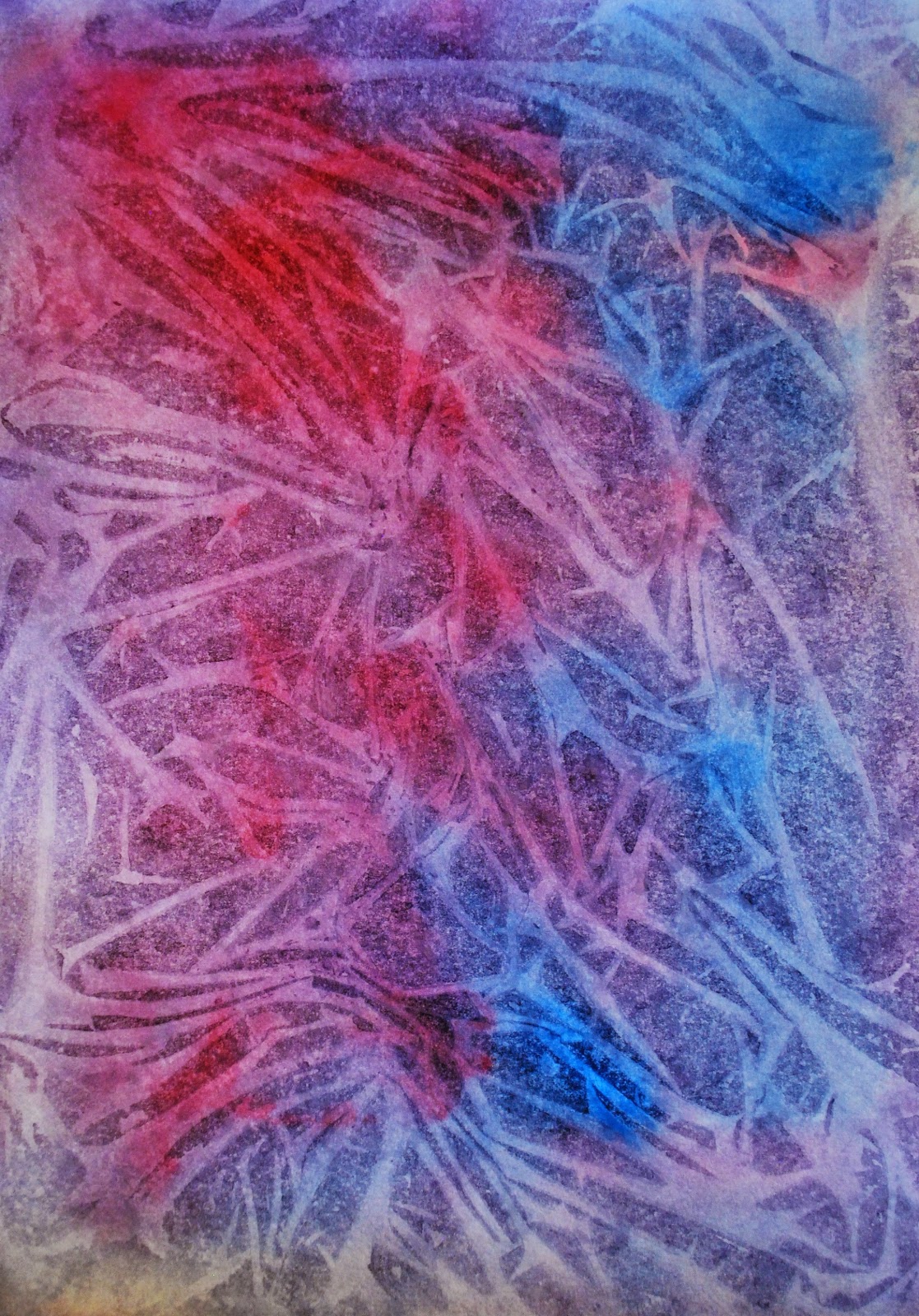
Plastic Wrap Texture - done in class (acrylic).  Wet paper, drop in paint (watercolor, acrylic, or gouache), place the plastic wrap on top.  Allow to dry before removing.

Salt Texture (acrylic on masonite prepped with Absorbent ground).  Wet the surface, drop in color (acrylic, watercolor, gouache), add salt while the surface is wet and shiny but not a puddle.  Remove salt when dry (it should mostly just drop off).

Salt Texture (watercolor on paper).  This was the example done in class (it's a sad example...).  

Wax Paper Texture (Gouache on paper).   Wet paper, drop in paint (watercolor, acrylic, or gouache), place the slightly crinkled wax paper on top, put a book on top to hold it down.  Allow to dry before removing.