2/26/20

BAL CP & MM

This was how it looked after last week's class

I did a little more work especially with white and also added some blue in the eyes (lightly) and some scarlet in the skin (very lightly) and tera cotta on the lips, eyebrows and hair (very lightly) and a little dark brown in the hair.  I will do more of this in class as I develop the form and values. 

2/20/20

BAL CP&MM Feb. 2020

I finished the pen & ink on the bottom turtle before class.  If this were not a demonstration I would finish the pen & ink before adding colored pencil.  I added more colored pencil on the top turtle working with white, spanish orange, canary yellow, cream, terra cotta, black cherry, black 
I worked on the leaves using olive green, spanish orange, terra cotta, and white.  I added some dark brown to the branch.
I shaded on some color with watercolor pencils.  I used greens in the background; orange, red, and yellow plus a little green in the face; browns, blue, orange, red, and green in the hair.  I wet the paint all over and let it mix some.  Then I used a bunch of color and did the sanding with some water spritzing.  After it was dry I started using white to gently shade the face and a little in the hair.  
I worked on the stem using chartreuse, spanish orange, pomegranate, white, and olive green.  I made a gentle transition from the darker green to the brighter green.  I added some more red, both the warm and cool red, to the left red grape.  I added more white as well.

Acrylic Cass 2020

First I made a very thinned paint, thinned with matte medium and water.  I dampened the canvas and painted the wet paint on the canvas.   I added some water near the top to make the effect of light. I added salt when the canvas was wet, but not puddled, to make a texture.  After that was dry we mixed a red brown and blocked in the turtle shape.
First I mixed a gray color, with 3 primaries leaned towards blue, added white, and painted the background (I made separate piles of the original gray and the lightened gray).  I added a bit of the darker gray at the top.  I spritzed it with a fine spray of water.  After that was dry we used blue (I mixed ultramarine blue and a little pthalo blue).  I made the blue darker by adding some black and made it light by adding white (I made separate piles of the lightened and darker color and the blue color).  I painted the values on the mountains. 

2/15/20

Sertoma CW Jan. & Feb. 2020

We added more dark to the background near the grapes to pop them forward.  I also added more color to a few of the unfinished grapes.  I have lots of little adjustments to make yet.
I added darks to his sunglasses, beard, and hair.  I want the hair to be shaped and yet partly softened and part of the background.  I started the mustache, it needs more work.  I added darks to the mouth, and parts of the face and the ear, more work is needed, but it's getting there.  I added some textured dark to the background grout lines.  I will continue texturing the background and pushing it back into space.

2/14/20

BAL CP&MM Feb. 2020

I started this with a black and white pen. If this were not a demonstration, I would completely finish the ink portion before starting the colored pencil.   Sometimes when I finish the ink I decide not to add colored pencil because it looks great as is.  I started the pencil on the top turtle.  I used white, cream, canary yellow, black cherry, black grape, and terra cotta (or sienna brown) so far.  It needs more work of course.  Substitute colors are absolutely fine.  For the dark you can use indigo and dark brown instead of black grape and black cherry for example.

This started with white.  I have added 70% cool grey, Copenhagen blue (or cobalt blue hue or denim blue), indanthrone blue (or indigo blue), true blue, violet, and black.  In the background I started shading chartreuse and Spanish orange.  I made the pencil strokes go in the direction of the feather textures.

I worked more on the left red grape using more red to deepen the color.  I will demo a grape or two and the stem and background next class

2/8/20

Sertoma CW Jan. & Feb. 2020

This was how it looked after class.

For this I wet the entire piece (less water on the face).  I rubbed a soft brush over the background focusing on the harder edges (I did not use a scrubbie). I then dropped in my purple blue (ultramarine blue) and my warm yellow (permanent yellow deep).  I still need to push some areas back more and can do this without wetting the entire painting.

DAC MM Jan. & Feb. 2020This is how the piece looked after class.

I demonstrated the hair, mustache, adding colored pencil to the background (lightly in this case), working on the goatee and the skin a little more.  I also worked a little more on the jacket with ink and some colored pencil in class and afterward as well.

I worked more after class on the hair, it still needs more dark and a little more refining.  I added some scarlet lake and terra cotta to the face, especially under the eyes.  I'm still refining the face by adding color and making it a little darker in some areas.  i'm also still working on the eyes to gain Matt's expression.  I started working on the neck and still need to add more shadows.

2/6/20

BAL CP&MM February, 2020

This is Stonehenge Aqua 300 lb. cold press watercolor paper.  It is not heavily textured so I like it for mixed media.  I also use the 140 lb. and their hot press for colored pencil and mixed media.  I do not love it for watercolor only painting.  I wet the paper, very wet so the paint will move, and dropped in color.  I used prussian blue (a green blue) and several mixtures of turquoise and green mixed with prussian blue and aureolin yellow (a cool yellow).  I made it lighter by adding some water to one end.  I wanted it a little lighter at the top (since ocean water is lighter near the top). When it was still wet, but not puddled I added the salt.  I used both large salt and fine salt.  This took the entire class and beyond to dry.  We will transfer the turtles in the next class.

This is Strathmore toned gray paper.  I started this by transferring with white transfer paper and then using a textured stroke in the direction of the feathers I started shading the bird.  on the branches I used a scribbled texture.  I have more to do before adding the darks and color.

This is Strathmore toned gray paper.  I started this by transferring with white transfer paper and then using a white pencil and smooth circular stroke adding the highlights and lights.  I then started using black grape to add the darks, again using the smooth circular stroke (you could use indigo in place of the black grape). For the red grapes I used scarlet lake and pomegranate over the white and black grape areas (you can use crimson lake for the pomegrante or crimson red to replace either or both reds).  I then added some spanish orange on the bottom of the left side grape and the left side of the background red grape (you can use canary yellow to replace spanish orange).  I have several more layers to demo in the next class.  For the stem I added yellow chartreuse and spanish orange with a little black grape at the top.  

2/5/20

Sertoma CW Jan & Feb 2020

I added more dark to the background (still more to add).  I wet a larger area, larger than the part I am darkening, and then drop in the dark color.  I dampened and added red to the background red grape.  While the grape was still wet, I added blue on one side and yellow on the other to make it more interesting.  I worked on the front green grape adding some yellow and dark green as well as some red.  I used white gouache to fix edges

First I used a mixed skin color (warm red, cool red, warm yellow with a tiny touch of green blue) and started adding shadows to his face and neck and ear.  I even added skin color to the left side teeth.  I have some darker shadows to add, but wanted to get the background, sunglasses, and hair started before doing so.  I dampened the bricks (about 4-6 at a time) and added a dark red color (warm red, cool red, and green blue plus some warm yellow).  I added this to the dampened bricks along with the colors used to make the dark red.  I dampened his hair, glasses and beard so the color would bleed into those areas and I also added some color into those areas.I dampened his t-shirt and added the blue and dark red color.  I plan to run water over the background to soften the lines in the background.  I will probably add more color as I do this.  I plan to do this before class so it will be dry in the next class.  I will post again after it's done.

2/3/20

DAC MM Jan & Feb 2020

I worked a bit more in the water.

In between class I started working in ink and worked on an eye and some skin. 

This was taken after class, after the demonstrations of ink on the jacket and adding colored pencil over the ink (I used white and blue as well as black colored pencil) and after demonstrating the eye, skin, and hair.  There are issues with the eyes and lips (I did not follow the drawing lines as closely as I should have...)

I re-transferred the drawing lines to determine the areas of issues and then re-worked those areas (I did not follow all the lines as suspected).  Sometimes, especially on textured backgrounds, I lose sight of lines or read some lines incorrectly.  There is more to demonstrate in class Thursday.

In between classes I shaded some watercolor pencil under the truck.  I used black (and will add other colors with colored pencil into the black)

In between classes I wet the pencil I had shaded and painted it under the truck. 

I did a demonstration of the watercolor pencil shadows and adding colored pencil into those shadows.  I also demonstrated adjusting the background color and adding form and texture to the truck using white, reddish brown (terra cotta or sienna brown), slate blue, dark brown.  There is more to do.

1/28/20

Sertoma CW Jan. and Feb. 2020

I worked on the face adding details and warm and cool shadows (with reddish brown and ultramarine blue).  I added lots of darks.  I also added texture to the mane and neck using a reddish brown.  I glazed the neck later with some warm yellow.  I have a little island formed near the eye that needs to be incorporated into the face.  It still has the first pass only on it.  The same for the light edge of the ear and the hair formed by negative painting.
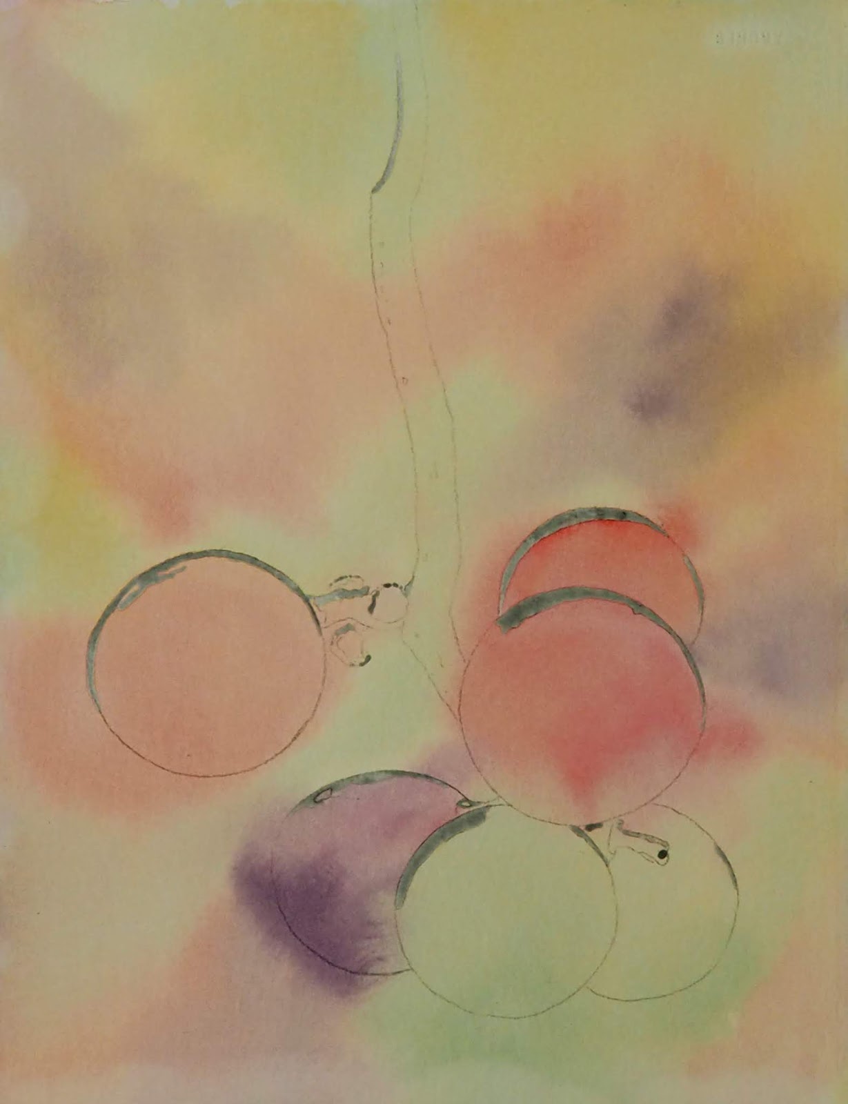
I wet the right side of the background and dropped in various colors going from dark to medium value as it moved away from the area I wanted to highlight.  I need to add color and shift values to the left side as well as the bottom.  I then painted the red and purple grape on the left side.  I dampened each one and dropped in color.  I mixed the reds for the red grape and also added some purple.  I dampened the purple grape and dropped in a dark purple as well as some rose.  I made sure for each grape that I incorporated the hard white shapes back into the grape. Later I used gouache to add the waxy white that is sometimes on grapes (and blueberries).  I used the white gouache to also incorporate the whites and add new whites into the grapes.
I transferred the drawing and dropped in mixed skin color, LIGHT color (made with both reds, a warm yellow, and a tiny bit of pthalo blue which is not always needed).  I then dropped in the colors used to make the skin color.  I wanted a colorful, but light, background to start.

1/25/20

DAC MM Jan. & Feb. 2020

I continued adding values with white on the stem and leaves (have a little more white to do).  I added a bit more color and dark value (have quite a bit of dark and color left to do).
I started by transferring the drawing.  I then wet the paper, dropped in color, and then added salt.  I added the salt when the paint was still wet, but was starting to dry.  I started working on the skin with white, light peach, peach, and terra cotta.  I added some darks in the eyes with terra cotta, dark brown and indigo blue.  I am ignoring the texture as I work concentrating on the form of the person.  I would like some texture to show through.  I decide later how much texture will show through depending on if it works well or is distracting. I plan to add black ink on this one. 
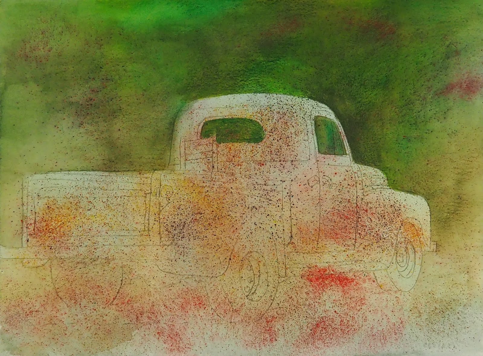
I started by transferring the drawing.  I wet the paper and dropped in some greens, all very light (like the bottom of this piece).  While the paper was wet I used a technique called sanding (I used red brown, warm yellow, orange, and red watercolor pencils).  Sanding is when you use sand paper or a strainer to add finely ground watercolor pencil to the wet paint, it makes the fine speckle pattern. After this dried I used a variety of green watercolor pencils and shaded the darker greens on the top half of this piece.  I then added water to the shaded watercolor pencil, moving the color around. The red you see is from the sanding technique before adding the green.
Using colored pencil I worked on the reflection part of the water adding the darks and lights and some color.  I still have more to do, but it's getting there.  i also worked a little on the swan, still need more shadows on the wings and back feathers. In the water I used colors such as dark green, aquamarine, spanish orange, indigo, sacrlet lake (beak reflection), and white

1/17/20

DAC MM Jan.& Feb. 2020

I am still working on the white (I left some for future demonstrations)  I started adding color to the bracts.  I used yellow chartreuse first and then grass green/olive green, dark green, and more white as needed to lighten areas.
I am continuing to work on the bracts.  I continue to use yellow chartreuse first and then grass green/olive green, dark green, and more white as needed to lighten areas and have added spanish prnge, scarlet lake, pomegranate, black/indigo blue (used on the background).  I use the colors in layers and continue refining as i go.  I use the stump as needed to smooth some areas. 
I used a black ink pen and a white ink pen on the swans head to get bold contrast.  I added some gray to the swan in the shadows and to make textures (worked in the head and neck area so far).  I used in on the beak as well as spanish orange and scarlet lake and white to get form om the beak.  I worked on the background, upper right portion adding color and dark.  I used yellow chartreuse, dark green, grass green, olive green, and black so far.  I started work on the reflection of the swan with the same colors as above adding scarlet lake and white to the mix.  Will continue that demo next class. 

1/14/20

Sertoma CW Jan. and Feb. 2020

I finished the remainder of the spots at home so they would be ready for class.  In class I mixed a gray and a warm brown to shade the parts of neck and head in shadow, lightly on this pass.  I also added some darker gray to the tips of the horns and inside the ear and nostril (the nostril was too wet and dispersed, it will need to be redone).  I wet the parts that needed shading beforehand.  If you are working on a paper that lifts easily add the shadows like a glaze without pre-wetting the paper.
I mixed a warm brown and used my warm yellow and added areas of warm color to parts of the face and neck and at the same time added the mane.
I added color to the grapes and stems one grape at a time.  For the red I mixed my warm and cool reds together and also added more of one color in areas that needed to be warmer or cooler.  For the green and purple I did a variety of mixtures to show you the possibilities you have with warm & cool red, warm & cool yellow, and purple blue and green blue. Mix your colors to get the various combinations you have and remember that ratios make a difference.  The textures in the red grapes were made while wet with a little ultramarine blue dropped into the red.  The green had a little quin. rose dropped in one and a little aureolin yellow and quin. rose dropped in the top of the other.  For the purple I made a few neutralized purples and added more red to the purple on the top part. I added the stem with green at the top, warm yellow at the bottom and a little red dropped in while it's wet.  The places The ends where other grapes used to be were made with purple brown with red and blue dropped in.  The one towards the bottom was warm yellow with a little green and some red.


I removed the masking using a rubber cement pick-up. I then used water, a soft brush and paper towel to soften the edges all over the piece. 

1/11/20

DAC MM Jan. & Feb., 2010

This is an unfinished watercolor painting from another class.  This could be finished as a watercolor or as a mixed media.
This is the painting demonstrated in class.  This was done in two layers.  I wet the paper and dropped in yellow and gray on the bird and on parts of the background.  I also added orange to the beak and the reflection.  After that was dry I wet the paper around the swan.  This paper does not life easily so the paint won't lift when I wet it again.  I mix a very dark green and a medium green and a yellow green.  I drip these colors around the swan adding them in a horizontal direction so it will look like water.  I will add a bit more with watercolor and ink in the next class before we start the colored pencil.

DAC MM Jan. & Feb., 2020


This is the start of the colored pencil over watercolor.  The background was made at home before class (so it would be dry for the demo).  It is an old painting of a cabbage that was not finished.  I added a medium dark green over the entire paper. I do not throw away unfinished or unsuccessful watercolor paintings.  I usually make them into something else.

I transferred the drawing using white transfer paper and started adding form and values with the white pencil only.  I use a stump to blend it as I work.The entire artichoke will be completed first with values using the white pencil.  From there we will add shadows and darks and some other color.
This is the background made in the class demonstration.  It has 2 layers of paint.  I started by wetting the paper and dropping in a mixed green.  After that dried I added another mixed green that leaned toward blue.  I did not wet the paper for the second layer because this paper lifts easily.  It's good to learn the characteristics of the paper you are working on.
This is a white gouache and watercolor painting.  It is a very similar process to the start of the mixed media project.  The background was made in two layers.  I wet the paper and dropped in some green and red.  After that was dry I added a darker green and speckled it with yellows in the background behind the artichoke. Then I started painting adding form with values using white gouache.  I added some dark red watercolor on one section.  After the white is done I will add shadows and darks.


1/8/20

Sertoma Cont. Watercolor, January and February, 2020

I wet the paper, making it very wet.  I dropped in ultramarine blue (the color is up to you), keeping it away from the lower neck and the front of the face.  This photo was taken in class with my phone so the lighting and color are not correct.

I started working on the spots.  I mixed a brown using 3 primaries (I used my warm red, warm yellow and green blue to make the brown - Daniel Smith pyrrol scarlet, pthalo blue, permanent yellow deep, colors you have will work fine. ).  I dampen one of the spots and drop in some brown.  I also drop a little yellow and/or red and/or blue into the brown (the ones I used to make the brown).  I will work to finish the spots before the next class.  For the eye, I looked at the light version of the photo in order to save some light areas in the eye.  I mixed a dark using my darkest blue, a red and yellow.  I wet the eye around the light spots  and dropped in the dark.  I then went around the outside of the eye with a damp brush feathering it out to look like fur.  I will show what to do with the light spots of the eye in class.

I saved my whites using masking fluid (I use gray Pebeo Drawing Gum).  You can see what I saved as it is gray.  After that was dry I wet the paper and dropped in color letting it bleed and spread.  I used both my warm and cool reds and even mixed them together for some areas.  I used a mixed green and a mixed purple.  

I wet the paper, very wet again, and dropped in warm yellow all over.  I will wait to make changes to the background until later as I need to see what it will need.