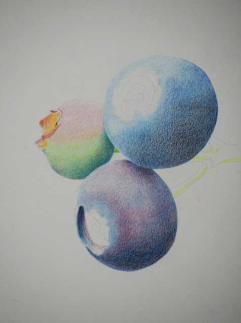
This is how it looked after the last post.
Using the same limited 6 color mixing palette, I continued to add darks to the shadow areas. I added more dark to the upper left blueberry and to the left pink and green blueberry.
Remember that Peacock Blue and Scarlet Lake make a good dark (and you can add Copenhagen Blue or other colors as needed) . Vary the ratios to vary the color - if you need it to be a dark blue lean it toward blue. If you need it to be a dark red lean it toward the red.
On the bottom left blueberry I started adding the center part using both blues and both reds. I am still working on the center. I also deepened the color on the blueberry and darkened the darks using both blues and both reds. I lifted as needed using an eraser, gently, like shading a light area with a pencil.
I used peacock clue and yellow chartreuse to make green on the stem. I used both reds on the red part and overlapped the reds and green a little. I mixed the red and green to make the darks as well. I used an eraser to lift a little light.


