2/21/21

GNSI-C Fun with Fur, February, 2021, Watercolor and White Gouache, Cow


Step 1.  I wet the paper and covered it in a medium version of the fur color.

Step 2.  After its dry, I used the color and several darker versions of the color to add some darks.  I'm using some negative painting.  This step helps me see the shapes better.

Step 3.  I added more darks on the front pieces of the fur.

Step 4.  I added more darks and a few stands of white with the white gouache.

Step 5.  I added layers of white gouache to make strands of light hairs.  I also continued to add darks, especially some in thin lines for some of the hairs.  This is in process and would need more time looking and refining the shapes, values, and textures.

GNSI-C Fun with Fur, February 2021, Mixed Media, Zebra

Step 1.  Wet the surface and drop in color.  The paper needs to be wet enough that the color moves,  I used a mixed red brown (burnt sienna will work), ultramarine blue (cobalt will work), and mixed brown (neither a red or yellow brown, burnt sienna with a little blue will work).


Step 2. After it's dry, I wet the stripes and added a dark blue (something like indigo, indanthrene blue, anthraquinone blue or phthalo blue mixed with a little yellow and red will work).  I dropped in the red brown in a few areas that are warm.  I wet the ear and also added some color to the ear.  I wet the mane and added some color there as well.


Step 3.  After its dry, I added black ink.  When I add the ink I can render it loosely as I have done here.  Or I can add it in a tighter more controlled fashion.  Either will work for this subject.

Follow the direction of the fur.


Step 4.  I then added the white ink using it in particular for breaking the straight dark edges of the stripes and mane. 

Follow the direction of the fur. 

Sometimes I finish the mixed media with the pen & ink, which would work great for this subject.  But, since I wanted to also show some colored pencil I will move on to the next step.

Step 5.  I started adding colored pencil.  I used white, black, burnt ochre, ginger root, true blue, Spanish orange.  I used it to soften some of the areas, add more texture and values.  I also started adding some details.  This is far along but not completed yet.  The end of the process is mostly looking and making adjustments.  It takes time.


2/16/21

BAL Painting and Drawing with Watercolor Pencils, February 17 and 24

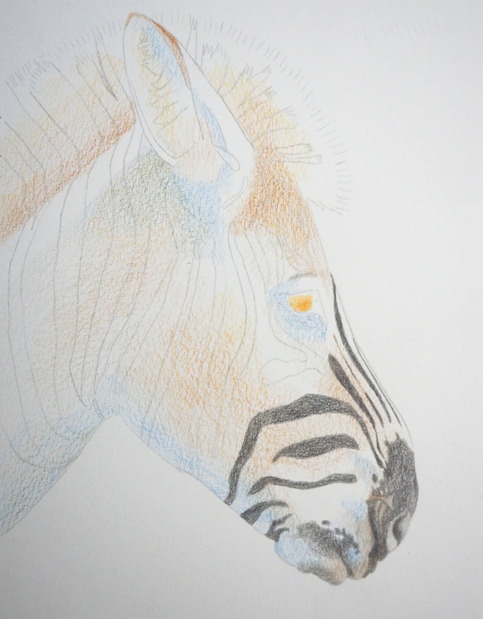
I started lightly shading with Burnt Ochre (reddish brown) and Dark Chrome (warm yellow).  I shaded these colors lightly and loosely around the zebra.  I added Chrome yellow heavily in the eye.  Don't be concerned if you do not have the exact colors. We could change these colors if we wanted.  We could make a zebra with purple and green undertones.

Using Warm Grey V (a medium dark warm gray) and Warm gray II (a light warm gray) I started adding the stripes and the muzzle (I finished adding the stripes before going on to the next layer, I wanted you to see the zebra with and without the stripes in one photo).  I also started lightly adding Pthalo Blue (a green blue blue). 
 

I added black and Raw Umber (yellowish brown) to the color palette.  I added black to the stripes and also added pthalo blue in some areas of the stripes and burnt ochre in other areas of the stripes.

I wet the front part so that you can see where this is going.  I left the back part dry pencil so you can see how different it looks once water is added.

I added white to the palette.   I wet the back half and realized I forgot to continue shading the ear, oops.  After the back half was dry I used more of the same colors adding textured and detail as well as some form.  I am shaping the zebra and I am adding the fur and mane texture.  I used the white to lighten areas and to add fur and mane texture.

This is where I catch the ear up to the rest.  I shaded the ear (using Burnt Ochre, Warm Gray V, Warm Gray II, and Chrome Yellow) and then added water. 

After the ear was dry, I used an eraser along with White, Black, Burnt Ochre, Warm Gray V to add the various hair texture and to shape the ear.  

So at this point the zebra could be finished.  But I will continue refining the values and details.  

Even though I like this with a white background, I have added a background so that you can see how that looks.  I will post those photos before next class.

I will go through all of this and more step-by-step over both sessions of this class so that it will make more sense. 


2/1/21

NCBG Drawing and Painting with Watercolor Pencils, Short Course, Jan. 30, 2021


WIP.  This is the demonstration leaf that I started in the workshop as a drawing with no watercolor pencils added before class. I used this to show you how to add the pencils and then wet them after the watercolor pencil layers were on the leaf.  I have not started detailing and refining this yet.  I started adding values on the upper left side.  I demonstrated sanding, so I re-wet the upper right side and using a small metal strainer I scraped the watercolor pencils in the strainer to get a fine spotted texture on the leaf.  And of course on the top background you can see where I dropped my paintbrush and it rolled.


WIP. This is the last photo from the previous post below.  This photo is of the leaf I worked on before class to get it part of the way finished and used as an example and for demonstration during class.  I wet the right side and left the left side un-wet so you could see the difference. 

 
WIP.  This photo is of the leaf I worked on before class and also demonstrated on during class.  I demonstrated wetting the watercolor pencil on the left side during class.  I demonstrated adding more darks and darker darks using a black pencil.  I demonstrated lightening areas and adding highlights with the white pencil.  I demonstrated adding more color in areas as needed. I demonstrated adding details and refining (especially edges).  There are still areas that need the darks, lights, highlights, refining, and details.

1/30/21

NCBG Drawing and Painting with Watercolor Pencils, Short Course, Jan. 30, 2021

Step 1- add yellow.  I used a mid yellow ( FC Cadmium Yellow 107) and a cool yellow (FC Light Yellow Glaze 104).  

I shaded the colors using the photo as a guide.  The mid yellow was added on the leaf and the cool yellow was added to the stem and some vein areas.  I used the side of a sharpened pencils to lay down the pigment.  I varied the pressure and amount of layers according to how much pigment I wanted to add to each area.

Step 2 - more yellow.  I used a warm yellow (FC Dark Chrome Yellow 109).

I shaded the colors using the photo as a guide.  I used the side of a sharpened pencils to lay down the pigment.  I varied the pressure and amount of layers according to how much pigment I wanted to add to each area.

Step 3 - add orange.  I used a orange to add more warmth (FC Dark Cadmium Orange 115). 

I shaded the colors using the photo as a guide.  I used the side of a sharpened pencils to lay down the pigment.  I varied the pressure and amount of layers according to how much pigment I wanted to add to each area.

Step 4 - add red.  I used a warm red (FC Pale Geranium Lake 121).

I shaded the colors using the photo as a guide.  I used the side of a sharpened pencils to lay down the pigment.  I varied the pressure and amount of layers according to how much pigment I wanted to add to each area.


Step 5 add more red.  I added a cool red (FC Magenta 133).

I shaded the colors using the photo as a guide.  I used the side of a sharpened pencils to lay down the pigment.  I varied the pressure and amount of layers according to how much pigment I wanted to add to each area.

Step 6 - add green.  I added a yellow green (FC Light Green 171).  This mostly was added to the stem and some veins and a few other small areas on the leaf.

I shaded the colors using the photo as a guide.  I used the side of a sharpened pencils to lay down the pigment.  I varied the pressure and amount of layers according to how much pigment I wanted to add to each area.


Step 7 - add more green.  I added a muted green (FC Earth Green Yellowish 168).  This mostly was added to the stem.

I shaded the colors using the photo as a guide.  I used the side of a sharpened pencils to lay down the pigment.  I varied the pressure and amount of layers according to how much pigment I wanted to add to each area.


Step 8 - add brown. I added 2 browns, one dark brown (FC Walnut Brown 177) and one orange brown (FC Burnt Ochre 187).  The dark brown was used to add shadows and the orange brown was used mostly to add color 

I shaded the colors using the photo as a guide.  I used the side of a sharpened pencils to lay down the pigment.  I varied the pressure and amount of layers according to how much pigment I wanted to add to each area.

Step 9 - wet the pencil. Using water to wet the pencil on the right half of the leaf and the stem and front leaf so that you can see the difference between the wet and dry pencil.


NCBG Drawing and Painting with Watercolor Pencils, Short Course, Jan. 30, 2021


This is the Fall Rhubarb Leaf that I have been working on.  It's almost complete, about 90%.  I'm looking at it often and making small adjustments here and there.  That is my process at the end of a piece.

1/9/21

CPSA DC 114 mini workshop Jan. 9, 2021

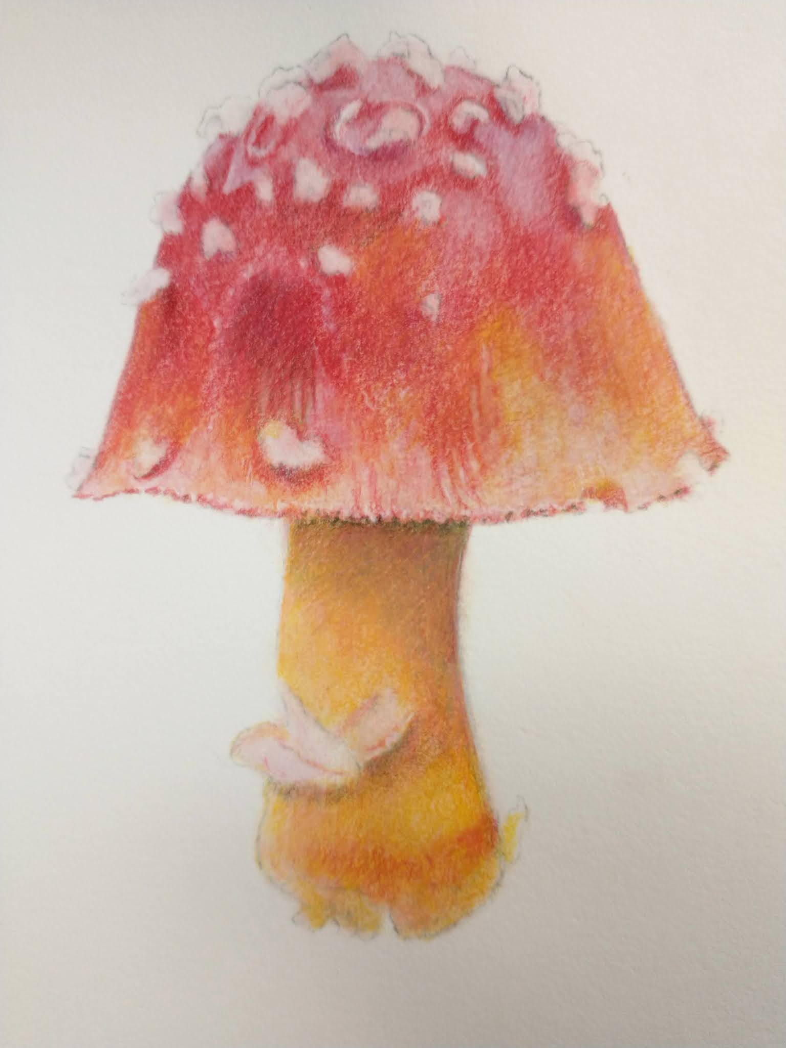
This is one of two ways I start these pieces when using a solvent as the under drawing.  For this process I apply the pencil lightly in layers and then dissolve and blend it and then finish with the colored pencil in layers.  

Step one, lightly shade the colored pencil layers.  This layer has a cool red (pomegranate) and a warm yellow (spanish orange).

A reminder that these are photos taken at different times of day, so the color and value are not 100% correct.


Step 2 add more layers, I added a warm red (scarlet lake) and more of the warm yellow and cool red.


I used the Rubbing Alcohol on half so that you can see what that looks like.


I finished the other half with the Rubbing Alcohol.


Using the same colors I added more layers and used the Rubbing Alcohol a second time.


I started on the layers after the solvent using colored pencil to add color, value, and detail.


I started adding a background by adding layers and by painting on and splattering dissolved colored pencil.


I used more colored pencil to add additional details and values.  This is still a work in process.  It will be completed after more color, value, detail, and refining on the mushroom and in the background.


This is colored pencil that has been dissolved/melted by rubbing alcohol.  I do not usually keep it in jars.  I did this for demonstration purposes.


This is one of two ways I start these pieces when using a solvent as the under drawing.  For this process I apply dissolved colored  pencil in layers and then finish with the colored pencil (non dissolved) in layers.

Step one, paint with dissolved colored pencil.  I dissolve the colored pencil in a small container (I use jar lids) with the solvent and tiny grated/sanded colored pencil pieces.  It looks like paint. This layer has a dissolved cool red (pomegranate) and a dissolved warm yellow (spanish orange).

A reminder that these are photos taken at different times of day, so the color and value are not 100% correct.


I added a dissolved warm red (scarlet lake).  This needs a layer or two more and then the process would continue with layers of undissolved colored pencil. And at some point I would add a background.


This is a photo of the entire page.  I signed it, but am still picking at it a bit.  It's mostly done.

This is a close up photo.


12/14/20

NCBG IEW Nov. & Dec. 2020


At home I finished adding the masking to the mushroom tops.  I added dots and whole areas of masking that I gently rubbed after the masking was dry.  These two masking techniques can be used to create texture and they help soften the side that needs to be softer.  

I started adding light washes of color to the mushrooms.  I started with warm yellow (Spanish orange) and warm red (pyrrole scarlet) plus purple blue (ultramarine). I added a second pass of washes on the middle mushroom.  I did this before class for drying purposes and to speed the process for the demonstrations. 


I used water and a brush to go over the entire background to subdue the texture.  Often the textures created are too distracting and using  water and a brush or some glazing is needed to push them back. 

I mixed a dark (the 3 primaries) and wet an area and added a shadow.  I used the dark to also attach the base of the stems to the ground. I made marks and added some brown to the bottom of the mushroom stems to ground them.  I will add a few darker darks at the bases of the mushrooms in the shadow areas at some point.  

I demonstrated the light washes of color (warm yellow, purple blue, warm red) to the mushroom and the stems (orange, warm yellow, and red).  I used a dark brown ( the primaries leaned towards red and yellow) to start adding some details and shadows to the mushrooms.  I used the dark from the shadow to add shadows and details as well.  More refining still needs to happen.  

I removed the masking.  I used a brush and water and a paper towel to soften any unwanted hard lines made by the masking. 


12/3/20

NCBG IEW Nov. & Dec. 2020


Texture made with wax paper.  I wet the watercolor paper, dropped in color, crumpled the wax paper, placed it over the wet paint, and placed something to hold it down until it was dry.


Texture made with plastic wrap.  Wet the paper, drop in color, place the plastic wrap on the wet paint, and scrunch and/or twist until you make interesting shapes.


Sanding texture made with watercolor pencils and a strainer.  Wet the paper and drop in some color if you wish (i added some yellow). While this is wet, color watercolor pencils on a strainer over the paper so the tiny pieces fall and make a spotted texture.  The yellow wash area and to the left of it is a place where I sprayed water to show what too much water can look like. The right side and along the top is the way it can look.


This is the start of the mushrooms using salt as the texture.  I wet around the mushrooms and dropped in dark color (you decide on the color and how dark).  I used both table salt and larger sea salt.  You can see the differences in size.  Add the salt when the paper is shiny, but not puddled..  I will most likely be adding more color and glazing this as it will be too distracting as is.  I also started adding masking fluid on the mushrooms (the gray stuff on there).  I will finish adding it before class.  


Before class I did a small part of the branch with a mixed dark gray color (the 3 primaries leaned toward blue).   I also started adding a light blue, like a glaze (ultramarine) to the petals.


I worked on more of the branch with the mixed gray (warm and cool red since plus warm yellow plus green blue), I glazed parts of it with blue and yellow.  I still need to adjust the values on the branch a little.  I added more ultramarine blue to the petals as well as some of the gray from the branch (but lighter).


Colored pencil (work in progress) over a dark watercolor background (that was another painting covered in dark color)

White gouache (work in progress) over a darkened watercolor painting of the artichoke.


The artichoke before I added a red glaze

The artichoke after a red glaze was applied to the background and the start of some edges being cleaned up.