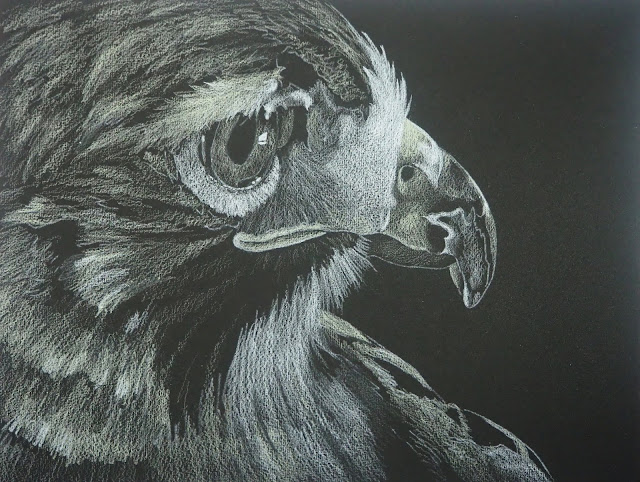
This is the one I worked on during class with the white and the cream.
This is the one I worked on before class with the white and the cream. This is the under-drawing. There are a few areas that will need to be changed which is usual at this point.
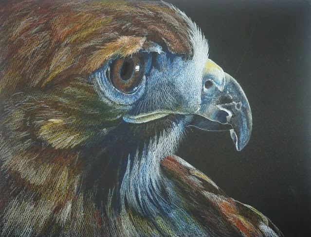
This is the one I did before class with color shaded over the white and cream. I used Copenhagen blue, terra cotta, burnt ochre, Spanish orange, and dark umber plus a little black near the eye. You can see in the pupil that the black pencil spot is darker than my paper.
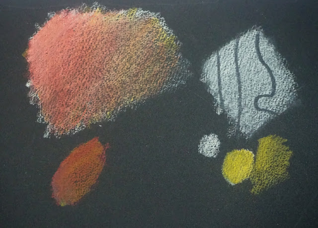
This is the mixing, blending, lifting, and erasing I did before we started the hawk. The places where the texture does not come through were from the colorless blender (which I would not use until the end or close to the end of a piece).


