9/8/16

C & C Class (acrylic)

We started with a value study approach for the first pass (green only). 

This is almost complete.  After the initial value study we used white as well as darks to accentuate the values.  We added color washes such as yellow and some red.  And we added the details.  This needs a tiny bit of refining, but it is very close to complete. 

We started by wetting the background and dropping in paint to create the background texture.


We did a wash over the background texture.  We painted some local color on the pea flower and leaves.  We used white for highlights and mixed a dark for the flower.  It needs more value and color work and then details on the flower and leaves.

The under-painting for the pelican.  We worked upright and used very wet paint.

The under-painting for the Camellia.  We worked upright and used very wet paint. 


9/2/16

Past classes

Done in a class awhile ago.  Worked on it some more.  The medium is colored pencil on Dura-Lar Matte.  Placed behind it is a watercolor and colored pencil texture painting on watercolor paper.  There is a white paper in the shape of the owl behind the owl so the background texture painting would not overpower the owl.

Done in a class awhile ago.  Gouache is the medium.  The white gouache is painted over a textured gouache and watercolor background.

Continuing Watercolor - August, September, October 2016

Paint with the painting on an incline.  Wet the paper, drop in the color.  (the colors here are a bit muted, this was taken with my phone in poor light)

Work on dry paper, paint glazes of yellow and drop in some red, again on an incline.

Paint in an incline.  Start with dry paper.  Make very wet and light colors, paint loosely.  Use a limited palette.

Again working on an incline and on a dry surface, add ore very wet and light color paying a bit more attention to the subject.

Again on an incline.  Using a little more pigment, start working on the pelican.  You can allow drips to happen or not, up to you.

8/25/16

Wakefield Vet Class August, 2016

Worked on the ear and around the face a bit more.  Also did a little more to the background.  It's not complete, but getting closer.  Remember - concentrate on the values, the lights and darks.  Color is secondary and can be changed.  Color is up to artistic interpretation, the values are the foundation/structure.  Also, to get white hairs on white paper to show up requires negative drawing.  What is put behind the hairs will shape those hairs and make them show up.  

8/18/16

Wakefield Vet Class August 2016


I painted the leaves and stem with watercolor.

I worked on this outside of class adding color, value, and detail.  It still needs more darks and a few more details.

Using colored pencils I started working on cleaning up edges, darkening the background and adding detail and form to the cat.  It has a lot of work still needed to finish.  I am using colored pencil to darken the background, but I could also have darkened it with another layer of watercolor.  Colors used - white, pomegranate, scarlet lake, canary yellow, black grape, black and a tiny of true blue on the cat and dark green, indigo, true blue, and canary yellow on the background) 


8/11/16

Wakefield Vet Class August 2016

I started adding darks and will continue to add darks as well as details.

Watercolor under painting.  I painted the flower with the pink and dropped in some blue.  After this was dry, I wet the background and dropped in paint and added water and helped it move.

I wet the background and dropped in paint.  I added a little paint onto the cat and softened the edge of the cat.  I might need to darken the background with a second round of paint.  If I do this I will post it again. When using watercolor in this manner, wet the background and drop in the wet paint and allow it to flow.

7/20/16

Wakefield Vet Class July 2016


I worked on this more with color (used red, yellow, blue and orange as well as a few areas of white) and then started adding the darks with black and black grape.

Wakefield Colored Pencil Class July 2016

White colored pencil, value study, on dark gray mat board

7/19/16

Wakefield Colored Pencil Class July 2016

Colored pencil on off white mat board.  I transferred the drawing and then started lightly shading in colors.

I shaded in more colors and started adding the values.  I also worked on the eye quite a bit.  It needs more values and of course more detail (I can show you this next class).

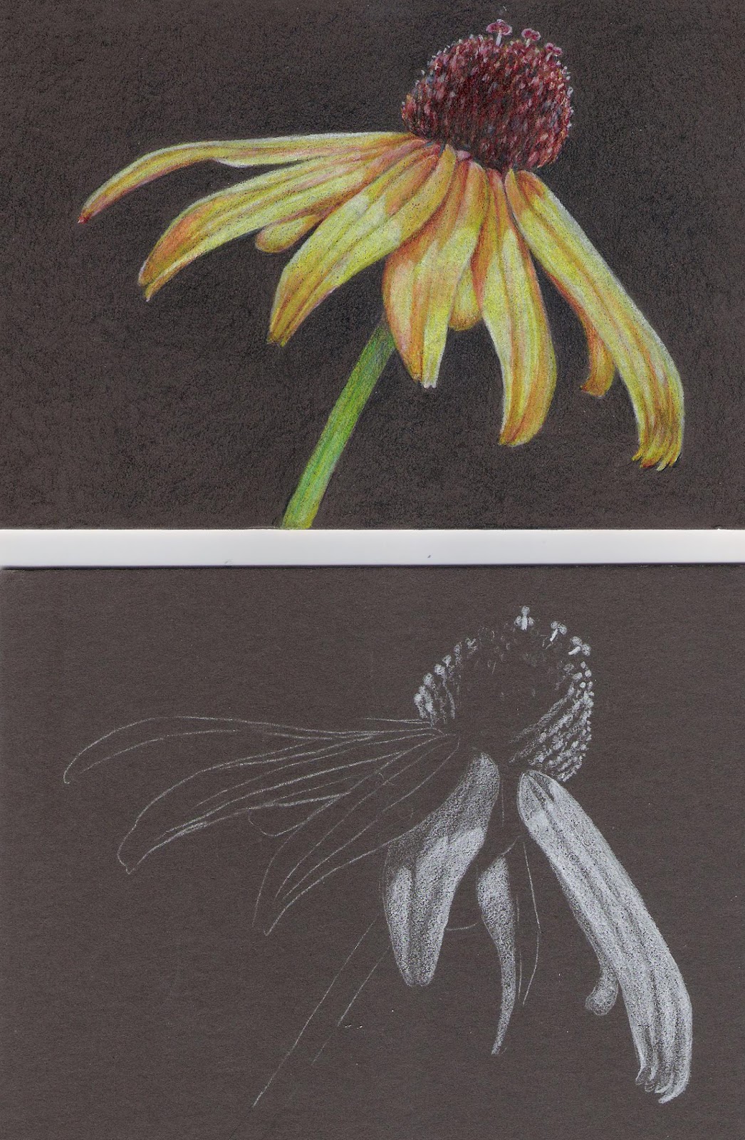
Colored pencil on dark gray mat board.  I transferred the drawing with white transfer paper.  The top is a finished flower.  The bottom is the start.  I usually start on a dark surface with white first.  I dd a white value study and then layer the color and detail later.

Colored pencil on off white mat board.  Same process as the emu above, just not very far along.

7/17/16

Wakefield Colored Pencil Class July 2016

View from the black side after adding color on the color side.

Color side - I have added canary yellow, pomegranate, and true blue, often layering to mix colors, to the fish on the color side.  It needs a tiny bit more work - refining and adjusting.

7/12/16

Wakefield Colored Pencil Class July, 2016

I added more black texture and values (light to dark) as well as details to the fish on the black side.  I also then added some white in the lightest areas.


This is the color side.  I added some white in the lightest areas to this side as well.

7/8/16

Wakefield Colored Pencil Class July, 2016

Colored pencil on Grafix Dura-Lar Matte.  This is the black side.  We used a black colored pencil and shaded the values of the fish.  This of course is not finished.

This is a view from the color side.

The process so far:  On the Dura-Lar we marked each side in the bottom right corner.  One side was color and one side was black.  We put the Dura-lar over the drawing, color side up. We traced the drawing with a #2 pencil.  Then we flipped it over and shaded on the black side with a black colored pencil.  This is a value drawing.

7/5/16

NCBG Gouache June 2016

I have added taxture to the mushroom and bottom ground.  I will continue adding texture, adjusting values and details, etc. until it is complete.

6/21/16

NCBG Gouache June 2016


I added a little blue and a few details.

This is the white gouache on a dark watercolor background.  It's a value study of light on dark, very good practice.  You can leave it as is or add color.

On textured backgrounds I most often start with white and then the darks. This helps define the subject on the textured background.  

I continue adding lights and darks and getting the first pass on all the shapes.  I start adding color, moving it around to keep balance.

More color, more values.  I also added a tiny bit of green to darken the background next to the mushroom (to push it back).  I started adding some detail and texture, as that is the next step along with continuing to define and refine.

This is the start on a different textured background.


6/16/16

NCBG Gouache June 2016

Wax paper texture - Wet paper, drop in watercolor, put crumpled wax paper on surface and a book on top until it's dry.

Salt texture - Wet paper, drop in watercolor (or gouache or acrylic), add salt when the paper is shiny, but not a puddle.

Salt and rubbing alcohol texture - Wet paper, drop in watercolor, add salt when the paper is shiny, but not a puddle.  Drop on alcohol when the paper is still wet.

Plastic wrap texture - Wet paper, drop in watercolor, put plastic wrap on paper and scrunch it to make the texture.  The dark blue marks were made because I started adding color without wetting the paper first...

Plastic wrap texture - Wet paper, drop in watercolor, put plastic wrap on paper and scrunch it to make the texture.

Wet paper and drop in color and let it move.

Bubble wrap texture - Wet paper, drop in watercolor, put bubble wrap on paper and put a book on top.

Toothbrush splatter texture - Dry paper, dip toothbrush in watercolor, use your finger to scrape the bristles causing a splatter.

Wet paper, run the color around in a pattern.

Dark background - wet paper and paint the paper yellow (you can try other colors too).  Let it dry.  Mix a dark and paint it over the yellow.  You can leave it as is to dry or spray it with a fine mist spray bottle.