8/2/18

BAL CP July 2018


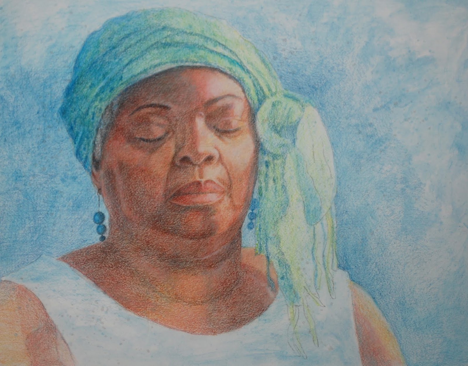
I continued with white, light peach, terra cotta, dark brown, black and scarlet lake refining and detailing the skin and clothes.


This is the black and white side with a little color added on the color side.

The color side.  I used aqua and true blue for the blue green areas plus denim blue for a little purple blue.  I used peach, terra cotta, spanish orange and dark brown on the face of the bird.

On a piece of watercolor paper (student grade) I traced the outline of the birds.  I colored the background with orange and red watercolor pencils and then used water and a brush to melt it.  i could also have used colored pencil and rubbing alcohol.  I made still add some colored pencil to this before I am done.

This is how it looks with the background sheet behind the birds.  Nothing is finished yet, but you can see the idea and hopefully get some of your own.

DAC CP July & August 2018

I worked more on the white of the egg in the middle and along the left bottom edge.

Color side.  I erased some color ( as a demo on how easy it is to start over) and added another section of color.

Black and White side

The first pass of color using black grape and accidentally peacock blue although the blue will be a nice addition later.

Added more peacock blue, especially to the clothing. For this addition of peacock blue I uses a small strainer to add bits of pencil to a container and added a little rubbing alcohol to make something like a paint with the pencil.  Painted it in the areas I needed it to go on her clothes and face.  Added a layer of skin color using terra cotta, dark brown, light peach and white.  Melted this second layer on the face.  I have more melting to do on her clothes.

Started working with white, light peach, terra cotta, peacock blue and dark brown on her skin to refine and detail.  I do not pan to melt again. Worked mostly on the light side of her face so far and a little in the shadows.

7/25/18

BAL CP July 2018

Colored pencil on watercolor paper using rubbing alcohol as a solvent to melt the first several layers of pencil.  I have started refining and detailing the face on the right side with the colored pencil.  I am focusing on values mostly and then color.  I also worked some of the head scarf, earrings and background.

Colored pencil on Dura-Lar Matte paper.  This is the black and white side.  I am shading with the black pencil (and have more feathers to add...).  Remember to use you eraser to smooth the pencil and adjust the values.

DAC CP July & August 2018

Colored pencil on UART dark sanded pastel paper.  I added lots of white to the dark side of the cat (could have left the paper showing through for the shadows).  I did this to show how to add color and darks back into the white.  I am still working on it, but it's getting there.

Colored pencil on Strathmore Toned gray paper.  I worked on shadows on the white part of the egg and highlights on the yolk.  It's getting there, but needs more work.

Colored pencil on Grafix Dura-Lar Matte paper.  This is the black and white side.  Instead of black and white I chose indigo and white to do the values on this side.

This is the color side.  I just started adding the color.  So far I have used pomegranate and spanish orange on the flower and grass green on the leaves. I added some canary yellow to the one leaf as well.  This is barely a start to the color.  Remember to use your eraser to smooth the pencil and adjust the values.

This is the view from the black and white side after some color was added.

7/20/18

BAL CP July, 2018

I added more white, some dark and some color onto the dog.  Worked on the cloth and tag and collar.  It needs some refining still, but it's getting close to complete.

Colored pencil on watercolor paper (hot press 140 lb.).  I started with a melted under drawing.  I started this with peacock blue as a light value study.  I melted the pencil with a solvent and a brush(in this case rubbing alcohol 91%, 70% will work as well).

I added scarlet lake all over the skin and a little spanish orange to the light side of her skin.  I added canary yellow to the light side oh her head scarf.  I melted with rubbing alcohol again.  I also melted some of the peacock blue in the lid of a jar and then painted it on the background and her clothes.

I added more scarlet lake and spanish orange and melted again.

I started using light peach, white, scarlet lake, and black grape over the top (barely got started before class ended).  I do not plan to melt this layer and will do more next class.

7/18/18

DAC CP July & August 2018

Colored Pencil on UART dark Sanded pastel paper 800 grade.  I used a stiff brush to work the colored pencil into the paper in a few areas to show you how that looks.  I added some more white in a few areas.  I started adding whiskers.  I still have some lights and darks and details to add, but it's getting close to complete.  At the end I will use the poster putty to clean up the background areas.  I have the option of adding a color to the background or using a black or dark gray if needed.  After it's cleaned with the poster putty I will spray it with workable fixative.

Colored pencil on Toned gray Strathmore Paper.  The first step was to shade white over the entire egg (yolk too).  I did this lightly and made sure I did not lose my drawing.  I then shaded canary yellow over the yolk and parts of the egg white. I then shaded spanish orange over the egg yolk as well.  I used crimson red on the darkest part of the yolk and scarlet lake over most of the yolk. I made a gray with scarlet lake, true blue and canary yellow for the shadow under the egg white (there is more blue in the shadow so it is gray).  I made a brown color for the shadows on the egg white using the same 3 colors and white (there is more red and yellow in the shadow so it is brown).  I need to make more of the shadows on the egg white to make the bubbles as it cooks, I will show it again next class.

I worked more on the yolk adding more of the reds and yellows.  I started adding white for the highlights (there are more I will do next class).  I also started adding more of the mixed brown to the white part of the egg.  I added more of the shadow under the egg white and added some of the grease spots from cooking.  I will demonstrate more on this next class.

7/15/18

DAC CP January & February 2018

Colored pencil on mat board.  I worked on this over a period of time adding more layers, adjusting the values, and refining and adding detail.  

7/12/18

BAL CP July 2018

Colored pencil on UART dark sanded pastel paper 800 grade.  This started with all white and a focus on the values in white.  I work lightly building up in layers.  After there was enough white we added some color.  I used terra cotta (sienna brown or burnt ochre will work as well) and true blue.  I used more white and some black to adjust the values. On the eye I did a little white, some terra cotta (sienna brown or burnt ochre will work as well) and then black and white to adjust the values and color on the eye. The body needs lots of work as does his scarf and collar (have not done much on those).  His head needs a little refining and detailing.  I will continue demonstrating if needed next week showing you more detail and refining.  

7/11/18

DAC CP July & August, 2018

Colored pencil on UART dark sanded pastel paper 800 grade.  This started with all white and a focus on the values in white.  I work lightly building up in layers.  After there was enough white we added some color.  I used pomegranate and spanish orange plus more white on the ear (especially on the hair textures of the ear).  I also used a little black grape on the dark edge of the ear (the line).  I used true blue, pomegranate and a little spanish orange on the shadowed part of the cat as well as more white (especially to start making the fur textures).  I added some pomegranate on parts of the face, inside the eye (not the eyeball), and nose plus more white.  I used blue and black grape on the black spot.  On the eyeball I used a little white first, some spanish orange and some black grape plus more white on the front edge and light area in the eye.  I used indigo on the pupil. I will continue demonstrating showing you the detail and refining. 

6/28/18

Art & Ale Colored Pencil

I continued working with white, oranges, yellows, terra cotta, and black to punch the values and color.  I added the whiskers and spots.   This has a little more work, but it's getting close to complete.  Remember when you are close to done - set your piece up where you can look at it over a few days and make tweaks to it as needed. 

Our tigers from the Art and Ale class.

NCBG BCP June 2018

I worked on the upper leaf.  It needs more work, especially on the top part, but it is well on the way.  I used white, peacock blue, canary yellow, and grass green.  

I started working on the left side of the branch using the 3 primaries, mostly used red and yellow in light layers.  I made the dark part of the branch mixing the 3 primaries with a lot of blue in the layers.  The light line in the middle of the dark branch was lifted with the scotch tape method Ellie shared with us from a class with Linda K. (thanks Linda and Ellie!).  I also showed using the stik tak/poster putty to help get the smooth gradations/transitions and to lighten and soften edges.  I use the stik tak a lot while drawing.  I made the blueberries with light layers of color mostly using the carmine red and true blue.  I used a stump during the process to blend and then the colorless blender towards the end on the bottom 2 berries and the dark branch (I do not use the colorless blender often).

6/21/18

Art & Ale Colored Pencil June 2018

I added a little more white in between classes.

After the white I put canary yellow all over the whole piece.  Then I started adding orange (pale vermilion mostly, could also use cadmium orange hue).  I used terra cotta on the shadows on the orange (could also use burnt ochre or sienna brown).  I added more white to the white areas and started adding some fur texture with white.  I added more orange to the orange fur areas and also some scarlet lake in some more red-orange areas (could use crimson red).  I started adding the black marks and some black to the terra cotta shading.  For the nose I had white first, carmine red and then more white shading it lighter near the nostrils.  I then added more carmine near the top edge of the nose.  For the eye I started with white and then canary yellow.  Then I added spanish orange.  I then added orange (pale vermilion or cadmium orange hue) around the edge of the eye and a little green and yellow in the middle.  I then added the black pupil.  I put a shadow with terra cotta (or burnt ochre or sienna brown) on the top part of the eye to create the shadow under the eyebrow.

NCBG BCP June 2018

I did some more white in between classes. More still to do.

I started adding color.  For demonstration purposes I have worked more on some small areas when normally I would work on the entire piece and finish it as a whole.  I used canary yellow, peacock blue, grass green and white on the leaves. first I layered the entire leaf, even the white highlight, with yellow.  next I layered the leaf with peacock blue avoiding the highlight areas.  I then used grass green and did also carefully go over the highlight areas. I layer these colors until I get good coverage.  I used extra yellow on the middle vein of the leaves to get the yellow green.  I then use white to shape the highlights, stems, veins and edged.  I use peacock blue yellow as a shadow.  Remember the gradate shadows and highlights.  Scribble to get texture.  The brown stem/branch was made with white, yellow, and red (either or both reds, crimson or carmine, will work).  I used white for highlights and a little extra blue (true blue I think?) for the shadows. For the flower I used both reds, more white and a little yellow on the red parts.  The part above/around the red I used grass green, canary yellow and carmine red plus white.  The main thing is work in light layers and build your color and value.  Pay attention especially to the values.

I started this with carmine red gradating as I moved toward the white.  I used a stump to blend.  I added true blue to make the purple areas and added crimson red and true blue plus a little canary yellow in the darker area of the berry.  I have a little more work to do to refine this one.  I used peacock blue and started adding a background so the white of the berry will show up.  We will go over this piece more in the next class.  Just try one berry this week.  Don't use white, use the white of the paper and your stik tack and eraser to help.

6/15/18

Art & Ale CP June 2018

I worked more with the same colors we have been using.  I demonstrated how to soften areas using white and then color.  We discussed values and how important they are.  Remember for demonstration purposes I am working in a small area.  Typically I work all over the piece bringing it up to completion as a unit.

Working on a dark surface.  I almost always start with white (or sometimes cream).  I do a value study, a reverse of the value study you would do on white paper with a dark pencil.  Use the stik tak/poster putty along with your pencil and eraser to get the values you need.  Work lightly and build up in layers.  For the eye I used white and yellow.

NCBG BCP June 2018

I worked more with the same colors we have been using.  I demonstrated how to soften areas using white and then color.  I demonstrated how to lighten an area or change the color using white and then color.  We discussed value and how important they are.  Remember for demonstration purposes I am working in a small area.  Typically I work all over the piece bringing it up to completion as a unit.

Working on a dark surface.  I almost always start with white (or sometimes cream).  I do a value study, a reverse of the value study you would do on white paper with a dark pencil.  Use the stik tak/poster putty along with your pencil and eraser to get the values you need.  Work lightly and build up in layers.

6/13/18

DAC MM April & May 2018

Did some refining of values and details.

6/7/18

DAC Mixed Media April & May 2018

I decided to keep lots of blue.  When I was showing you all the skin color I thought it looked neat with most of it staying blue.  I worked on letting things gradate out from her face - the colors and values and details.  I will now spend time looking at this and making minor adjustments if I see things that bother me.  That's how I spend the last bit when finishing my work.

Art & Ale Colored Pencil

Colored pencil on Strathmore toned gray paper.  I started this with indigo blue and white concentrating on the values (lights and darks). I worked with light pressure using the side of the sharpened pencil.  Keep it light for subsequent layers. 

I used canary yellow and lightly shaded the stem/stalk and a tiny bit on the triangle leaves/scales (using the side of the sharpened pencil) .  I used crimson red, lightly, on the triangle leaves/scales and the top part (crown).

I worked on a small middle section of the stalk/stem using grass green.  Then I used all 4 of the previous colors, layering it adding color and value.  Remember, for demonstration purposes I only worked on a small section (rather than the entire piece as I typically do).  The slight variation in the paper and pencil color is due to the photographs being taken with different cameras in different lighting.  Next class I will work on the triangle leaves/scales and the top (crown).

NCBG Beginning Colored Pencil June 2018

Colored pencil on Strathmore toned gray paper.  I started this with indigo blue and white concentrating on the values (lights and darks). I worked with light pressure using the side of the sharpened pencil.  Keep it light for subsequent layers. 

I used canary yellow and lightly shaded the stem/stalk and a tiny bit on the triangle leaves/scales (using the side of the sharpened pencil) .  I used crimson red, lightly, on the triangle leaves/scales and the top part (crown).

Using all of the previous 4 colors plus grass green, I worked on a small middle section, layering it adding color and value.  Remember, for demonstration purposes I only worked on a small section (rather than the entire piece as I typically do).  The slight variation in the paper and pencil color is due to the photographs being taken with different cameras in different lighting.