5/28/15

Exploring Abstraction (May and June 2015)

This is caulk added with no squishing using my doodle shapes.  Caulk can be put on paper, cardboard, canvas, foam core, masonite, etc.

Caulk added to cardboard in diagonals and then scraped.

Caulk added with my hand to create the texture.

Caulk added thickly, pressed with my hand, and scrapped with a tool with a serrated edge.

This is the caulk texture I did at home and was dry for class.  I added very wet acrylic.  If I was going to work in watercolor I would paint this with absorbent ground first and then use watercolor.

This is the composition I drew based on the magazine clipping.  I have added some more color and value.  I splattered some white.

This is the rubber cement abstract I have been working on at home.  It has a ways to go.

This is the rubber cement from class.  I added a second pass of rubber cement squiggle and brush marks and then added yellow paint.
Acrylic Skins.  I did these on freezer paper.  I had to leave these at Sertoma (way to wet to take home).  So this is a photo of it wet and after it had run together a bit.  The bottom white shape will be clear with blue lines and yellow dots.  The white up higher is white paint.  Anyway, make batches of these both transparent and opaque.  For transparent skins use polymer medium, matte medium, pouring medium, or etc. (something that dries clear) and add dots of color into the mediums and move it around.  You can also make opaque skins with paint colors.


This is the entire wax paper texture with the marker at the top.  I think marker will work well on this piece.

This is a close up of the wax paper texture with black marker.  For class I used Sharpies, but on my art I use good drawing markers such as Micron Pigma, Faber-Castell, etc.


Strawberry Exercise

This is the drawing.  The paper is toned gray drawing paper (Strathmore).  I used Dick Blick colored pencils for this (Bordeaux-Red, Yellow, White, Prussian Blue).  I could also have used Prismacolor colored pencils as well (Pomegranate, Canary Yellow, White, True Blue or Copenhagen Blue)

This is after 2 steps, one with White and one with Prussian Blue.  

Here I added Yellow.

I added Bordeaux-Red on the berry and into the leaves.  I also added a little blue into the strawberry (to make a wrinkle)

I used all 4 colors to refine the strawberry.

Colored Pencil Exploration (May and June 2015)

This is the black and white side of the Dura-Lar.  I have added more color on the color side, refined some of my shadows and highlights, and started to do a bit on the black and white side on the background (need to do the plate as well...)..

This is the color side.  I have of course added more color - I have used an orange, Bordeaux-Red, Yellow, and a little Prussian Blue.  It still needs more color.  I apply the color lightly and in layers.  At the end I ad it more thickly.

This is for a background.  I transferred the drawing to white paper (I use white drawing paper, watercolor paper, mixed media paper - whatever I have on hand).  This is the melted colored pencil.  I rubbed it in a jar lid, added Goo Gone, and painted it on with a brush.  This can also be done with watercolor, gouache, or acrylic as well.

This is the strawberry I worked on in class.  This is the base after single passes with the white, blue, yellow, and red.

This is the strawberry that was completed before class.  This si after reusing all 4 colors and refining everything (I will show this next week in class)

5/22/15

Continuing Watercolor (November and December 2013)

I have added details and some darks. 

Continuing Watercolor (March and April 2013)

I have finished some areas and added details and values.

Tuesday Morning Roxboro Class 2012

This is colored pencil over watercolor on watercolor paper.  I have added a lot of detail and values to pop the flowers forward.

Continuing Watercolor (January and February 2014)

Watercolor and  a little white gouache on watercolor paper.  I have added details and values to this painting.

Thursday Roxboro Class (2012)

This is watercolor and a little white gouache on watercolor paper.  This was a project from a class in Roxboro.

Jackson, TN Mixed Media Workshop (March 2013)

This is watercolor, gouache, pen & ink, and colored pencil.  It was one of the demos from the workshop.

5/15/15

Exploring Abstraction (May/June 2015)Rubber Cement.

Blind contour, hand. I need to do a few more blind contours on here and then I can paint it as an abstract.  It has a nice variety of shapes and will most likely have a decent composition for starting.  Blind contours are a great way to start an abstract painting.

This is the transferred shapes from the magazine cutout.  Finding a composition in a magazine is a good way to start an abstract.

Doodles.  Most people doodle.  Our doodles are unique to each of us.  I have used these often in abstracts and realistic paintings.

Plastic wrap texture.  This is  a technique to add texture to a painting - abstract or realistic.  It can also be used as the start of an abstract.  The paper tore as I was removing the plastic wrap and I like the tears, they are a good addition (mistakes/accidents can be wonderful).  You make these by wetting the paper, dropping in color (watercolor, thinned acrylic, or gouache), and pressing plastic wrap onto it and wrinkling it up a bit.  Let it stay until dry.

Rubber Cement.  This has a few more layers.  This is a technique I use for backgrounds, in realistic paintings, and to start abstracts.  For me this is fun and I do these often.

Splatter and drip - this is just a meesy texture technique and can be used to start an abstract.  I glaxed the yellow after it was dry.

Sponging.  I use sponging in paintings for texture or as backgrounds most often.  I glazed the pink after it was dry.

This is just painting with color and texture onto damp paper.

This is a print/press of the one above with a glaze of pink after it was dry.

This is a texture rubbing (placed the paper over an item, rubber it with a #2 pencil).  Leaves work well for this.  I glazed the yellow acrylic over the top and tore the paper while it was wet to get the nice organic edge.  I could use this for collage.

Wax paper texture.  This is  a technique to add texture to a painting - abstract or realistic.  It can also be used as the start of an abstract as well.  You make these by wetting the paper, dropping in color (watercolor, thinned acrylic, or gouache), and pressing crinkled wax paper onto it and weighing it down with some books.  Let it stay until dry.

Wet-in-wet techniwue with salt for texture.  I wet the paper and dropped in color.  Whe  the paper was shiny, but not puddles, I added the salt.

5/14/15

Colored Pencil Exploration (May/June 2015)

Colored pencil on Dura-Lar Matte.  This is the black and white side.  I shaded with a black colored pencil.  You can also use other mediums such as a graphite pencil or pen & ink for this side.  This needs a bit more work, but is close.

This is the black and white side after the color was started on the color side.

This is the color side after barely starting to add color.  I have used Dick Blick bordeaux red, yellow, burnt ochre, and a little prussian blue.  There is quite a bit of color work yet to do.

4/15/15

Continuing Watercolor (March & April 2015)

I have added more blueberries and leaves.  I have glazed a very light red over some of the leaves (to make the greens more real).  I started to add the stem at the top.  I have used the scrubber to make some white lines in the leaves and to life a few highlights out of the blueberries.   I want a variety of colors and especially values in the leaves and berries.  I am so close to getting the leaves done!

I have added the trees on the right side.  They need snow and a bit more texture.  I may also add a bit of brown to the trees (only a little) and a bit of purple to the barn.  I want to unify them a little.  Might add more blue to the sky.

I added a few more areas on the first pass.  I have also done 2 passes on the face and basket.  This has a ways to go, but is off to a good start.  This is an excellent exercise to hone those value skills!

Aqueous Acrylic & Gouache (March & April 2015)

Acrylic.  I am close to complete.  I have changed the shape on the back of the rooster and it needs another pass with the dark.  I added some details and enhanced some values today to improve him.  I will spnd some time looking and making small adjustments as needed.

This has a ways to go.  I worked on the background dark, the tablecloth, and the bowls on the right as well as the window (which still needs help).  I may add a glaze of a muted blue to the tablecloth.  I may slightly darken the window frame and I will continue working on the bowls and pots.

Acrylic.  He is close to complete.  The photo is a bit washed out.  I added color washes over the white today.  I made a few passes, one color and the other with white to re-establish highlights.  When you add the color it often diminishes the value contrasts and they need to be re done.  I will study him and decide what it needs.

4/8/15

Continuing Watercolor (March and April 2015)

I have added more berries and more leaves.  I am working towards a variety of values as well as varied greens in the leaves.

I worked on the trees on the right side.  I did a tiny bit on the doorway to the bard (added some white dry brushing).  There are more trees to do and a little bit of finish work, but it's close.

I wet the background and dropped in the color.  This is a value study so one color only for now.  After that was dry I did the band, wetting it and applying the dark on both ends with the highlight in the middle.  I then wet her face and neck and painted in the dark values and face shapes.  I adjusted the lips a bit later.  I later wet the should on our right and did the shadows.  I put in the stripes on the shoulder on our left.  I wet her arm and added the shadows.  This is the first pass.  More darks and details and shadows will be added.

Aqueous Acrylics & Gouache (March and April 2015)

Acrylic.  I added some details around his eye (the scribbles and white highlights), I painted some value and texture on his comb and behind it (negative painting) to make it show up more.

I fixed the table perspective on the left side.  There are more values and details needed there still.  I added shadows to the bowl.  it needs highlights.

I worked on the entire white areas adding more highlights as well as some shadows and details.

4/1/15

Continuing Watercolor (March & April 2015)

I used white gouache to fix the front body shape of the sheep (so that it no longer looked like a cotton ball...).

I added browns and darker gray to the barn, some as a dry brush technique (for texture). I added darks, worked on the porch, added details all over, used white gouache for the snow and to add dry brush texture to the barn.  I made sharp trees (so they would come forward visually) and used white gouache to make snow on the trees.  I will do the trees on the right next class.

Aqueous Acrylic & Gouache (March and April 2015)

Acrylic.  Worked on the eye adding highlights and shadows.  Added some yellow to the red.  Added some highlights and shadows around the eye.

Acrylic. Worked on the pot and the bowl.  Remember I used white, a dark reddish brown, and a very dark reddish brown.  The values (esp. the highlights) make the pot look shiny.   I need to work on the background and fix the perspective on the table as well as work on the bowls and utensils.  

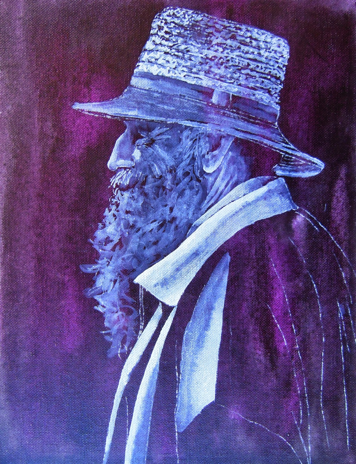
Added more white to the shirt, hat, face, and beard.  Concentrate on the lights and darks for this value study.