12/11/19

Paint Pouring, Black Creek Brewery Tables, December, 2019

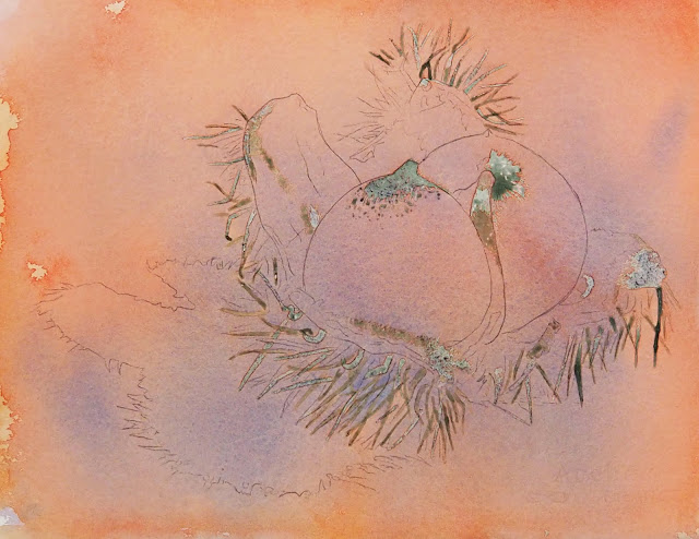
Many thanks to everyone who helped with the paint pouring of the brewery tables!  They look beautiful. I am posting the pictures of the tables here, the pictures do not do the tables justice.


11/22/19

Art & Ale Colored Pencil October and November, 2019

Colored pencil on Grafix Dura-Lar Matte paper.  The color side with a white background.  After erasing the original traced pencil lines, I started adding layers of color, usually starting with the yellows, then orange, then red, and then brown for the darker beer.  I used canary yellow, spanish orange, cadmium orange hue or pale vermilion, crimson red or scarlet lake, dark brown or dark umber and white.  The lighter beers have the yellow, orange and red.  The darked beer has the addition of brown.  I used canary yellow and burnt ocher for the wood part, I shaded both with more of the brown in the shadows and on the wood grain.  I have more to do, but this shows some from each area.


Colored pencil on Grafix Dura-Lar Matte paper.  The color side with a black background.  This is so you can see the white pencil.  I usually put the white pencil on the black and white side and sometimes on both sides.


Colored pencil on Grafix Dura-Lar Matte paper.  The black and white side with a white background.


Colored pencil on Grafix Dura-Lar Matte paper.  The black and white side with a black background.


NCBG IEW October and November, 2019

Artichoke from another class.  I did a wash of green with splatters of yellow and darker green over this artichoke that was only partially done to show you how you can use white gouache when you lose all the whites.  I think i will finish this as a gouache piece.

How it looked before class.

I added some dark thorns and more texture of the fur like texture inside the shell.  I added darks and textures to parts of the shell.  I darkened the right chestnut.  I lifted the highlight on the shell with a damp brush for the left chestnut and used a scrubber for the right chestnut (in order to demonstrate both). I then demonstrated the use of some white gouache to add some light needles and on the left side to lighten the background around the shadow.  I used the same colors as before - the browns made with warm and cool red plus purple blue and green blue plus warm yellow.  I leaned one brown toward the blues and one toward the reds. 

An example from another class.

I demonstrated the layers of painting for the 2 leaves (the right one is not quite done yet).  I did several layers using mixed green.  The green I use most is my green blue mixed with my warm yellow.  To darken the green I add either more blue or red or both sometimes.  For the yellow green areas I dropped in cool yellow.  For blue green areas I dropped in some blue or blue green or glaze with those colors.  I demonstrated more petals.  I used quin. rose and ultramarine blue for the petals.  I do them in layers building to the mediums and darks.  The dark rose color I started in the middle shadow part of the flower was quin. rose with a little green added to darken the rose.  I may also use ultramarine blue in some areas to darken.  I glazed the left half of the background with rich green gold (could have also used my warm yellow - see the flower above).  I left the other half so you can see the difference.  I can glaze more if necessary, maybe with some red in some areas.

11/14/19

Art & Ale CP October and November, 2019

I added more darks, more red and indigo, on  areas of the elephant.  I worked more on the background.  I used the stump to blend some areas (remember to clean it with sand paper when changing colors to blend!).  I still have more to do.


Using black and 70% french gray so far I have started working on the black & white side of the Grafix Dura-Lar Matte paper.  I have more to do still on the glasses and I will show you the wood section next class as well as adding the color.  Work on gaining a smooth pencil stroke and on being able to gradate values.

NCBG IEW October and November, 2019

I added a few more bracts and added a light glaze of warm red to the top portion of the background.  To do this I wet the background and added in the color.  I plan to do this on the entire background.

I started by transferring the drawing and wetting everything but the flower petals.  I dropped in yellow, green and red as well as salt.  I have made what looks like a 1970's wallpaper.   I will glaze this at some point in the next class.  I did the first pass on a petal and a leaf.  I will do more of this next class as well as the later passes on each.  The leaf was done by dampening it and dropping in a mixed green (warm yellow and green blue) and then I dropped in brown and blue on the edges.   The petal was done by dampening and then dropping in cool red and gradating it outward.  I also dropped in purple blue near the base. 

NCBG IEW October and November, 2019

I did a small pour with blue (ultramarine) in the bottom shadow area and removed a little masking.  This was before class


I painted some blue and dropped in red in some of the dark areas so that it would dry and I could remove the masking before the next demonstration in class.  I started making some dark spikes.


I removed more masking leaving some to show the removal during class.


I painted a few spikes using blue and mixed browns.  The browns were made with warm and cool red plus purple blue and green blue plus warm yellow.  I leaned one brown toward the blues and one toward the reds.  I also used the browns and purple blue to add shadow to the spikes and to start working the spikes into the composition.  When masking is used it makes hard edges all around and I find I must work it back in.  I painted a dark area at the top and painted the first coat on a chestnut.  I painted the chestnut by carefully dampening the area and dropping in the darker more blue brown on the left and dropping in the more red brown on the right. I let it gradate upward to tint some of the white textures at the top of the chestnut.  There is a lot more to do with basically the same processes.


11/13/19

NCBG IEW October & November, 2019

I masked more and poured with the red and blue and a small amount of warm yellow. 


I did not mask again.  I did a smaller pour with the red and blue concentrating it in the darker areas.  After it was dry I removed the top masking.  I am leaving the rest in order to paint some darks before removing the masking.

11/7/19

Art & Ale CP October and November, 2019

I added indigo to the crimson red and white.  I lightly started adding the indigo to the dark areas to create deeper shadows.  I also added light layers building them up on the background.  Need to finish the layers.  I added some red to the background near the top right. 

NCBG IEW October and November, 2019


Watercolor pouring, this has had 2 passes so far.  First I transferred the drawing.  I used Pebeo drawing gum to save some of the whites (any masking fluid or miskit or friskit will work).  I mixed some watercolor paint in a jar.  I made 4 colors - warm red, cool yellow, warm yellow and then a mixture of both blues.  You can mix any colors you wish.  I sprayed the paper and poured the paint, mostly the yellow and red for the first pass.  You can also use a pipette to add the paint.  I moved the paper around which moved the paint.  The more you move it around the more the colors mix.  I let this dry and then did some more masking concentrating mostly on the spikes.  I poured again adding the red and the blue and moved the paper less.  I plan to mask more spikes and do at least one more pour, maybe two more, before class.  Then I will remove the masking and finish by painting details and shadows with a brush and lifting as needed.


I worked more the the bracts.  I started adding some dark shadows (I mixed a dark using the primaries leaning it towards green). I also started adding some of the medium shadows and form and the texture of the bracts.  I wet the stem and into the leaves in order to keep a hard line from forming where the leaves meet the stem.  I used green and dropped it down the length of the stem.  I dropped in some yellow and some red as well as some blue green.  As it started to dry and was in the "danger zone" of watercolor I ran my damp brush (not a wet brush or you will get blooms) down the length to start getting the striations.


S CW August and September, 2019

I finished the unfinished areas adding shadows, darkening some dark areas and adding some textures.  i glazed the background to make the gray a blue and green gray.

BAL CP&MM, October, 2019

I finished the areas that had been left unfinished (the left ear and the body and sides of the face). I used the same colors and lots of white.  I also lightened the background with white.

DAC CP&MM, July and August, 2019

I continued working on the dog adding lights and darks. Overall I lightened lots of areas as it needed it.

DAC MM, Jan. and Feb., 2019

I worked more on the turtles focusing on the values and color as well as texture.  I made the background lighter at the top and darker at the bottom to mimic the light in the ocean.

11/2/19

Art & Ale, October and November, 2019

For the beginning of this project we are gently layering red (either crimson red, scarlet lake or crimson lake)  in our medium and dark areas and white in the light areas.  This will establish the values and work well as an under drawing for the colors we will use on top.  I still need to finish the leg and ear.  I am saving those areas as demonstrations for those who need to see it again and for those who missed class.  I also saving some wrinkles for demonstration purposes.  The yellow is photographing very brightly, this is after I toned it down while editing the photo.

I started by wetting the paper and dropping in warm yellow at the top and cool yellow at the bottom letting it move around the paper.  After that dried, I started working on each separate bract.  I dampened the individual bract, making it less wet than when I dropped color in the background.  Less wet means I have a little more control and can guide the paint.  I started moving around doing areas that do not touch.

This picture was taken in class with a cell phone so the colors and values are off.


I continued working around the head of the artichoke making sure I don't work next to an area that is still wet.  I also started with second passes on a few bracts working on adding more color and value in the medium and dark areas where needed.  I am building to the darks.  I also showed lifting with a soft brush especially on the blue green too dark bract on the right.  I also use lifting with a soft brush to soften edges when needed.  I showed scrubbing with a stiff bristle brush, one I made myself by cutting the bristles at an angle.  Scrubby brushes are also available for purchase.  I have always made my own.  I wet the scrubby and rub it over the are I want whitened.  Remember, I usually do this at the end of a painting as scrubbing changes the surface of the paper and is difficult to paint around.  I will use glazing to adjust colors as needed.  I mixed the green I used with my green blue (DS pthalo blue green shade) and my warm yellow (DS permanent yellow)

11/1/19

DAC CP October, 2019

Continuing to use the 6 colors (warm and cool red, warm and cool yellow, purple blue and green blue), I worked on adding more shadows.  The values, the lights and darks, are important in order to create form.  I have gently layered the color to make skin tones in the shadows and in the light. 

If you are struggling with the values, do this piece (or another piece of your choosing) with a dark pencil of any color, just use one color.

On the shirt I added blue and used a stump and eraser to smooth and shape the blue.  I did not add the patterned shirt as in the reference photo as that would be distracting here and would pull the viewers eye to the bottom of the page.

This piece is not finished.  I will continue working with the same 6 colors gently layering and blending working towards the darks.


I worked on a red grape adding shadow and highlight using scarlet lake and pomegranate (crimson red and/or crimson lake will work as well), white, and black grape or indigo.  I added some more background and need to continue the background and finish the grapes and stems.

10/24/19

BAL CP & MM October 2019

I added a little more light and some color and some black to help it pop more.  need to finish the neck...

I worked a little on the left side of the neck and more on the tongue (added highlights).

I added a lot of dark using black over the color that were there.  I added more shadows in the red with black grape/cherry.  I shaded the eye on the shadow side.  I worked on the beak adding color and value and soothing it with white and a stump.  It has quite a bit of work yet.

DAC CP October, 2019

I started adding peacock blue )green blue) to the left side eye.  I shaded in the peacock blue, carefully, as well as a little scarlet lake (warm red). We will work on her more in the next class.

I worked on the shading of the grapes, the stem, and the background.  I shaded more color and value on the purple and green grapes and then went over each grape with white to smooth and blend the color and value.  Then I went back in with the same colors to add another layer of color and reestablish the values. I also use the stump to blend and smooth the layers.

I worked on adding a background to the bottom.  Backgrounds can add interest and depth and help to clean up edges.  Typically I use colors from the subject in my backgrounds.  I do sometimes add other color, but I do so carefully and thoughtfully. When I change from one color to another I overlap the colors and blend them together to make smooth transitions.

10/17/19

BAL CP and MM, October 2019

I worked on the tongue.  I did a layer of peach first and then used white and some pomegranate, lightly.  I also used some scarlet lake and more peach and white.  In the shadow I used pomegranate and black grape and smoothed it with white and then used black, lightly for the shadow. I often do layers alternating color (1-3 layers of color) and white.  The amount of alternating layers varies depending on what I am trying to do and how it's looking.  The white blends the color.  I used ink on the moth, the gums.  i then used whit ink on the whitest highlights.  Then I used white, black, terra cotta, and burnt ochre pencil.  Still working on the edges of the smile, it needs to be lightened and textured to look like fur (rather then the joker from batman). I added a little more light and dark to areas of the face and ear -using white, burnt ochre, dark brown and black mostly.  I worked on the muzzle with a lot of white and some black, pomegranate (lightly and carefully), peach, and true blue.

I used mostly scarlet lake and a little pomegranate.  I used a little brown ochre and terra cotta and scarlet lake on the neck.  I used spanish orange in the eyes.  I shaded it in and then melted it with rubbing alcohol and a brush.  

I used black and started adding feathers with a curved line pencil stroke going in the direction of the feathers.  I used some scarlet lake on the eye to shade it more orange and then blended with white and then added a shadow with scarlet lake.  I used black for the pupil.  I used scarlet lake, pomegranate and black grape (indigo with work) on the comb to shade the dark area.  I used a scribbly stroke to make texture.  I started adding scribbly scarlet lake to the red face areas.  I used spanish orange, then brown ochre and then white and then more brown ochre and some dark brown on the tip of the beak.  I started shaping the beak.