9/28/17

Sertoma Continuing Watercolor September and October 2017

I worked on the shadows underneath, adding a dark and dropping in reflected color.  It could use a bit more color.  I added some darks, more are needed.  I added some texture to the yellow pepper and the stems.  I also need to add more detail. I scrubbed out/reshaped the white highlight on the green pepper (the highlight at the top).

I worked more on the head, especially the eye and beak.  It was mostly adding darks and details.  I  used a mixed brown for the eye and a mixed dark for the shadows.  I used a scrubber to correct some textures in the feathers.  I then glazed some color into those areas.  I have a little work left overall, but this one is close to complete.

I glazed the background with what else but...yellow...  I pulled the glaze into the hair at the back and into the shirt and the scarf (the yellow scarf in the photo).  I worked on the hair and beard (have more to do) and worked a little on the skin.  This whole thing needs darks and details which I will do next class.

9/20/17

Sertoma Continuing Watercolor September and October 2017

I worked more on the yellow pepper.  It still needs shadows, especially at the bottom and where the stem attaches.  All the peppers need shadows and more detail.  Added some yellow orange to the red pepper to give it some warmth.

I added color and texture to the feathers.  I started working on the comb and wattle, adding some darks.  Need to work on the eye and beak.

This is a wet-on-dry watercolor painting done upright on an easel.  I started with a yellow, blue, and red - all very watered down.  I focused on the skin pulling the color out into the background.  I allowed drips.  During the second pass I mixed a skin color (quin. rose and aureolin yellow and quin. gold).  I then painted the skin paying attention to darks and lights.  The third pass focused on adding some of the darks.  I used a mixed brown as it is the safest.  Color can be used as well for those who want to be more adventurous.  I also added some blue (ultramarine) to the front of the face and blended it out and encouraged a drip.  I put some blue behind his head as well to balance it.  I focused on the area on the front of the face below the hat and above the chin for demonstration/time purposes.

9/19/17

DAC Beg. Colored Pencil, September 2017

Darkened a little more of the background with indigo blue and grass green.

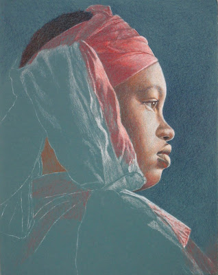
Did a little more of the scarf using white and scarlet lake.  Started adding red to her clothes and sienna brown to her neck.

On the coffee press, after the white, I used cadmium orange hue over almost the entire thing (saved a little black) and canary yellow and scarlet lake in some areas.  Then I reestablished some of the whites as well as the black (I used indigo and dark brown to make black or you can use black).  For the wooden handle, after the white, I used dark brown and canary yellow with a little indigo for the dark side, I also used more white as needed.  For the plate, after the white, I used true blue, canary yellow, and a little orange and scarlet lake as well as more white.  I used indigo and orange in a few small dark places on the shadowed side of the plate (I used the same colors for the stack of plates).  In the background, after the white, I added indigo blue very lightly.  For the tablecloth, after the white, I used sienna brown (terra cotta would work too) and canary yellow and more white to creat some highlights.

9/16/17

DAC Beg. Colored Pencil, September 2017

Colored pencil on black.  I have completed the first layer, the white value study.  In class I will show you the next steps which involve adding color.

9/14/17

Sertoma Continuing Watercolor September and October 2017

This is from last week

I started adding shadows with both dark color and the complimentary color.  I added a few details and some color with glazing.  I will continue next week adding details and shadows.  I added the shadows underneath with a dark mixed with primaries - a purple blue, a warm red and a touch of warm yellow (indanthrone blue, pyrrol scarlet, quin. gold).  I added a touch of the color of the pepper into the shadow while it was wet, you could also let the shadow dry and glaze the color into the shadow. 

This is from last week.

I started this with a dark that I mixed using 3 primaries - a purple blue, a warm red and a touch of warm yellow (indanthrone blue, pyrrol scarlet, quin. gold).  I did not wet the paper although you could dampen it if you were afraid of going to slow. While the dark was still wet I used a damp brush (not a wet brush) to add the feather texture.  I removed the masking.  I painted the red parts (comb, wattle, ear, ear lobe, eye ring, part of the beak).  I used small table salt for the texture.  I painted it in sections.  For salt -  wet the area, add paint, and when it's still shiny but not puddles add the salt.  Then I started glazing colors into the dark all over the rooster.  I used yellow,  yellow and red together, green, and a blue purple in some areas (I put down the yellow and dropped in some red).  It still needs work which I plan to do next class.  

9/13/17

DAC Beg. Colored Pencil, September 2017

After filling the background with darker color (grass green, scarlet lake, black grape) I burnished it with white.

I went over half of the burnished background with indigo (so you can see the difference, I will finish it at some point) and added some green and scarlet lake as needed in some areas.  I will either leave this solid or lift/erase some background textures.  Have not decided yet.  I added darks to the leaves and shadows to the stem.

After the white value work I lightly covered the entire face with terra cotta (could use sienna brown as well).  I went a little heavier with the terra cotta on the green areas.  Then I used dark brown and black grape in the darker areas and peach in the mid tone areas.  Then I lightly covered all areas with the peach, even the dark areas.

This is the same as above only with no pencils on it and taken in slightly different lighting..

I went back over the darker areas with terra cotta and dark brown and the lighter areas with white.  I used peach in the mid areas to help transition from dark to light.  I also added a little scarlet lake to some areas on the face.  I used indigo blue in the darkest areas.  I lightly covered the scarf with scarlet lake going slightly heavier in the green areas.  I started to to back over the light areas with the white (did not finish).  I used terra cotta, scarlet lake dark brown, and indigo in the hair.

Started in class with the white.  Will shade the entire piece in white before adding color.

Worked on this more to give you an idea of how I will work in the white.  Still have some areas to finish, but this will give you a good idea.  This has lots of subtle value areas.  use your eraser and stik tak as needed  while you work.

9/12/17

DAC Beg. Colored Pencil, September 2017

I worked more on the background adding dark.  It's still in process.

I added more white doing a value study.  We will add color in class.

9/6/17

Sertoma Continuing Watercolor September and October 2017

First I wet the red pepper (except the highlights), mixed a cool red and warm red (pyrrol scarlet and quin rose), and painted the pepper.  Then I wet the yellow pepper (except the highlights) and painted it yellow (a mixture of a cool yellow and a warm yellow).  While it was still wet I dropped in some red (red pepper mixture) and some green (the green was a mixture of pthalo and quin gold).  You can also do this in 3 steps -  Wet, paint yellow, let it dry.  Wet, drop in red, let it dry.  Wet, drop in green, let it dry.

Next, I wet the green pepper (except the highlights) and painted it green (same green mixture as above).  I added yellow green to the lighter areas and blue green to the dark areas.  I added some red (same red as above) in the dark areas and around the stem.  After the peppers were dry I wet the background.  I mixed a gray with the three primaries ( I mixed several grays and used them all).  Remember the color wheel and the color opposite on the color wheel neutralizes that color (example - green neutralizes red).  Also remember if you lean a color towards red or yellow it will look brown and if you lean it towards blue it will look gray.  After mixing the gray I wet the background again and started painting the background gray.  Then, near the top, I touched the background with a wet brush and created blossoms.  At the bottom I used a dry brush to life color.

This is the masking.

This is after the first pour.  I used red, yellow green and purple (I do not know what colors I used as these were premixed long ago).  To pour, wet the paper (I do this with a spray bottle), pour the paint, shake and tip the paper to get the paint to move.  You can also add color with a dropper/pipette.

I did a little more masking.  I poured a second time with blue, red, purple, and yellow green.  It also has a little rain texture added on the trip in the pouring rain to the car as well as a few blooms from the rain water.

9/5/17

DAC Beg. Colored Pencil, September 2017

A reminder that for demonstration purposes  I work on small sections but this is not the way I typically work.  I worked on leaves and the stem.  I used alternating layers of canary yellow and true blue first on the leaves,  Then I did a few layers of grass green and scarlet lake/pomegranate (either red will work).  Then I did black grape in the dark areas.  The leaf on the left shows what it looks like after those layers.  After that I used white to burnish the entire leaf.  Then using the colors I have already used I added in more darks and used white to make the light areas lighter.  I added color as I thought it was needed.  I drew in veins with a sharp white pencil followed by a line of shadow next to it with a sharp black grape pencil.  The leaf on the right shows what it looks like after burnishing and refining a bit.  The green on this leaf may need to be knocked back a bit with some red.

I worked on burnishing and refining the leaf on the left.  I also worked on the petals with layers of pomegranate and scarlet lake.  I burnished with white and then added more color as needed.  I used black grape, only a little to add shadows. The stem was layers of canary yellow, scarlet lake or pomegranate, and true blue with white to burnish and black grape as a shadow on the side.  The dark background was layers of scarlet lake and grass green.  Then I put back grape over the top.  I erased out a stem and leaf shape to show how to add these if you want to you background.  I may burnish at some point, possibly with a stiff brush, a stump, or the colorless blender.

I started working on the neck with the same layers of colors that we used elsewhere.  It is not complete yet (not enough dark values yet).