8/30/17

BAL CP People Feb. and Mar. 2017


Colored pencil and solvent.  This started as a melted turquoise under drawing with some splatters. Then color was added and melted and splattered on the under drawing.  Then I drew on top with colored pencil, no more melting with the solvent. I worked on values, colors and details refining and adjusting.   

DAC Intermediate drawing based WC plants March, April, May 2017


Watercolor and gouache on watercolor paper.  I have finished the grapes.  I added a warm yellow wash to the background and over the cast shadows.   I added detail and refined the color and values.  I used white gouache to add the film that is often found on grapes.

DAC Beg. Colored Pencil, September 2017

Colored pencil on white Stonehenge paper.  This is what I had done before class.  I used canary yellow on the leaves and stem.  I colored them all in yellow, very lightly.  I used pomegranate on the flower paying attention to value and texture as shaded.

This is how it looked at the end of class.  I finished shading the flower and lightened it a little using the poster putty.

Colored pencil on toned gray Strathmore paper.   This is how it looked before class.  I used white for the highlights and black grape for the darks.  For this one pay attention to the values, the lights, mediums and darks.

This is how it looked after putting in the values. 

This is how it looked at the end of class.  Remember for demonstration and time purposes I worked on the head only.  Normal procedure is to work all over building it up as a unit.  You can see on the neck how first I added yellow and scarlet lake in light layers.  I did quite a few of these layers.  Then, I added cadmium orange hue in the mix and continued building layers.  Then I used white on the highlights and light areas.  I used scarlet lake on the reddish areas.  Then I added black grape in the dark areas.  I will keep refining as I go with these colors making adjustments  to color and value as needed.  Towards the end I used white to add the feather texture.  On the  dark part of the beak I had added some of the yellow and scarlet lake.  I then used indigo blue to darken the beak.

8/26/17

Sertoma Continuing Watercolor OND 2015

This is how the painting started. 

This is how it ended up.

DAC Intermediate drawing based WC plants March, April, May 2017


This is how it looked at the end of class

This is after class after more work with values and color


BAL Colored Pencil People July 2017

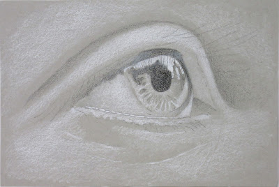
Colored pencil on gray drawing paper.  Worked a little more on the eye adding some color and values.

8/24/17

Sertoma Colored Pencil Exploration May & June 2017


This is how it looked when class ended

After more work and white in the background (to incorporate the shadows and to cover all the smudges and excess marks...) as well as cropping I think it might be done.

NCBG AEW June 2017

This started with masking and pouring.  This was about as far as I got demonstrating in class

This was work done after class

This was finished with more painting, glazing and gouache

BAL Colored Pencil People July 2017


This is how it looked after the class demo.

This is what I have done since class, refining and adding more color.

This is how I might crop it (not sure yet).

BAL Colored Pencil Animals June, 2017

Colored pencil on dark mat board. Kept refining, correcting, and finishing unfinished areas.  I think it's done.

8/17/17

Sertoma Painting People in watercolor (July and August 2017)

This is after last class

Worked on it a little more adding more shadows, darkening the hair, working on the clothes a little.

More shadows on the face and neck, more work on the clothes.  Still a lot to do, working slowly adding glazes of value and color as needed.

8/15/17

Sertoma Painting People in watercolor (July and August 2017)


This is how the painting looked after class.  I did a blue glaze over the entire background as well as parts of the shirt and into the hair. I added more shadows to the neck and face.  I added dark to the eye area.  This is not finished, but you can see the progression.  I will post if I get time to work on it more.

8/8/17

Sertoma Painting People in watercolor (July and August 2017)


I added the side to the cello.  Lots more to do here.

This project is about texture.  I dampened the paper and dropped in color.  When areas of the paper were wet/shiny and not puddles I started sprinkling salt on those areas (I used a larger sea salt which makes quite the texture, but any salt will work).  I avoided the puddle areas until they were a bit more dry.  You can avoid putting salt on the face if you wish.

I mixed a dark orange brown color.  I mixed it using a purple blue and an orange red (it has the orange red used in the background in it which keeps it unified).  I started doing a value study on the face.  I mixed a dark blue color (a green blue with some of the red orange from the background in it).  I then painted the hair making sure to soften the edge around the face.  I softened by using a brush clean of color and mostly dry and pull the color out from the line.  I made the color a medium dark, did not want to put the darkest value on yet (and that way I can decide later if it needs to be darker)

8/3/17

BAL Colored Pencil People July 2017

I worked more on the face and hair, adding shadows, texture, and details.  I will continue refining as I go.  I started working on the clothes adding wrinkles (shadows and highlights) and color.  Of course I need to do the neck and hands.

I worked more on the face, hand and arm using only white, indigo and peacock blue.  It has a long way to go...

White and black pencil in gray Strathmore paper (from the drawing pad).

The addition of color over the black and white value study on gray.  I used peach, terra cotta, light peach, more white, true blue, spanish orange, scarlet lake, pomegranate and more black.  Doing a drawing starting with black and white on gray paper is a great learning experience.  

8/1/17

Sertoma Painting People in watercolor (July and August 2017)

I darkened the back and bottom of her hair and the background. Need to add darks to her face, especially after darkening the hair and background.   

At home I added orange and blue to the dark shape of his clothes.  I then wet and painted a glaze on the background (ultramarine).  In class I wet his hair and painted it with a dark and dropped in color on the wet dark.  I also wet the face and used darker skin color (and let the hair color bleed in a little).  I need to darken the hands and then add shadows and detail to the face and hands.  Of course the cello needs detail and shadow as well.

This is the poured painting after some value work with similar colors used in the pours was used (reddish orange and purple blue and the mixes they make).  There are a few more things I will do, but this one is close.