4/24/17

DAC Intermediate drawing based WC plants March, April, May 2017

I glazed the bottom left grape with a yellow glaze and scrubbed a highlight on the top left of that grape.

I glazed the background with a red glaze.

Monochromatic painting.  Upright painting at an easel.  I have demonstrated cast shadows (hard edges, made by blocked light).  The cast shadows are a light, fairly flat wash of color applied wet on dry.  I demonstrated form shadows (soft edges, gradated, made as an object turns from the light).  The form shadows (which are also textured) were painted wet on wet to create texture and to keep the edges soft.  I demonstrated the background, wet on wet.  I wet the paper and dropped in color allowing it to run and leave white spaces.  I am keeping it light right now, it will most likely darken as the painting progresses.

4/14/17

NCBG Beg. CP March & April 2017

Colored pencil on tinted Stonehenge (from the multi pad) I finished the first 3 layers - the true blue, pomegranate, and canary yellow.  Using all 9 colors in our palette I worked on various areas showing you how to finish.  The palette - true blue, pomegranate, canary yellow, white, cad. orange, black grape, indigo blue, grass green, dark brown.

Vet class

Blind contour, hand

Drawing marks (hatching, cross hatching (with my messy cross hatching/scumbling mix next to it), contour hatching, scumbling, stippling, using words to shade.

The start of a contour hand using a grid matching the plexi viewfinder grid.

Your homework - practice, practice, practice!

4/11/17

DAC Intermediate drawing based WC plants March, April, May 2017

Blind contour

Thumbnails

Drawing

Started this painting wet on wet.  used a mixed green, yellow and a reddish purple on the asparagus letting it run out into the background, guiding it into the background, and dropping some in the background.  This dried light and can be seen at the top and sides of this image.  I let that dry.  Then I mixed a green (using green blue and warm yellow) and a reddish purple (using ultramarine, rose, and a tiny bit of yellow. I started at the bottom and worked my way up wet on dry.

Warm/cool color wheel.

I started by using flat and graded washes of the pink color.  It is the under painting.  I then did a darker red purple color (as seen on the bottom left grape).  The grape on the top left has an additional glaze of cool red near the back 3/4s and a warm yellow near where the stem attaches. I did a dark purple at the stem of the top left grape and shaded the stem with the dark purple to make it look round.  After that was dry I did a glaze of yellow (to make it look brown).  I added the shadow on the bottom right with the dark purple and some blue.  I then made it look fuzzy by pulling it out and adding a little water around the edge.  For demonstration purposes I left the painting in various states of completion.  When I am not doing demonstrations for class I work on the entire painting as a whole bringing it up to completion as a unit.

I continued working, started on the left grape with red purple and yellow as well as on the stem with some mixed dark green, black, and yellow.  I lifted to soften the highlight on the bottom left grape.

Worked more on the bottom 2 grapes as well as the stem.

Flat wash and graded wash.

4/7/17

NCBG BCP March and April 2017

I worked on a petal at home, blending and refining.

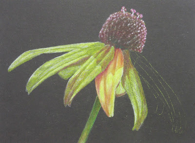
I demonstrated a petal in class, blending and refining.  I used white, canary yellow, cad orange, and pomegranate working in layers switching between pencils as I adjusted the values and colors.  I also lifted out the dark in the top as it needs to be redone.  

I demonstrated a petal in class, blending and refining.  I used white, canary yellow, cad orange, and pomegranate working in layers switching between pencils as I adjusted the values and colors.

I used true blue and did a light value study (started it at home).  Remember to use the pencil AND the poster putty to lift as needed.

After the value study was completed in class I started adding pomegranate to all areas that are red, purple, orange, brown, and dark areas.  I them added some yellow to show what that looks like on the green, brown, and dark areas.  Those are the first 3 steps - true blue value study layer, pomegranate layer, and then a yellow layer.

Vet Class

Worked on the body with true blue, indigo blue, black grape, white, pomegranate, and a little yellow (on the chest).  It needs a little more dark and feather textures.

Sertoma CW March and April 2017

Worked on the clothes and some background and some more leaves.  Still needs quite a bit of work.  When I work on this I will plan to post photos and email the class.

Worked on the background and leaves.  Everything needs another few passes.

The left is a tree made by blowing watercolor paint through a straw.  The right is several passes on a tree, started with the clumps of leaves, added the branches while it was wet and then made a second pass adding dark and texture.

A tree started with the leaf clumps, added trunk and branches while it was wet.

First pass was wet on wet.  The second pass was wet on dry (did not finish, would add another small tree on the right.  Would most likely do more passes adding small details, darks, and textures.

4/3/17

DAC Intermediate drawing based WC plants March, April, May 2017

I worked on this a little more in class adding darks and lifting highlights  I worked on the stem and the main leaf near the top.  I also did a tree branch in the upper left (blown with a straw) and plan to add some of these to the background.
This is a photo of the set-up I used at home to draw the grapes.  I like to have them on a white surface (paper towels here) so that I can see the shadows.  I like one light source so I either use a lamp to create the single strong light source or I sit next to a bright window to get the single light source.

One of the blind contours.  The purpose of a blind contour is as a warm up and to focus the artist, to get them to really look at and SEE the subject they are drawing. 

Thumbnail sketches.  These are used to try various compositions, shapes, values, etc. before doing the final drawing.  

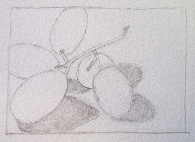
This is a sketch, a slightly more finished sketch than a thumbnail.  I did this sketch so that I could see the positive and negative shapes and the composition I had chosen a little better.

Black and white reference photo of my fruit still life.  I worked on the sketches and drawing from the grapes sitting in my studio.  I took the reference photo because fruit deteriorates or can get moved (or eaten).  I used the photo to work on the grapes in class as I did not have this set-up in class.  Reference photos are good to have.

Colored reference photo of my fruit still life.

Finished drawing transferred to watercolor paper (my original drawings are most often done on tracing paper and transferred).

The painting.  I started by using flat and graded washes of the pink color.  It is the under painting.  I then did a darker purple red color (as seen on the bottom left grape).  The grape on the top left has an additional glaze of cool red near the back 3/4s and a warm yellow near where the stem attaches. I did a dark purple at the stem of the top left grape and shaded the stem with the dark purple to make it look round.  After that was dry I did a glaze of yellow (to make it look brown).  I added the shadow on the bottom right with the dark purple and some blue.  I then made it look fuzzy by pulling it out and adding a little water around the edge.  For demonstration purposes I left the painting in various states of completion.  When I am not doing demonstrations for class I work on the entire painting as a whole bringing it up to completion as a unit.

Flat wash on the left graded wash on the right.  I worked wet on dry.

Flat wash on the left graded wash on the right.  I worked wet on dry.


4/1/17

NCBG Beginning Colored Pencil March and April 2017

Step one of the dark on light.  Used pomegranate to do a value study.  I left a few petals unfinished in case they are needed for demonstration purposes.

The second step was to add yellow to the entire flower.  This reduces the value contrast which we will re-establish in later steps.

Added grass green to the stem and the middle.  Then used dark brown on the middle.  Also added more pomegranate to the edges and a little indigo.  Started to add white highlights to the middle as well. The next step is to refine what and re-establish the values.  We will do that next class.

First step of light on dark is to do a value study in white.  I left a few petals unfinished in case they are needed for demonstration purposes.

The second step is to cover the entire flower in yellow.  The third step is to use grass green on the stem and dark brown on the middle.  I also started adding pomegranate to the shadow areas on the petals.  The next step is to refine what and re-establish the values.  We will do that next class.